Grocery Go - UX Case Study
Finding one item shouldn’t take ten minutes
A mobile app designed to help shoppers locate items using aisle-level, store-specific navigation.
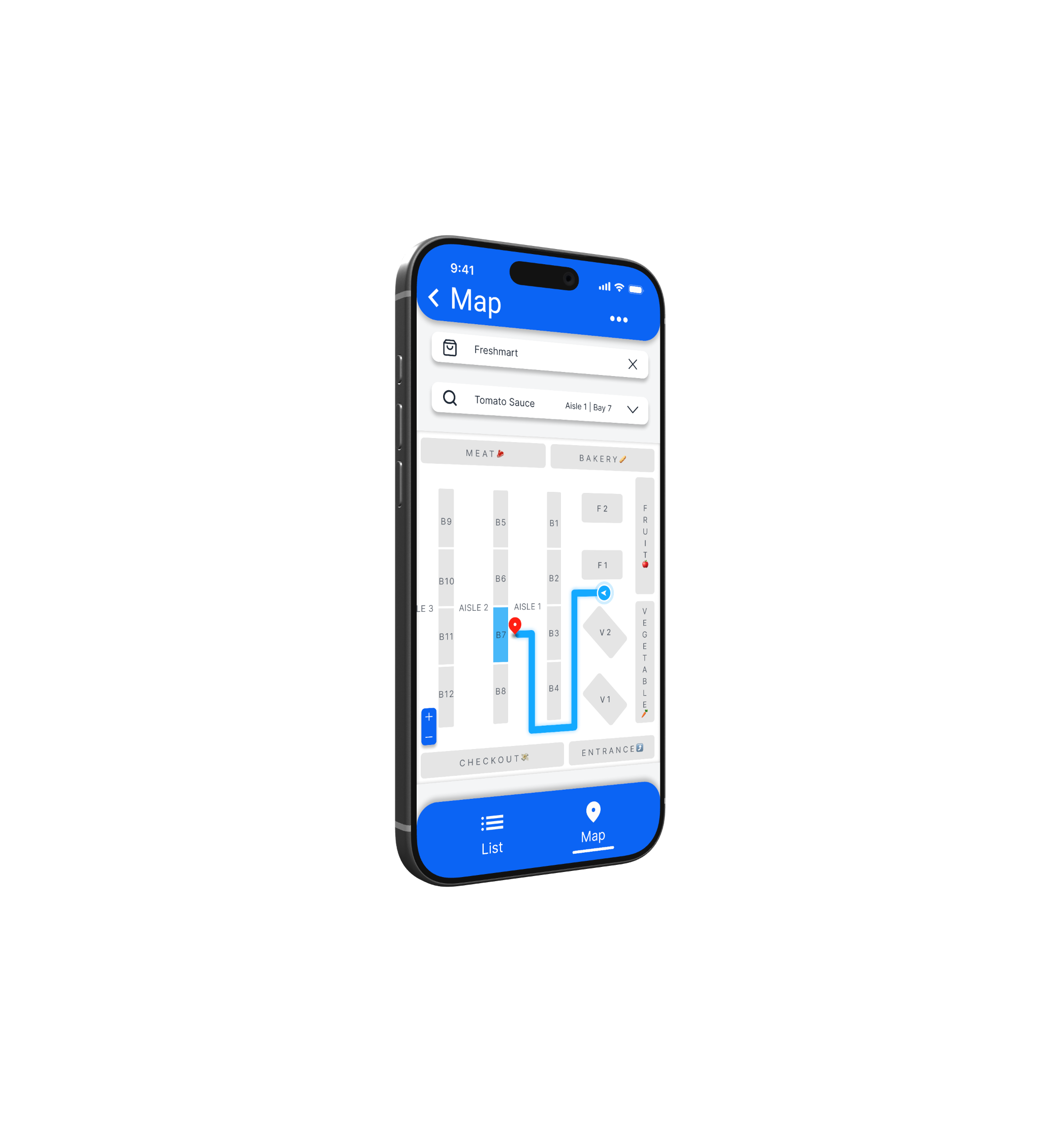
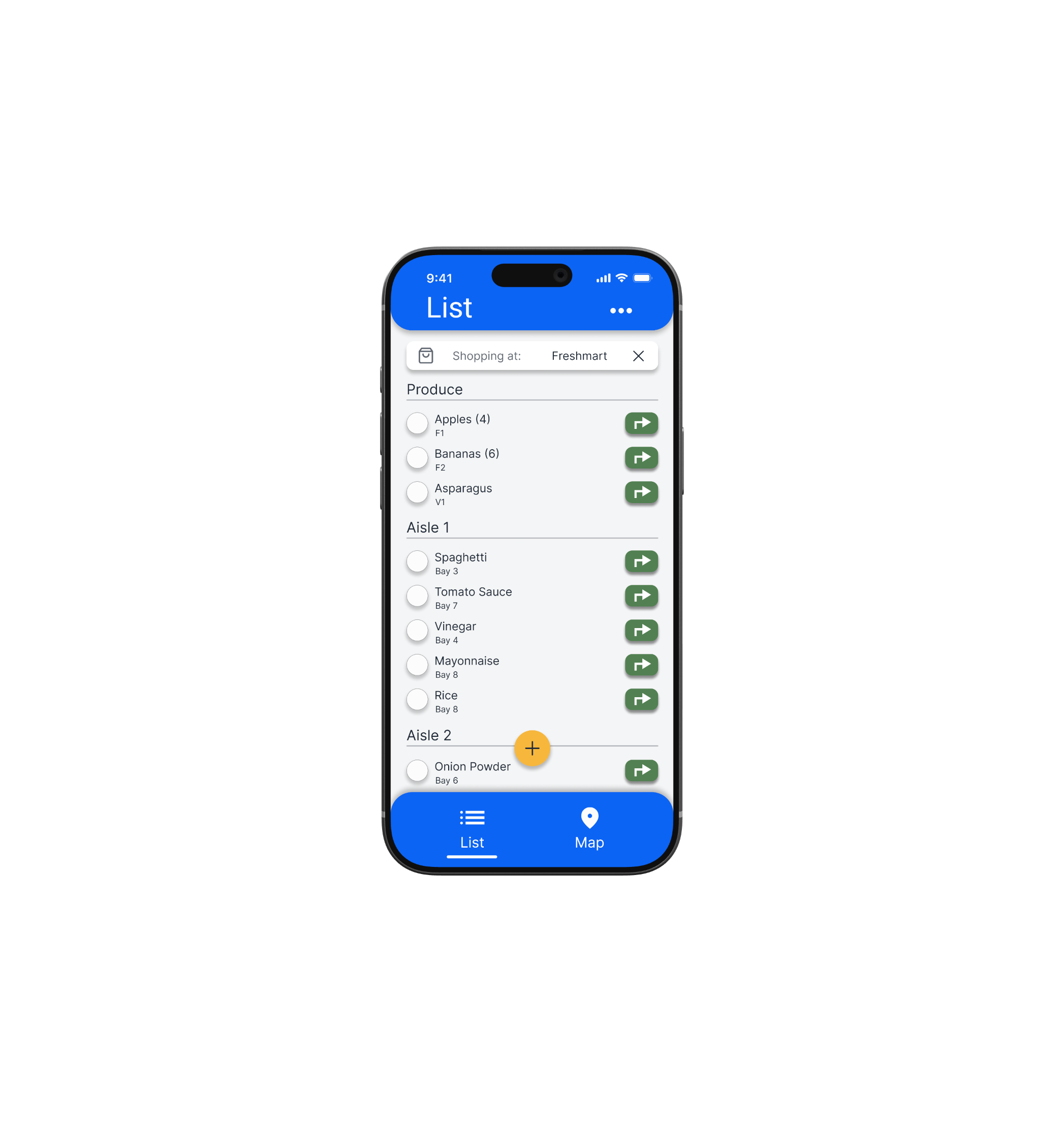
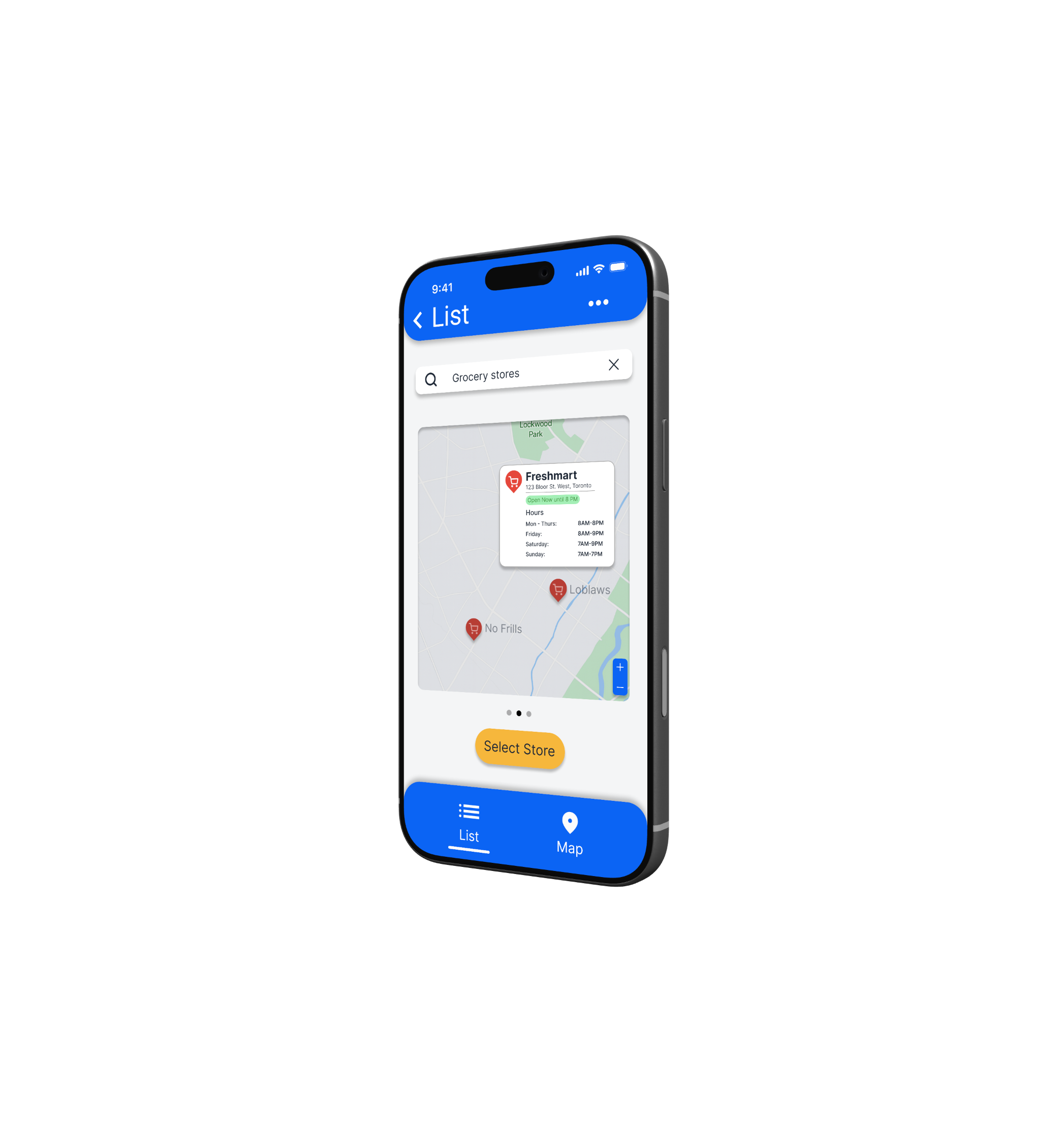
Project
Overview 🎯
The Problem
Many grocery shoppers struggle to find specific items in large stores, leading to wasted time, frustration, and abandoned purchases especially when store layouts vary by location.
The Solution
The goal was to help users quickly find grocery items in-store through clear, location-based navigation in a simple and intuitive mobile experience.
Design Process
Research
Define
Ideate
Prototype
Test
Role
UX Designer
UX Researcher
UI Designer
Tools
Figma Claude
Notion
Timeline
Dec 2025
4 weeks
Understanding the user
User Research 👨🏻🔬 Personas 🙋🏽♀️️
User journey maps 🌎 The Problem 🚨
User Research 👨🏻🔬
Summary
I conducted user research with frequent grocery shoppers to understand their in-store grocery shopping experience, pain points, and behaviours. Across interviews, a consistent pain point emerged: users frequently struggle to locate items, especially in unfamiliar stores. This uncertainty often leads to aimless wandering or reliance on store employees, increasing frustration and slowing down the shopping experience. These insights informed a design focus on clear item location, efficient navigation, and user confidence.
Notably, 5/6 users already rely on their phones to manage grocery lists. This behaviour highlighted an opportunity to unify list management and in-store navigation into one app, streamlining the shopping experience and supporting users in real time.
Pain Point #1
Difficulty locating items
Users often waste time searching for items because store layouts are inconsistent. This guided designs toward aisle-level accuracy and store-specific layouts.
Pain Point #2
Overwhelming store size
Large grocery stores feel overwhelming, especially when users only need a few items. This reinforced the need for a focused, step-by-step item navigation experience.
Pain Point #3
Reliance on staff for help
Many users feel awkward or frustrated needing to ask employees for help. This informed the decision to prioritize self-guided navigation.
Pain Point #4
Time pressure
Users shopping on workdays or during busy hours want to get in and out quickly. This pushed designs toward minimal screens and fast search results.
Personas 🙋🏽♀️
Personas were created by synthesizing patterns across user interviews, focusing on shared behaviours, motivations, and pain points rather than individual demographics. Three distinct shopper personas emerged from this research. One representative persona is shown below to illustrate the primary needs and challenges the design was built to support.
User Journey Map 🌎
The grocery shopping journey was mapped to understand users’ core actions, emotions, and frustrations from planning a trip to returning home. This exercise highlighted key moments of uncertainty and stress, revealing clear opportunities where in-store navigation and guidance could improve confidence and efficiency.
Problem
Statement 🚨
How might we help grocery shoppers confidently find items while shopping in-store by making product location simple, fast, and accessible without relying on staff assistance?
Starting the design
Paper wireframes ✍🏻 Digital wireframes 🧑🏻💻
Lo-fi prototype 🧪 Usability study 📚
Paper
Wireframes ✍🏻
I explored multiple layout ideas for the list and map screens, focusing on how quickly users could search and receive location information. Early sketches helped prioritize simplicity over feature-heavy designs.
Digital
Wireframes 🧑🏻💻
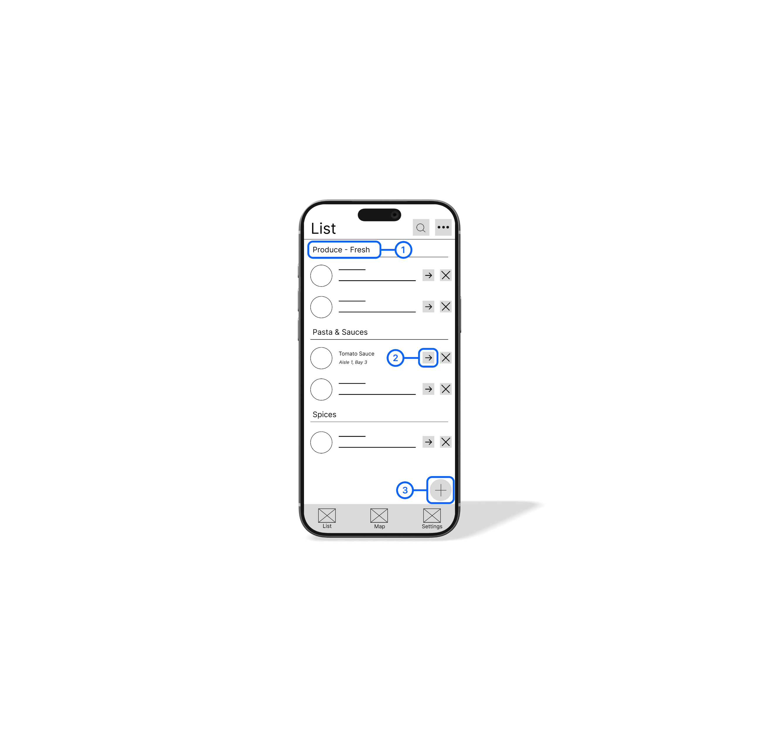
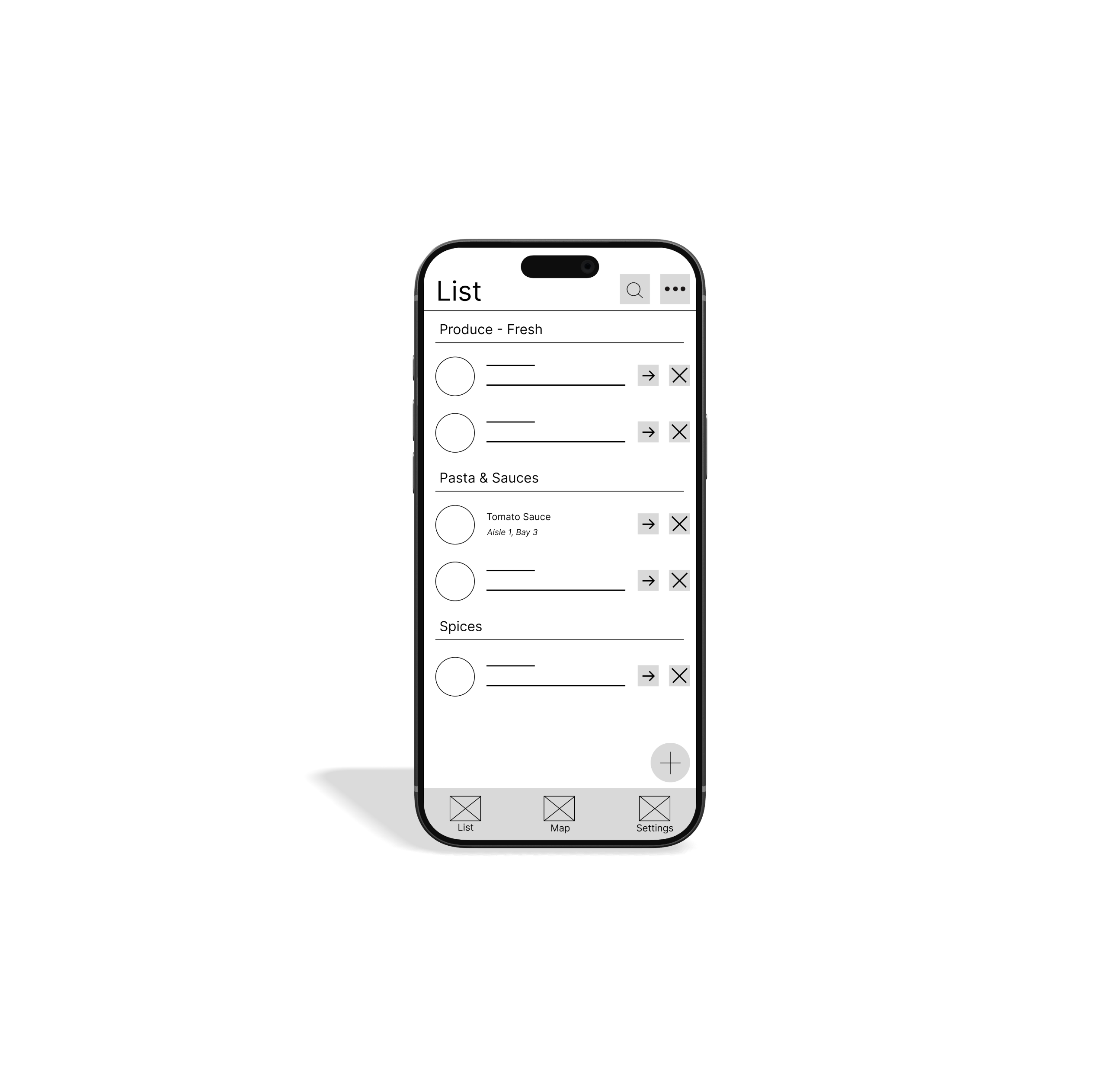
This wireframe explores how grocery lists can be automatically organized based on a store’s physical layout. Items are grouped by department and aisle to reduce wandering and help users shop efficiently. Each item includes a direct navigation action that connects the list to in-store wayfinding.
Key List Features
(1) Aisle Based Grouping
Items are automatically grouped by store section and aisle to help users shop in a logical and efficient order.
(2) Direct-to-Item Navigation
Navigate directly to an item’s location on the in-store map.
(3) Automatic List Sorting
Newly added items are automatically sorted based on the store layout.
Key Map Features
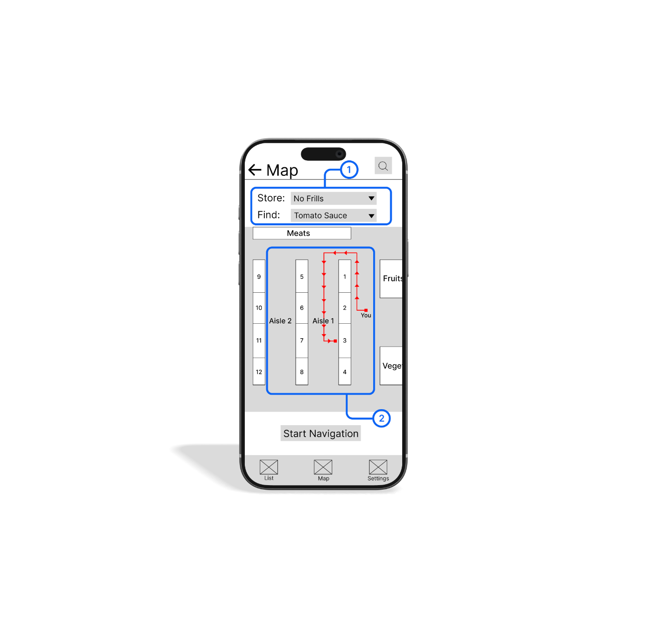
(1) Store-Aware Item Search
Users can select their current store and search for an item they’re looking for, allowing the map to adjust dynamically based on the store’s specific layout and item location.
(2) Guided In-Store Navigation
The map highlights the exact aisle and displays a clear navigation path from the user’s current location to the selected item, reducing uncertainty and unnecessary backtracking.
Low-Fidelity Prototype 🧪
The low-fidelity prototype focused on validating the core in-store shopping flow, from adding grocery items and viewing their aisle locations to navigating in-store and checking items off the list.
Usability Studies 📚
Evaluating Clarity and Ease of Use
I conducted two unmoderated usability studies with five participants to evaluate the clarity, ease of use, and overall flow of the Grocery Go prototype. Participants completed a series of common shopping tasks while thinking aloud and recording their screens.
The study focused on understanding how intuitively users could add items, navigate between views, and locate products in-store using the map. Insights from the sessions were synthesized using an affinity diagram to identify patterns, usability issues, and opportunities for improvement. These findings informed iterative design changes in the next round.
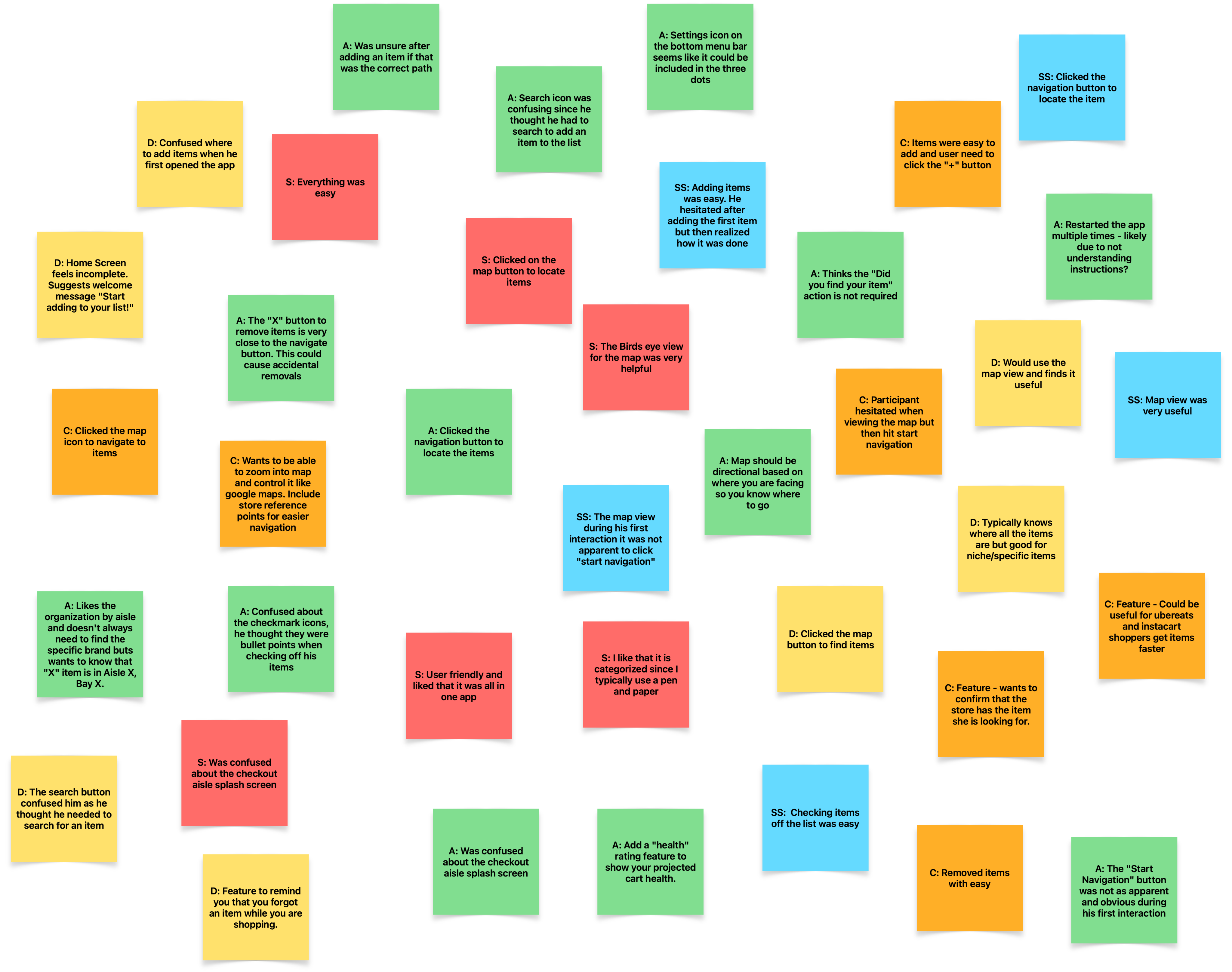
Before Usability Study
Initial testing revealed that participants struggled to understand the app’s purpose upon entry and lacked confidence when starting navigation, despite finding the map feature generally usable.
Ability to understand the app’s purpose
Ability to add items to their list
Ability to navigate the store using the map
Ability to navigate directly to an item
Ability to confidently start navigation


1 / 5
2 / 5
4 / 5
2 / 5
1 / 5
After Usability Study
After iterating on onboarding, list organization, and navigation cues, all measured usability categories improved in the second round of testing. These improvements validated the design direction and informed the final high-fidelity mockups.
Ability to understand the app’s purpose
Ability to add items to their list
Ability to navigate the store using the map
Ability to navigate directly to an item
Ability to confidently start navigation
4 / 5
5 / 5
5 / 5
4 / 5
5 / 5
Refining the design
Mockups 🎨 Design System 🧑🏻🎨
High-fidelity prototype 🏆 Accessibility ♿️
Mockups 🎨
Design Iterations
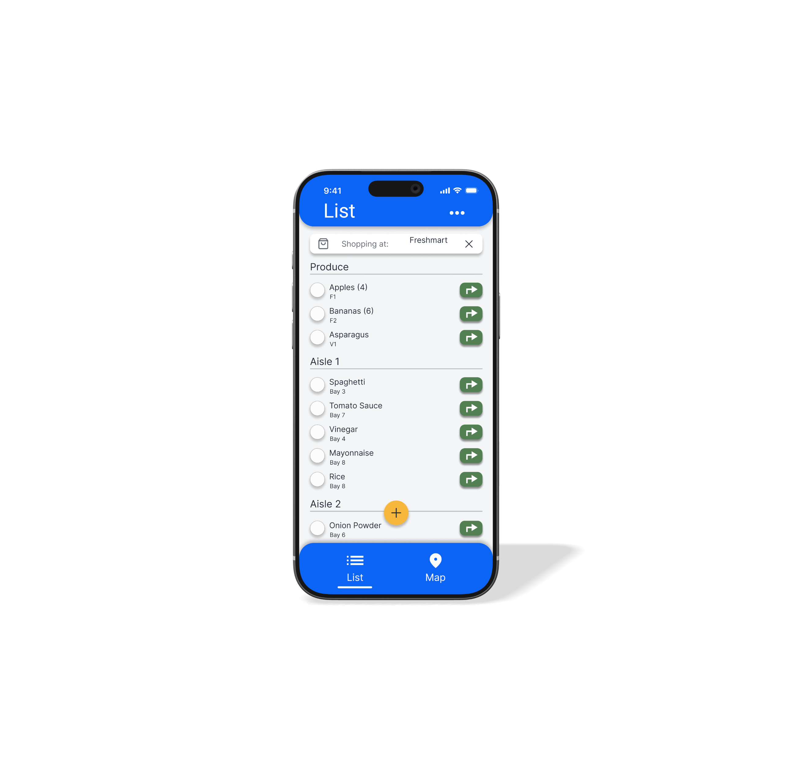
The initial usability study was conducted using low-fidelity wireframes to quickly identify issues related to clarity and flow. Based on these findings, I refined the design and transitioned to high-fidelity mockups to improve visual hierarchy, affordance clarity, and overall usability.
The list view was refined to better reflect store layout and improve scannability. Clear section headers, consistent item metadata, and navigation actions help users understand where items are located and what actions are available at a glance.
Before usability study

After usability study
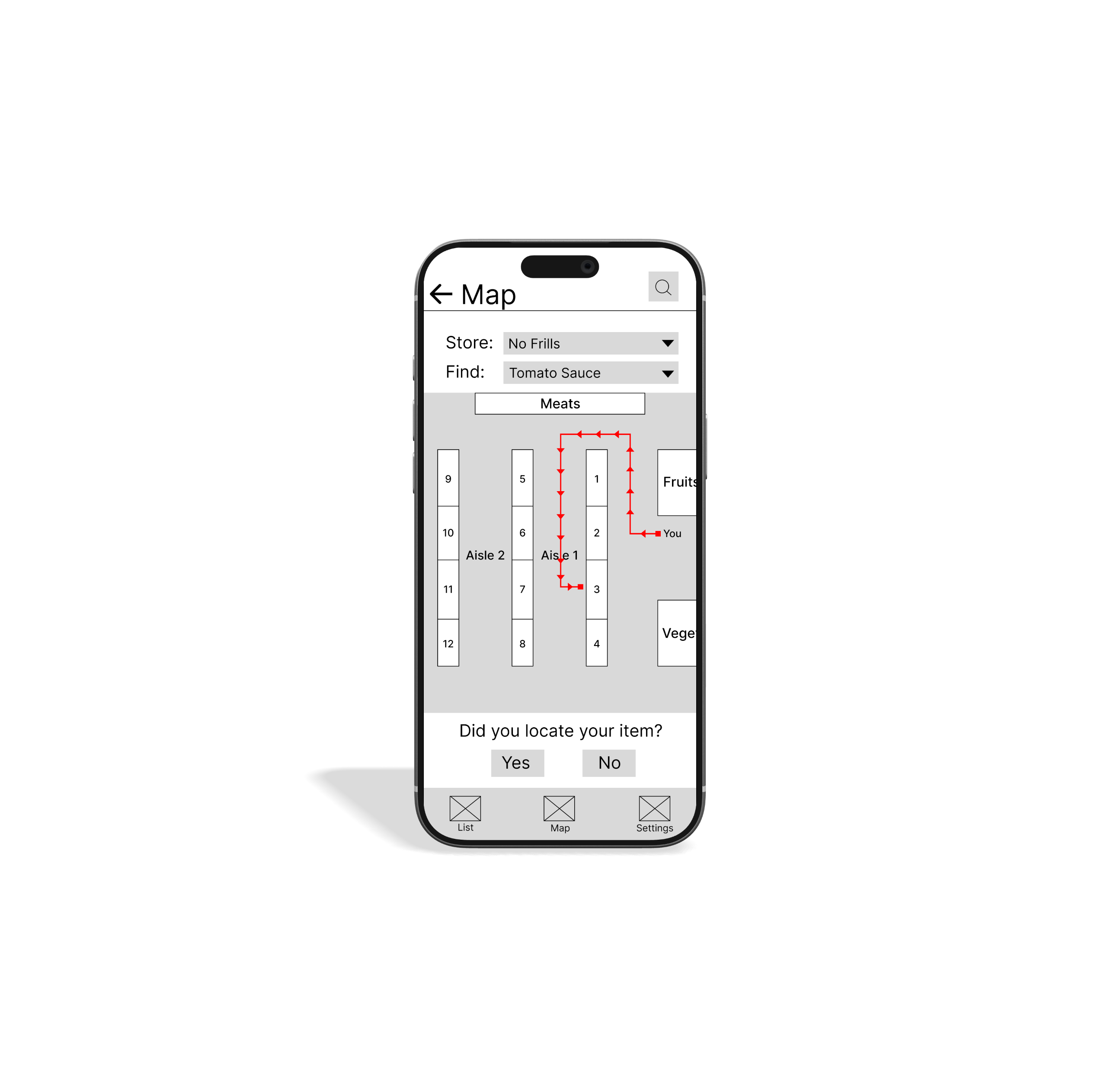
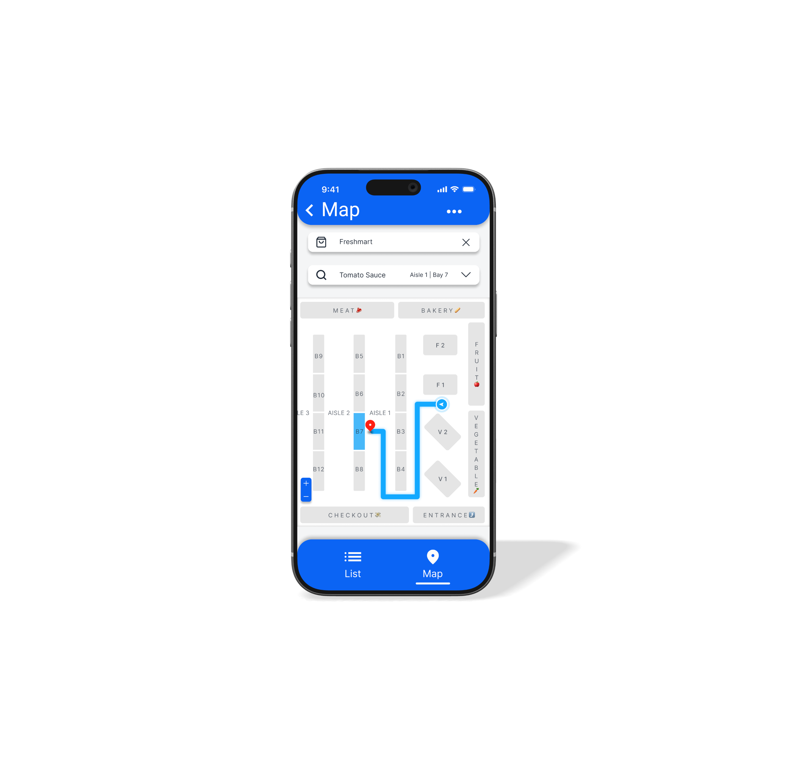
Simplified Map Interaction and Navigation Flow
The map experience was simplified to reduce visual clutter and make in-store navigation more intuitive. Visual hierarchy was improved, routes were clarified, and unnecessary controls were removed so users can focus on finding items quickly.
Before usability study

After usability study
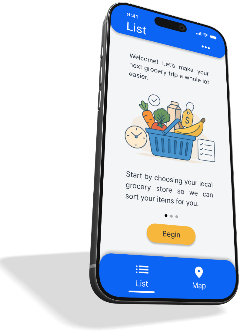
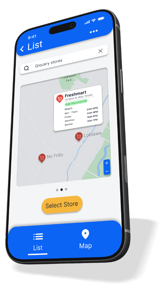
Refining Onboarding and Core Interactions
Onboarding, settings, and key interactions were refined based on usability findings to improve clarity and reduce friction. These changes helped users understand the app faster and navigate to items with greater confidence.



s
h
o
p
w
i
t
h
c
o
n
f
i
d
e
n
c
e



b
u
i
l
d
y
o
u
r
l
i
s
t
c
h
o
o
s
e
y
o
u
r
s
t
o
r
e
a
u
t
o
-
s
o
r
t
e
d
b
y
a
i
s
l
e
n
a
v
i
g
a
t
e
y
o
u
r
s
t
o
r
e
s
h
o
p
w
i
t
h
c
o
n
f
i
d
e
n
c
e
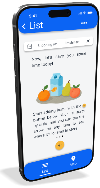
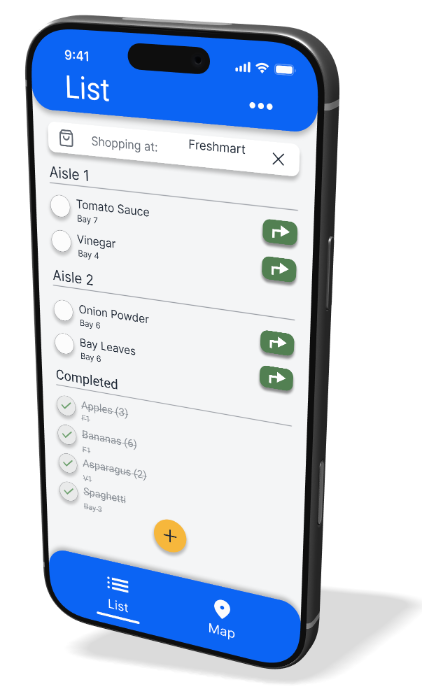
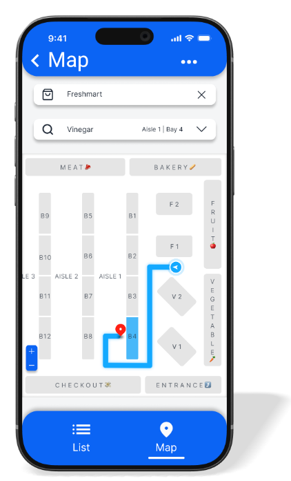
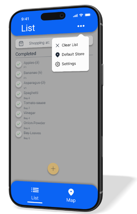
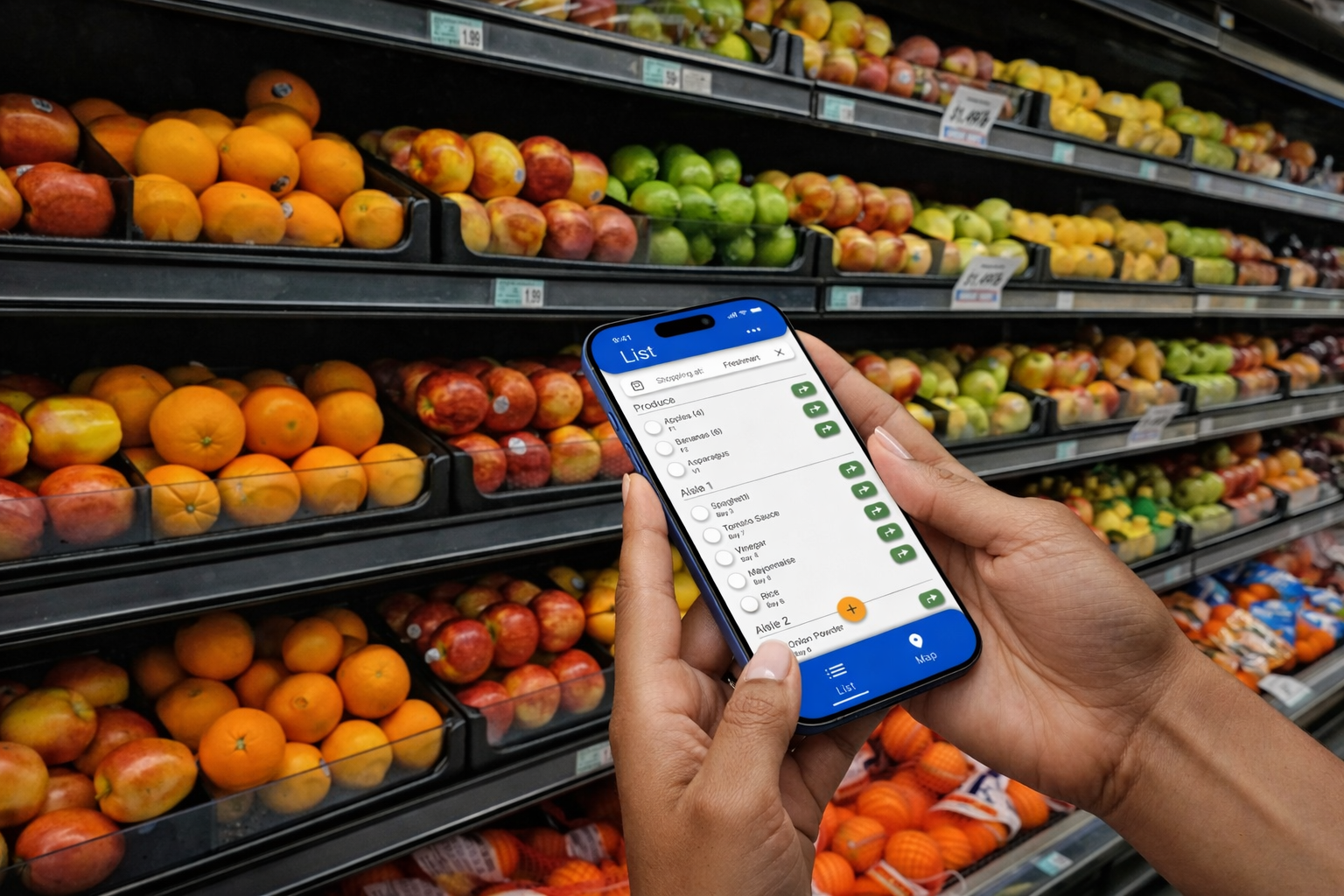
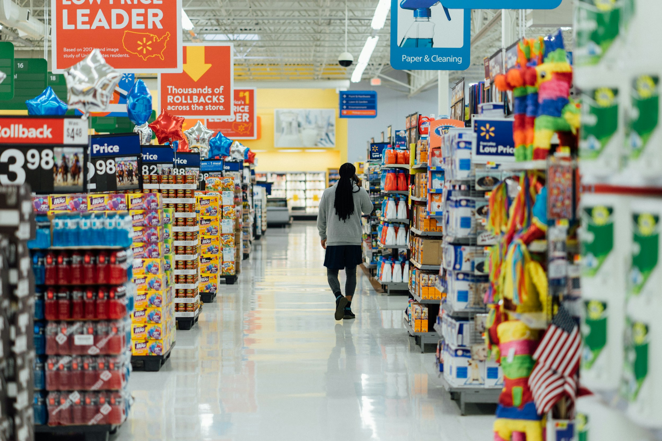
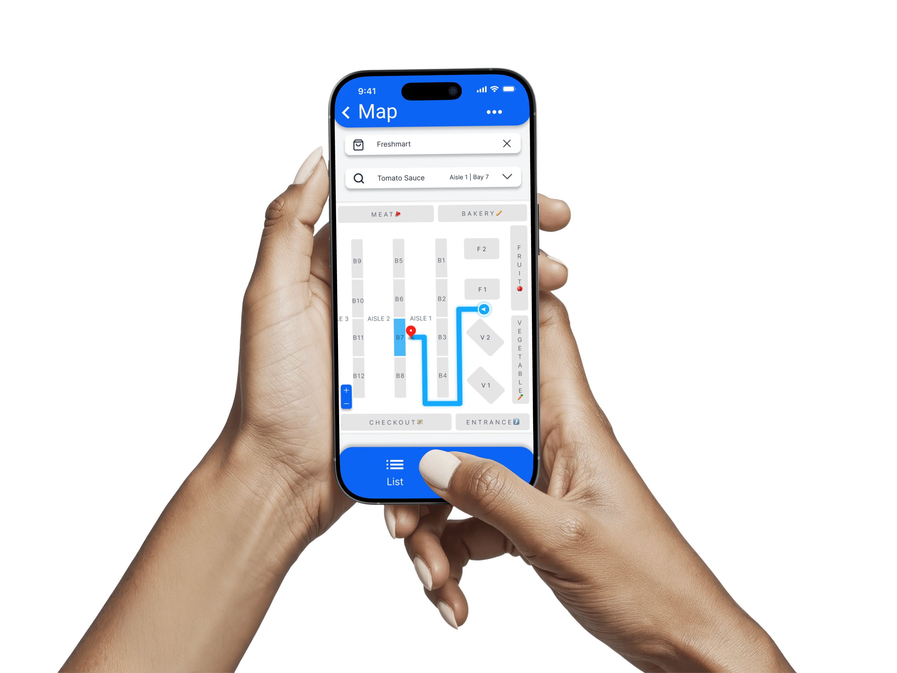
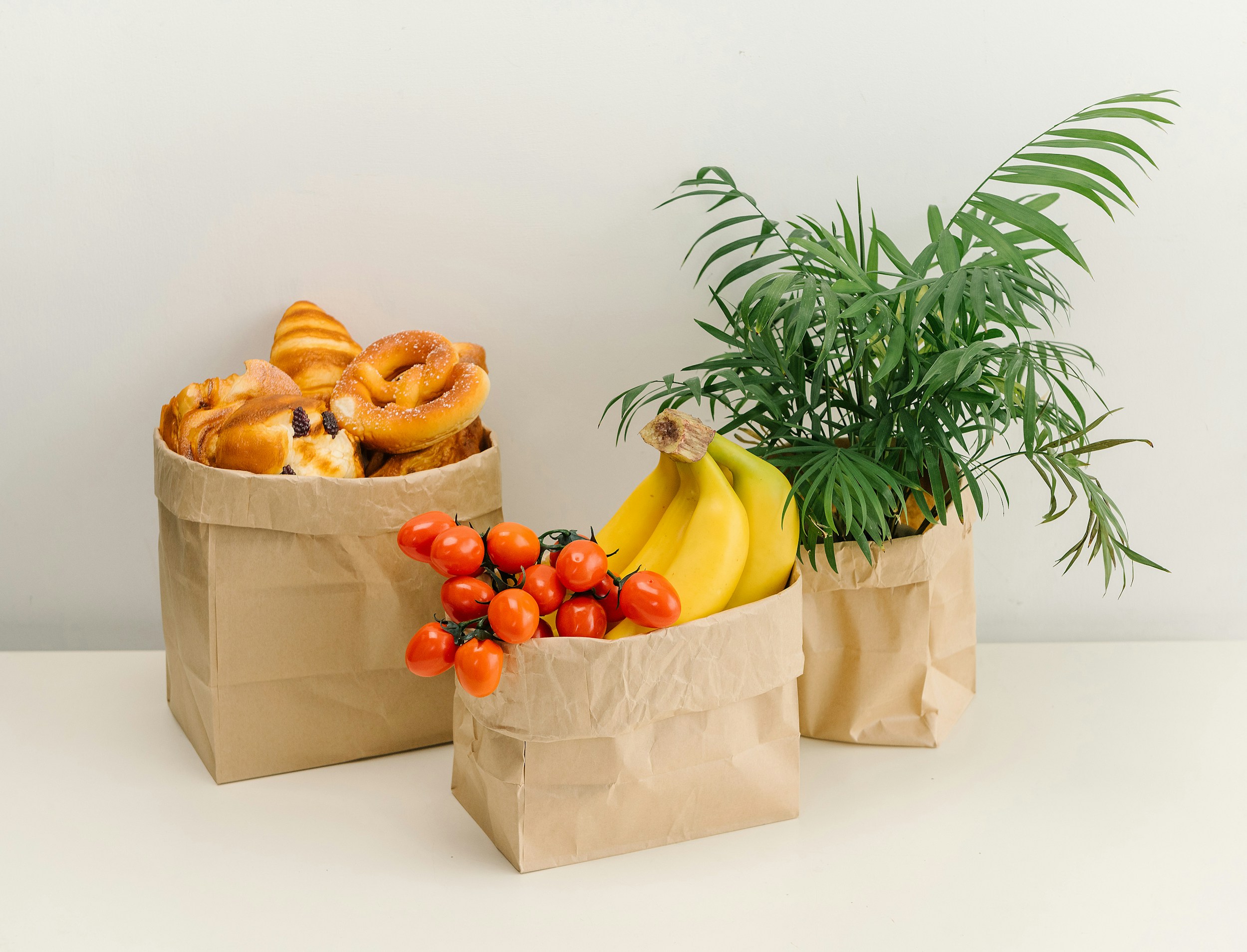
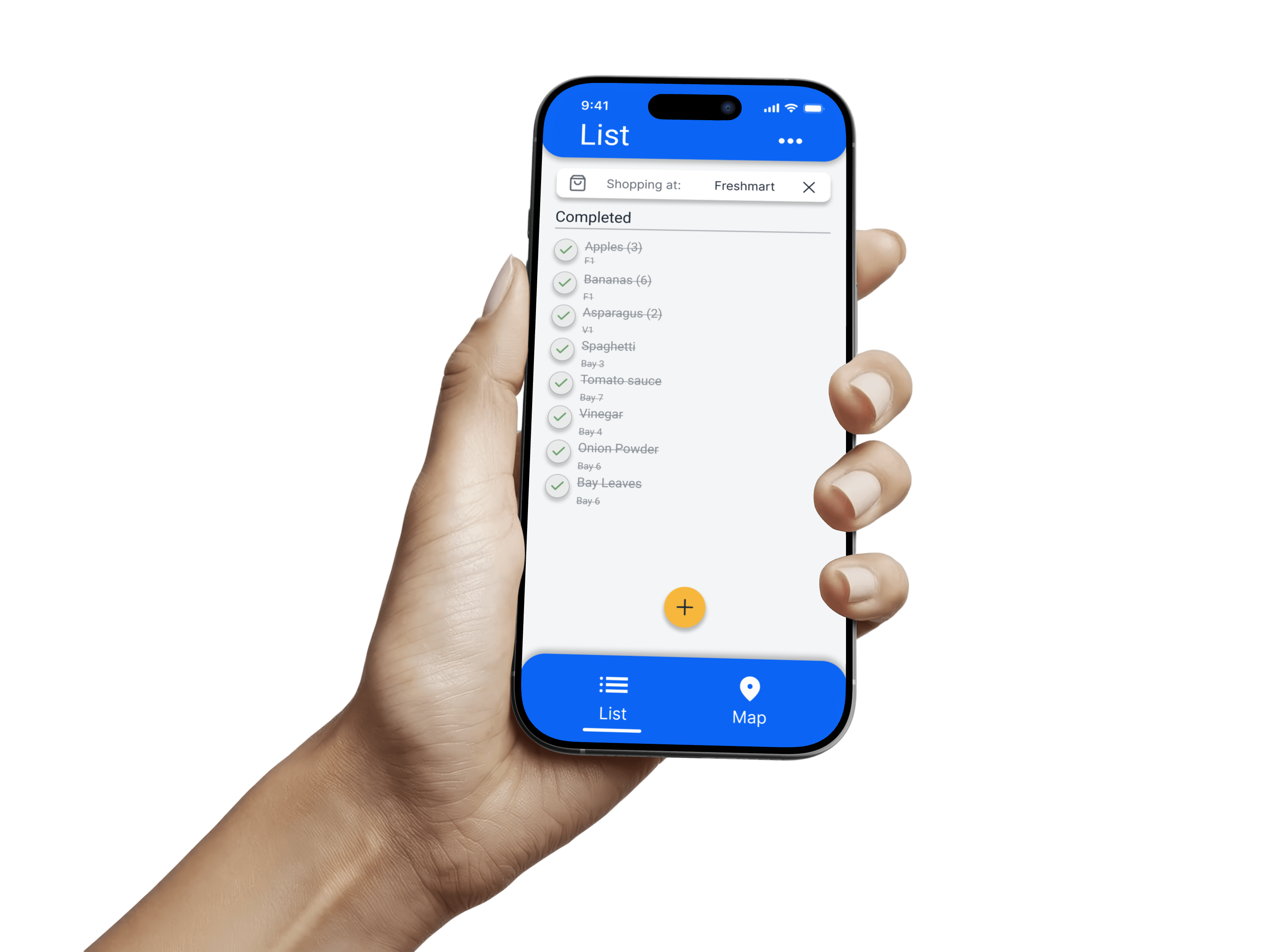
Grocery Go, in context
Design System Components 🧑🏻🎨
A reusable component sheet was created to ensure visual consistency across components such as buttons, colours, typography, navigation elements, and icons. Blue was selected as the primary colour to establish clarity and trust, while yellow was used selectively to highlight important actions and guide attention without overwhelming the interface.
High-Fidelity Prototype 🏆
High-fidelity screens were created to visualize the final user experience, incorporating usability insights, accessibility considerations, and refined interaction patterns.
Accessibility
Considerations♿
Designing for Inclusivity and Readability
Accessibility was considered from the beginning of the design process to ensure the app is usable, readable, and intuitive for a wide range of users across devices and abilities.
WCAG AA Colour Compliance
Primary colours were tested to meet WCAG AA contrast standards for readability in all core flows.
Limited Typography System
Only two typefaces were used, one for headings and one for body copy. This was chosen to reduce cognitive load and prevent visual fragmentation.
Redundant Visual Cues Beyond Colour
Icons and labels are used alongside colour to convey meaning, ensuring users with colour-vision deficiencies can still understand actions and hierarchy.
Going Forward
Takeaways 🎓
Next steps 👏🏻
Takeaways 🎓
Impact
After testing, 5 out of 5 participants were able to locate an item successfully without assistance. One participant shared, “This would actually make me less stressed grocery shopping.”
What I learned
I learned the importance of focusing on a single core user problem and resisting the urge to over-design. Simplicity and clarity consistently tested better than added features.
Next Steps 👏🏻
Opportunities for future iteration
If I were to continue the development of this app, I would:
- Test the app in real grocery store environments.
- Expand app features like account profiles, cross platform syncing, alerts, stock information, etc.
- Explore in app shopping experience to help find deals and comparable products.

Liked what you read?Check out my next case study
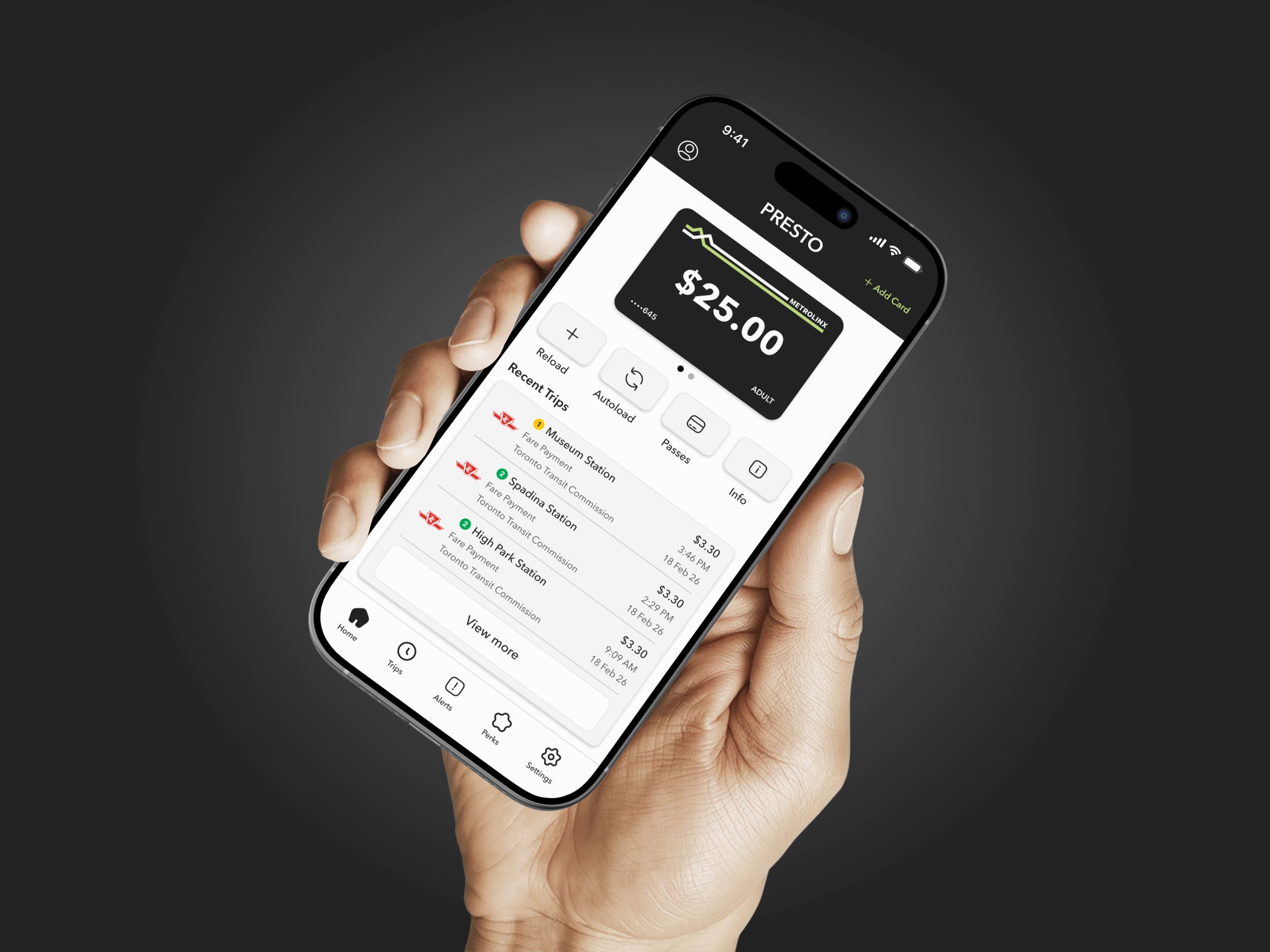
Redesigning PRESTO around the people who ride
A full UX and UI redesign of the PRESTO transit app. Simplifying core flows, surfacing missing features, and building a system designed to scale.
View case study

Grocery Go - UX Case Study
Finding one item shouldn’t take ten minutes
A mobile app designed to help shoppers locate items using aisle-level, store-specific navigation.
Project Overview 🎯
The Problem
Many grocery shoppers struggle to find specific items in large stores, leading to wasted time, frustration, and abandoned purchases especially when store layouts vary by location.
The Solution
The goal was to help users quickly find grocery items in-store through clear, location-based navigation in a simple and intuitive mobile experience.
Design Process
Research

Define

Ideate

Prototype

Test
Project Duration
Nov 2025 - Dec 2025
4 weeks
Role
UX Designer
UX Researcher
UI Designer
Tools
Figma, Claude, Notion
Understanding the user
User Research 👨🏻🔬
Personas 🙋🏽️
User journey maps 🌎
Problem Statement 🚨
User Research 👨🏻🔬
Summary
I conducted user research with frequent grocery shoppers to understand their in-store grocery shopping experience, pain points, and behaviours. Across interviews, a consistent pain point emerged: users frequently struggle to locate items, especially in unfamiliar stores. This uncertainty often leads to aimless wandering or reliance on store employees, increasing frustration and slowing down the shopping experience. These insights informed a design focus on clear item location, efficient navigation, and user confidence.
Notably, 5/6 users already rely on their phones to manage grocery lists. This behaviour highlighted an opportunity to unify list management and in-store navigation into one app, streamlining the shopping experience and supporting users in real time.
Pain Point #1
Difficulty locating items
Users often waste time searching for items because store layouts are inconsistent. This guided designs toward aisle-level accuracy and store-specific layouts.
Pain Point #2
Overwhelming store size
Large grocery stores feel overwhelming, especially when users only need a few items. This reinforced the need for a focused, step-by-step item navigation experience.
Pain Point #3
Reliance on staff for help
Many users feel awkward or frustrated needing to ask employees for help. This informed the decision to prioritize self-guided navigation.
Pain Point #4
Time pressure
Users shopping on workdays or during busy hours want to get in and out quickly. This pushed designs toward minimal screens and fast search results.
Personas 🙋🏽♀️
Personas were created by synthesizing patterns across user interviews, focusing on shared behaviours, motivations, and pain points rather than individual demographics. Three distinct shopper personas emerged from this research. One representative persona is shown below to illustrate the primary needs and challenges the design was built to support.
User Journey Map 🌎
The grocery shopping journey was mapped to understand users’ core actions, emotions, and frustrations from planning a trip to returning home. This exercise highlighted key moments of uncertainty and stress, revealing clear opportunities where in-store navigation and guidance could improve confidence and efficiency.
Problem Statement 🚨
How might we help grocery shoppers confidently find items while shopping in-store by making product location simple, fast, and accessible without relying on staff assistance?
Starting the design
Paper wireframes ✍🏻
Digital wireframes 🧑🏻💻
Low-fidelity prototype 🧪
Usability studies 📚
Paper Wireframes ✍🏻
I explored multiple layout ideas for the list and map screens, focusing on how quickly users could search and receive location information. Early sketches helped prioritize simplicity over feature-heavy designs.
Digital Wireframes 🧑🏻💻
This wireframe explores how grocery lists can be automatically organized based on a store’s physical layout. Items are grouped by department and aisle to reduce wandering and help users shop efficiently. Each item includes a direct navigation action that connects the list to in-store wayfinding.
Key List Features
(1) Aisle Based Grouping
Items are automatically grouped by store section and aisle to help users shop in a logical and efficient order.
(2) Direct-to-Item Navigation
Navigate directly to an item’s location on the in-store map.
(3) Automatic List Sorting
Newly added items are automatically sorted based on the store layout.
Key Map Features
(1) Store-Aware Item Search
Users can select their current store and search for an item they’re looking for, allowing the map to adjust dynamically based on the store’s specific layout and item location.
(2) Guided Navigation
The map highlights the exact aisle and displays a clear navigation path from the user’s current location to the selected item, reducing uncertainty and unnecessary backtracking.
Low-Fidelity Prototype 🧪
The low-fidelity prototype focused on validating the core in-store shopping flow, from adding grocery items and viewing their aisle locations to navigating in-store and checking items off the list.
Usability Studies 📚
Evaluating Clarity and Ease of Use
I conducted two unmoderated usability studies with five participants to evaluate the clarity, ease of use, and overall flow of the Grocery Go prototype. Participants completed a series of common shopping tasks while thinking aloud and recording their screens.
The study focused on understanding how intuitively users could add items, navigate between views, and locate products in-store using the map. Insights from the sessions were synthesized using an affinity diagram to identify patterns, usability issues, and opportunities for improvement. These findings informed iterative design changes in the next round.
Before Usability Study
Initial testing revealed that participants struggled to understand the app’s purpose upon entry and lacked confidence when starting navigation, despite finding the map feature generally usable.
Ability to understand the
app’s purpose upon entry
Ability to add items
to their list
Ability to navigate the
store using the map
Ability to navigate
directly to an item
Ability to confidently
start navigation


1 / 5
participants
2 / 5
participants
4 / 5
participants
2 / 5
participants
1 / 5
participants
After Usability Study
After iterating on onboarding, list organization, and navigation cues, all measured usability categories improved in the second round of testing. These improvements validated the design direction and informed the final high-fidelity mockups.
Ability to understand the
app’s purpose upon entry
Ability to add items
to their list
Ability to navigate the
store using the map
Ability to navigate
directly to an item
Ability to confidently
start navigation
4 / 5
participants
5 / 5
participants
5 / 5
participants
4 / 5
participants
5 / 5
participants
Refining the design
Mockups 🎨
Design System 🧑🏻🎨
High-fidelity prototype 🏆
Accessibility ♿️
Mockups 🎨
Design Iterations
The initial usability study was conducted using low-fidelity wireframes to quickly identify issues related to clarity and flow. Based on these findings, I refined the design and transitioned to high-fidelity mockups to improve visual hierarchy, affordance clarity, and overall usability.
The list view was refined to better reflect store layout and improve scannability. Clear section headers, consistent item metadata, and navigation actions help users understand where items are located and what actions are available at a glance.
Before usability study

After usability study
Simplified Map Interaction and Navigation Flow
The map experience was simplified to reduce visual clutter and make in-store navigation more intuitive. Visual hierarchy was improved, routes were clarified, and unnecessary controls were removed so users can focus on finding items quickly.
Before usability study

After usability study
Refining Onboarding and Core Interactions
Onboarding, settings, and key interactions were refined based on usability findings to improve clarity and reduce friction. These changes helped users understand the app faster and navigate to items with greater confidence.





c
h
o
o
s
e
y
o
u
r
s
t
o
r
e
b
u
i
l
d
y
o
u
r
l
i
s
t
a
u
t
o
-
s
t
o
r
t
e
d
b
y
a
i
s
l
e
n
a
v
i
g
a
t
e
y
o
u
r
s
t
o
r
e
s
h
o
p
w
i
t
h
c
o
n
f
i
d
e
n
c
e
Grocery Go, in context


Design System Components 🧑🏻🎨
A reusable component sheet was created to ensure visual consistency across components such as buttons, colours, typography, navigation elements, and icons. Blue was selected as the primary colour to establish clarity and trust, while yellow was used selectively to highlight important actions and guide attention without overwhelming the interface.
High-Fidelity Prototype 🏆
High-fidelity screens were created to visualize the final user experience, incorporating usability insights, accessibility considerations, and refined interaction patterns.
Accessibility Considerations ♿
Designing for Inclusivity and Readability
Accessibility was considered from the beginning of the design process to ensure the app is usable, readable, and intuitive for a wide range of users across devices and abilities.
WCAG AA Colour Compliance
Primary colours were tested to meet WCAG AA contrast standards for readability in all core flows.
Limited Typography System
Only two typefaces were used, one for headings and one for body copy. This was chosen to reduce cognitive load and prevent visual fragmentation.
Redundant Visual Cues Beyond Colour
Icons and labels are used alongside colour to convey meaning, ensuring users with colour-vision deficiencies can still understand actions and hierarchy.
Going Forward
Takeaways 🎓
Next steps 👏🏻
Takeaways 🎓
Impact
After testing, 5 out of 5 participants were able to locate an item successfully without assistance. One participant shared, “This would actually make me less stressed grocery shopping.”
What I learned
I learned the importance of focusing on a single core user problem and resisting the urge to over-design. Simplicity and clarity consistently tested better than added features.
Next Steps 👏🏻
Opportunities for future iteration
If I were to continue the development of this app, I would do the following:
- Test the app in real grocery store environments.
- Expand app features like account profiles, cross platform syncing, alerts, stock information, etc.
- Explore in app shopping experience to help find deals and comparable products.

Liked what you read?Check out my next case study
Redesigning PRESTO around the people who ride
A full UX and UI redesign of the PRESTO transit app. Simplifying core flows, surfacing missing features, and building a system designed to scale.
View case study
Grocery Go - UX Case Study
Finding one item shouldn’t take ten minutes
A mobile app designed to help shoppers locate items using aisle-level, store-specific navigation.
Project Overview 🎯
The Problem
Many grocery shoppers struggle to find specific items in large stores, leading to wasted time, frustration, and abandoned purchases especially when store layouts vary by location.
The Solution
The goal was to help users quickly find grocery items in-store through clear, location-based navigation in a simple and intuitive mobile experience.
Design Process
Research
Define
Ideate
Prototype
Test
Project Duration
Nov 2025 - Dec 2025
4 weeks
Role
UX Designer
UX Researcher
UI Designer
Tools
Figma, Claude, Notion
Understanding the user
User Research 👨🏻🔬
Personas 🙋🏽♀️️
User journey maps 🌎
Problem Statement 🚨
User Research 👨🏻🔬
Summary
I conducted user research with frequent grocery shoppers to understand their in-store grocery shopping experience, pain points, and behaviours. Across interviews, a consistent pain point emerged: users frequently struggle to locate items, especially in unfamiliar stores. This uncertainty often leads to aimless wandering or reliance on store employees, increasing frustration and slowing down the shopping experience. These insights informed a design focus on clear item location, efficient navigation, and user confidence.
Notably, 5/6 users already rely on their phones to manage grocery lists. This behaviour highlighted an opportunity to unify list management and in-store navigation into one app, streamlining the shopping experience and supporting users in real time.
Pain Point #1
Difficulty locating items
Users often waste time searching for items because store layouts are inconsistent. This guided designs toward aisle-level accuracy and store-specific layouts.
Pain Point #2
Overwhelming store size
Large grocery stores feel overwhelming, especially when users only need a few items. This reinforced the need for a focused, step-by-step item navigation experience.
Pain Point #3
Reliance on staff for help
Many users feel awkward or frustrated needing to ask employees for help. This informed the decision to prioritize self-guided navigation.
Pain Point #4
Time pressure
Users shopping on workdays or during busy hours want to get in and out quickly. This pushed designs toward minimal screens and fast search results.
Personas 🙋🏽♀️
Personas were created by synthesizing patterns across user interviews, focusing on shared behaviours, motivations, and pain points rather than individual demographics. Three distinct shopper personas emerged from this research. One representative persona is shown below to illustrate the primary needs and challenges the design was built to support.
User Journey Map 🌎
The grocery shopping journey was mapped to understand users’ core actions, emotions, and frustrations from planning a trip to returning home. This exercise highlighted key moments of uncertainty and stress, revealing clear opportunities where in-store navigation and guidance could improve confidence and efficiency.
Problem Statement 🚨
How might we help grocery shoppers confidently find items while shopping in-store by making product location simple, fast, and accessible without relying on staff assistance?
Starting the design
Paper wireframes ✍🏻
Digital wireframes 🧑🏻💻
Low-fidelity prototype 🧪
Usability studies 📚
Paper Wireframes ✍🏻
I explored multiple layout ideas for the list and map screens, focusing on how quickly users could search and receive location information. Early sketches helped prioritize simplicity over feature-heavy designs.
Digital Wireframes 🧑🏻💻
This wireframe explores how grocery lists can be automatically organized based on a store’s physical layout. Items are grouped by department and aisle to reduce wandering and help users shop efficiently. Each item includes a direct navigation action that connects the list to in-store wayfinding.
Key List Features
(1) Aisle Based Grouping
Items are automatically grouped by store section and aisle to help users shop in a logical and efficient order.
(2) Direct to Item Navigation
Navigate directly to an item’s location on the in-store map.
(3) Automatic List Sorting
Newly added items are automatically sorted based on the store layout.
Key Map Features
(1) Store-Aware Item Search
Users can select their current store and search for an item they’re looking for, allowing the map to adjust dynamically based on the store’s specific layout and item location.
(2) Guided In-Store Navigation
The map highlights the exact aisle and displays a clear navigation path from the user’s current location to the selected item, reducing uncertainty and unnecessary backtracking.
Low-Fidelity Prototype 🧪
The low-fidelity prototype focused on validating the core in-store shopping flow, from adding grocery items and viewing their aisle locations to navigating in-store and checking items off the list.
Usability Studies 📚
Evaluating Clarity and Ease of Use
I conducted two unmoderated usability studies with five participants to evaluate the clarity, ease of use, and overall flow of the Grocery Go prototype. Participants completed a series of common shopping tasks while thinking aloud and recording their screens.
The study focused on understanding how intuitively users could add items, navigate between views, and locate products in-store using the map. Insights from the sessions were synthesized using an affinity diagram to identify patterns, usability issues, and opportunities for improvement. These findings informed iterative design changes in the next round.
Before Usability Study
Initial testing revealed that participants struggled to understand the app’s purpose upon entry and lacked confidence when starting navigation, despite finding the map feature generally usable.
Ability to understand the
app’s purpose upon entry
Ability to add items
to their list
Ability to navigate the
store using the map
Ability to navigate
directly to an item
Ability to confidently
start navigation


1 / 5
participants
2 / 5
participants
4 / 5
participants
2 / 5
participants
1 / 5
participants
After Usability Study
After iterating on onboarding, list organization, and navigation cues, all measured usability categories improved in the second round of testing. These improvements validated the design direction and informed the final high-fidelity mockups.
Ability to understand the
app’s purpose upon entry
Ability to add items
to their list
Ability to navigate the
store using the map
Ability to navigate
directly to an item
Ability to confidently
start navigation
4 / 5
participants
5 / 5
participants
5 / 5
participants
4 / 5
participants
5 / 5
participants
Refining the design
Mockups 🎨
Design System 🧑🏻🎨
High-fidelity prototype 🏆
Accessibility ♿️
Mockups 🎨
Design Iterations
The initial usability study was conducted using low-fidelity wireframes to quickly identify issues related to clarity and flow. Based on these findings, I refined the design and transitioned to high-fidelity mockups to improve visual hierarchy, affordance clarity, and overall usability.
The list view was refined to better reflect store layout and improve scannability. Clear section headers, consistent item metadata, and navigation actions help users understand where items are located and what actions are available at a glance.
Before usability study
After usability study
Simplified Map Interaction and Navigation Flow
The map experience was simplified to reduce visual clutter and make in-store navigation more intuitive. Visual hierarchy was improved, routes were clarified, and unnecessary controls were removed so users can focus on finding items quickly.
Before usability study
After usability study
Refining Onboarding and Core Interactions
Onboarding, settings, and key interactions were refined based on usability findings to improve clarity and reduce friction. These changes helped users understand the app faster and navigate to items with greater confidence.





c
h
o
o
s
e
y
o
u
r
s
t
o
r
e
b
u
i
l
d
y
o
u
r
l
i
s
t
a
u
t
o
-
s
o
r
t
e
d
b
y
a
i
s
l
e
n
a
v
i
g
a
t
e
y
o
u
r
s
t
o
r
e
s
h
o
p
w
i
t
h
c
o
n
f
i
d
e
n
c
e
Grocery Go, in context.


Design System Components 🧑🏻🎨
A reusable component sheet was created to ensure visual consistency across components such as buttons, colours, typography, navigation elements, and icons. Blue was selected as the primary colour to establish clarity and trust, while yellow was used selectively to highlight important actions and guide attention without overwhelming the interface.
High-Fidelity Prototype 🏆
High-fidelity screens were created to visualize the final user experience, incorporating usability insights, accessibility considerations, and refined interaction patterns.
Accessibility Considerations ♿
Designing for Inclusivity and Readability
Accessibility was considered from the beginning of the design process to ensure the app is usable, readable, and intuitive for a wide range of users across devices and abilities.
WCAG AA Colour Compliance
Primary colours were tested to meet WCAG AA contrast standards for readability in all core flows.
Limited Typography System
Only two typefaces were used, one for headings and one for body copy. This was chosen to reduce cognitive load and prevent visual fragmentation.
Redundant Visual Cues Beyond Colour
Icons and labels are used alongside colour to convey meaning, ensuring users with colour-vision deficiencies can still understand actions and hierarchy.
Going Forward
Takeaways 🎓
Next steps 👏🏻
Takeaways 🎓
Impact
After testing, 5 out of 5 participants were able to locate an item successfully without assistance. One participant shared, “This would actually make me less stressed grocery shopping.”
What I learned
I learned the importance of focusing on a single core user problem and resisting the urge to over-design. Simplicity and clarity consistently tested better than added features.
Next Steps 👏🏻
Opportunities for future iteration
If I were to continue the development of this app, I would do the following:
- Test the app in real grocery store environments.
- Expand app features like account profiles, cross platform syncing, alerts, stock information, etc.
- Explore in app shopping experience to help find deals and comparable products.
Liked what you read?Check out my next case study
Redesigning PRESTO around the people who ride
A full UX and UI redesign of the PRESTO transit app. Simplifying core flows, surfacing missing features, and building a system designed to scale.
View case study