
Luma Wealth - UX Case Study
Managing your money shouldn’t feel overwhelming
A digital banking experience designed to help users confidently set up and manage personal accounts online through clarity, trust, and simplicity.

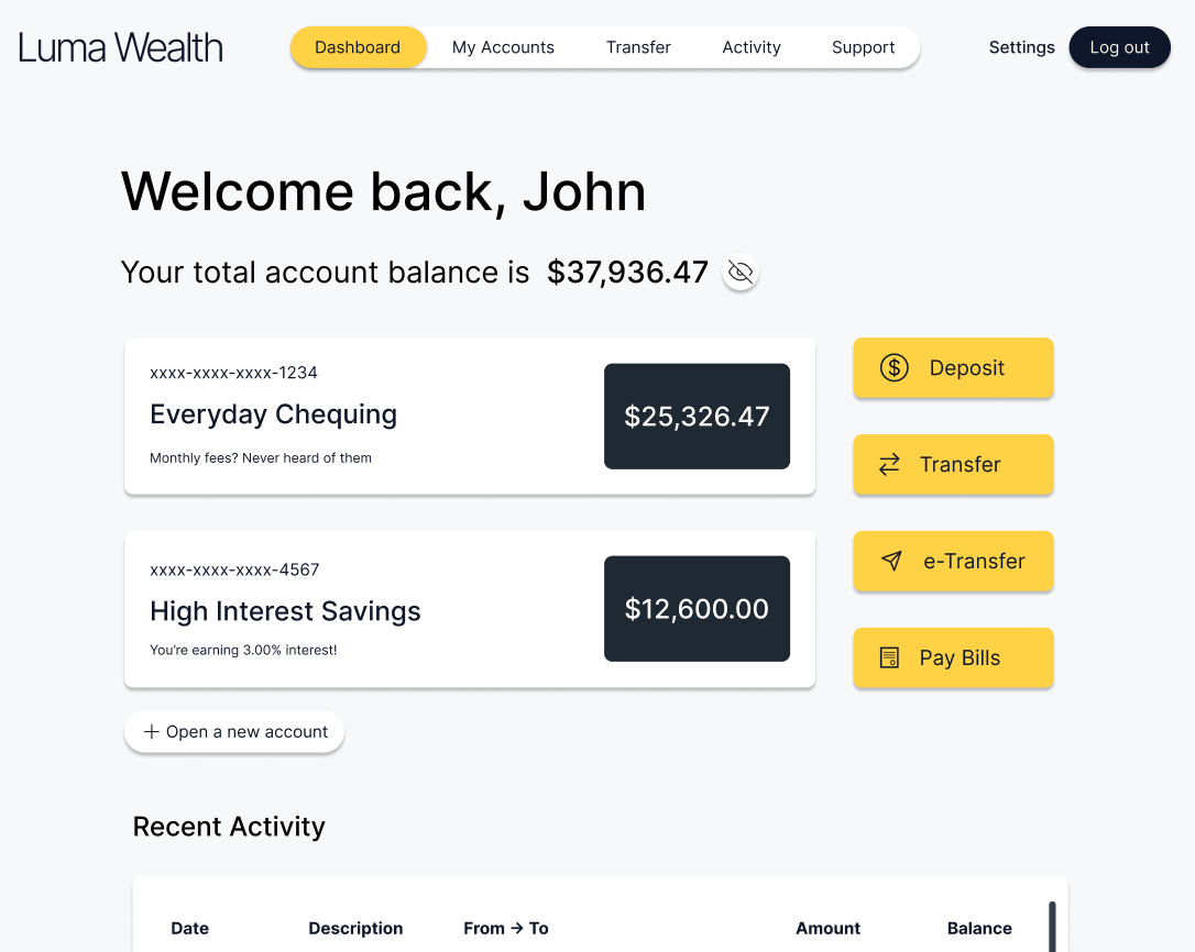
Project
Overview 🎯
Context
Luma Wealth is a concept digital banking platform created as a heuristic evaluation and product-thinking exercise. Rather than redesigning a specific bank, this project examines recurring breakdowns in legacy digital banking experiences such as unclear progress, broken activation states, and limited recovery paths. Using established UX heuristics and industry patterns, I explored how a system-driven design approach can reduce anxiety and build trust across onboarding and everyday banking.
The Problem
Legacy digital banking experiences often succeed at regulatory compliance but fail at user activation. Long onboarding flows, unclear system states, and broken transitions between “account opened” and “account usable” create uncertainty and eliminate trust. When issues occur, users are frequently pushed offline to resolve them, undermining confidence at critical moments.
The Solution
The goal was to design a digital banking experience that rethinks common legacy banking patterns. Luma Wealth helps users confidently move from account setup into everyday banking through visible progress, predictable interactions, and a cohesive system that supports both onboarding and ongoing use.
Design Process
Evaluate
Define
Design
Prototype
Refine
Role
UX Designer
UX Researcher
UI Designer
Tools
Figma Claude
Notion
Timeline
Jan 2026
4 weeks
Evaluating Legacy Digital
Banking
Heuristic Evaluation 💭 Industry Patterns 🏦
Design Direction 🔄
Heuristic
Evaluation 💭
To evaluate common legacy digital banking onboarding patterns, I opened a personal savings account with Royal Bank of Canada (RBC) and documented the end-to-end experience, from account selection to online banking enrolment.
This onboarding flow highlights how legacy digital banking experiences often meet regulatory requirements but fall short at activation. While users may technically complete account creation, unclear progress, task interruptions, and weak error recovery can prevent them from successfully accessing or using the product. This disruption undermines trust at a critical moment.
Key breakdowns observed during onboarding:
Pain Point 1: Lack of Progress Visibility
Throughout the onboarding flow, there is no progress indicator or step count to help users understand how long the process will take or how many steps remain. Users are repeatedly asked for sensitive, high-effort information (identity, address, employment, tax status) without any sense of completion or momentum. This makes the experience feel longer and more exhausting than it likely is.
Pain Point 2: Unnecessary Friction
During account selection, multiple account options are visually presented side-by-side, suggesting easy comparison. However, switching accounts requires several additional steps:
- Clicking “View details”
- Opening a secondary panel
- Scrolling past dense promotional content
- Finding the “Change to this account” action at the bottom
This interaction pattern contradicts how the account tiles visually suggest they can be selected, creating unnecessary friction at a moment when users should feel in control.
Pain Point 3: Business-Driven Upsells
Throughout the onboarding flow, users are prompted to opt into additional products or programs that are not essential to opening a savings account, including:
- Suggestions to open additional accounts
- Optional enrollment in rewards programs (e.g., points or fee savings)
- Voluntary credit checks framed around “personalization” and “relevant offers”
While these prompts may serve business goals, they interrupt task focus and raise questions about user intent, especially when the product being opened does not inherently require a credit check.
Pain Point 4: Account Created, But Not Accessible
After successfully completing onboarding, I encountered an error while enrolling in online banking that prevented further progress. The system instructed me to call support or visit a branch, despite my account being confirmed and credentials already set up.
Although this may not occur for every user, experiencing this interruption firsthand highlighted a gap between account creation and actual usability, creating frustration at a moment meant to feel seamless.
Industry
Patterns 🏦
Overview
Legacy digital banking onboarding flows are often shaped by regulatory and business constraints rather than user activation. Compliance-first design leads to long, high-effort sequences with limited progress visibility, while broken systems separate “account opened” from “account usable” without clearly communicating that distinction. When onboarding breaks, recovery paths frequently push users offline to call support or visit a branch, undermining the promise of a fully digital experience. At the same time, business-driven upsells and “personalization” prompts are embedded within critical tasks, increasing cognitive load and interrupting momentum at moments where clarity and confidence matter most.
So where does that lead us?
Industry Patterns Observed (TL;DR)
- Compliance-first design deprioritizes progress visibility and momentum.
- Broken activation states create gaps between “account opened” and “account usable.”
- Limited digital error recovery pushes users offline during critical moments.
- Embedded growth prompts interrupt task-focused flows and increase cognitive load.
Design
Direction 🔄
Rather than redesigning an existing bank or borrowing patterns from competitors, Luma Wealth was designed from first principles in response to the systemic issues identified above. The design focuses on clarity, activation, and trust across both onboarding and everyday banking experiences. Trust is not established once during onboarding, but reinforced through every interaction that follows.
Exploring Design Solutions
Design Principles 👨🏼🍳️ Paper wireframes ✍🏻
Digital wireframes 🧑🏻💻 Lo-fi prototype 🧪
Design
Principles 👨🏼🍳️
The following design principles were derived directly from the patterns identified during the heuristic evaluation. Each principle translated high-level insights into design decisions across key user flows.
Principle 1: Progress Visibility
Users should always understand where they are, what remains, and when an action is complete.
Principle 2: Activation Continuity
Onboarding should not end at account creation. Access, setup, and first use should feel like a single, continuous flow.
Principle 3: In-Product Recovery
When errors occur, users should be supported within the digital experience whenever possible.
Principle 4: Minimal Distractions
Critical tasks should remain free of distractions until users achieve their primary goal.
Paper
Wireframes ✍🏻
Early Explorations from Concepts to Structure
I used paper wireframes to explore multiple layout directions for onboarding, the dashboard, and account views. Rather than mapping full flows, these sketches focus on comparing structural approaches and identifying patterns that best support clarity, progress visibility, and cognitive simplicity.
Across these explorations, I focused on three core questions: how progress and system state could be made explicit during onboarding, how onboarding could transition seamlessly into a usable account experience, and how financial information could be structured to reduce cognitive load during everyday use.
Onboarding Progress & Activation
To explore how progress and system state could be made more explicit during onboarding, I drafted a lightweight concept focused on momentum and continuity rather than individual form screens. The flow uses a persistent progress indicator and subtle motion to reinforce forward movement as each step is completed. Instead of ending on a static confirmation screen, onboarding concludes with a clear handoff that invites users to continue directly into their dashboard, reinforcing activation and reducing uncertainty at the moment of completion.
Digital
Wireframes 🧑🏻💻
After identifying promising layout patterns through paper exploration, I translated these concepts into digital wireframes to refine hierarchy, spacing, and interaction structure. This step focused on clarifying primary actions, reinforcing progress and system state, and ensuring continuity between onboarding and everyday banking experiences.
Low-Fidelity Prototype 🧪
To evaluate whether the proposed structure supported our principles, a few key screens were connected into a low-fidelity prototype focused on onboarding flow and system feedback before moving into high-fidelity design.






Refining the System &
Experience
Mockups 🎨 High-Fidelity Prototype 🏆
Design Systems 🧑🏻🎨 Accessibility ♿️
Mockups 🎨
Translating Insights into a Usable Banking Experience
These mockups translate the onboarding and activation insights into a cohesive, end-to-end experience. Design decisions focus on making progress and system state explicit, reducing cognitive load, and ensuring users can move from account setup into everyday banking with confidence and continuity.
Onboarding Flow
These screens highlight clear progress indicators, reduced decision friction, and a guided transition from onboarding into a usable account state.
Extending the Experience Beyond Onboarding
While the heuristic evaluation focused primarily on onboarding and the transition into account access, its insights directly informed the design of the dashboard, account views, money transfer and support pages. These screens were intentionally designed to carry the same principles forward. By maintaining continuity beyond initial setup, the experience reinforces trust and usability throughout everyday banking.
Dashboard & Account
Transfer & Support
High-Fidelity Prototype 🏆
This prototype demonstrates the complete onboarding experience from first step through account activation, followed by a seamless transition into the user’s dashboard. The flow emphasizes clear progress, system feedback, and continuity, ensuring users move from setup into everyday banking without uncertainty or interruption.





Design System 🧑🏻🎨
The Luma Wealth design system was intentionally restrained to support clarity, trust, and emotional calm. A predominantly black-and-white palette reduces visual noise and cognitive load, while a warm yellow accent reinforces moments of action and progress, aligning with the idea of “Luma” as light and guidance.
Rounded corners and softened components were used throughout to reduce perceived severity and create a more approachable, human experience, particularly during high-stakes interactions such as onboarding and money movement.
Accessibility Considerations ♿
Designing for Inclusivity and Readability
Accessibility informed key design decisions from early exploration through final designs. The goal was to ensure banking tasks feel readable, predictable and usable across devices and abilities.
Contrast & Visual Hierarchy
Text contrast meets WCAG AA standards, with emphasis on high readability for primary actions.
Plain Language & Predictable Interactions
Labels, instructions, and system messages use plain language and consistent patterns to reduce ambiguity.
Clear Focus & Keyboard States
Interactive elements were designed with visible focus states and consistent hover/active feedback to support keyboard navigation and improve clarity
Outcome & Next Steps
Takeaways 🎓
Next steps 👏🏻
Takeaways 🎓
Impact
This project reframed legacy digital banking as a system of trust rather than a collection of features. By addressing common breakdowns in onboarding and activation, Luma Wealth demonstrates how clarity, progress visibility, and predictable interactions can reduce anxiety and support confident everyday banking.
What I learned
Designing for financial products reinforced the importance of system thinking and restraint. Small decisions around progress, language, and state communication have an outsized impact on user confidence, especially during high-risk moments like onboarding and money movement.
Next Steps 👏🏻
Opportunities for future iteration
Future work would focus on validating these solutions through usability testing and expanding the system to support edge cases such as account recovery, error handling, and customer support flows. Additional iterations could also explore personalization that adapts over time without interrupting core tasks or increasing cognitive load.

Liked what you read?Check out my next case study
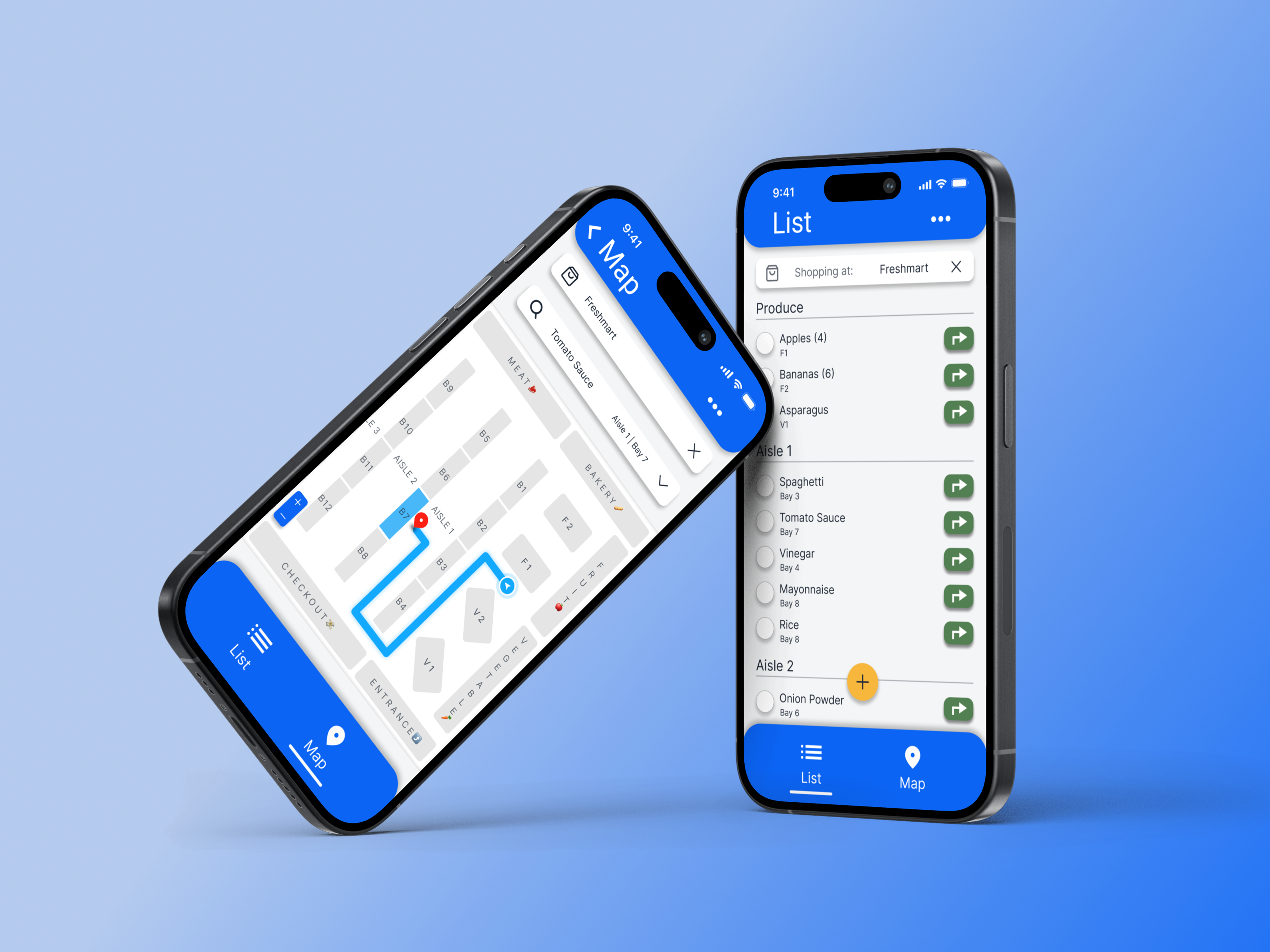
Designing clarity into everyday grocery shopping
A mobile app that organizes grocery lists by store layout and guides users aisle-by-aisle reducing friction, decision fatigue, and time spent wandering the store.
View case study
Luma Wealth - UX Case Study
Managing your money shouldn’t feel overwhelming
A digital banking experience designed to help users confidently set up and manage personal accounts online through clarity, trust, and simplicity.
Project Overview 🎯
Context
Luma Wealth is a concept digital banking platform created as a heuristic evaluation and product-thinking exercise. Rather than redesigning a specific bank, this project examines recurring breakdowns in legacy digital banking experiences such as unclear progress, broken activation states, and limited recovery paths. Using established UX heuristics and industry patterns, I explored how a system-driven design approach can reduce anxiety and build trust across onboarding and everyday banking.
The Problem
Legacy digital banking experiences often succeed at regulatory compliance but fail at user activation. Long onboarding flows, unclear system states, and broken transitions between “account opened” and “account usable” create uncertainty and eliminate trust. When issues occur, users are frequently pushed offline to resolve them, undermining confidence at critical moments.
The Solution
The goal was to design a digital banking experience that rethinks common legacy banking patterns. Luma Wealth helps users confidently move from account setup into everyday banking through visible progress, predictable interactions, and a cohesive system that supports both onboarding and ongoing use.
Project Duration
Dec 2025 - Jan 2026
4 weeks
Role
UX Designer
UX Researcher
UI Designer
Tools
Figma, Claude, Notion
Design Process
Evaluate
Define
Design
Prototype
Refine
Evaluating Legacy
Digital Banking
Heuristic Evaluation 💭
Industry Patterns 🏦
Design Direction 🔄
Heuristic Evaluation 💭
Research Insights
To evaluate common legacy digital banking onboarding patterns, I opened a personal savings account with Royal Bank of Canada (RBC) and documented the end-to-end experience, from account selection to online banking enrolment.
This onboarding flow highlights how legacy digital banking experiences often meet regulatory requirements but fall short at activation. While users may technically complete account creation, unclear progress, task interruptions, and weak error recovery can prevent them from successfully accessing or using the product. This disruption undermines trust at a critical moment.
Key breakdowns observed during onboarding
Pain Point 1: Lack of Progress Visibility
Throughout the onboarding flow, there is no progress indicator or step count to help users understand how long the process will take or how many steps remain. Users are repeatedly asked for sensitive, high-effort information (identity, address, employment, tax status) without any sense of completion or momentum. This makes the experience feel longer and more exhausting than it likely is.
Pain Point 2: Unnecessary Friction
During account selection, multiple account options are visually presented side-by-side, suggesting easy comparison. However, switching accounts requires several additional steps:
- Clicking “View details”
- Opening a secondary panel
- Scrolling past dense promotional content
- Finding the “Change to this account” action at the bottom
This interaction pattern contradicts how the account tiles visually suggest they can be selected, creating unnecessary friction at a moment when users should feel in control.
Pain Point 3: Business-Driven Upsells
Throughout the onboarding flow, users are prompted to opt into additional products or programs that are not essential to opening a savings account, including:
- Suggestions to open additional accounts
- Optional enrollment in rewards programs (e.g., points or fee savings)
- Voluntary credit checks framed around “personalization” and “relevant offers”
While these prompts may serve business goals, they interrupt task focus and raise questions about user intent, especially when the product being opened does not inherently require a credit check.
Pain Point 4: Account Created, But Not Accessible
After successfully completing onboarding, I encountered an error while enrolling in online banking that prevented further progress. The system instructed me to call support or visit a branch, despite my account being confirmed and credentials already set up.
Although this may not occur for every user, experiencing this interruption firsthand highlighted a gap between account creation and actual usability, creating frustration at a moment meant to feel seamless.
Industry Patterns 🏦
Overview
Legacy digital banking onboarding flows are often shaped by regulatory and business constraints rather than user activation. Compliance-first design leads to long, high-effort sequences with limited progress visibility, while broken systems separate “account opened” from “account usable” without clearly communicating that distinction. When onboarding breaks, recovery paths frequently push users offline to call support or visit a branch, undermining the promise of a fully digital experience. At the same time, business-driven upsells and “personalization” prompts are embedded within critical tasks, increasing cognitive load and interrupting momentum at moments where clarity and confidence matter most.
So where does that lead us?
Industry Patterns Observed (TL;DR)
- Compliance-first design deprioritizes progress visibility and momentum.
- Broken activation states create gaps between “account opened” and “account usable.”
- Limited digital error recovery pushes users offline during critical moments.
- Embedded growth prompts interrupt task-focused flows and increase cognitive load.
Design Direction 🔄
Rethinking Digital Banking from Insights
Rather than redesigning an existing bank or borrowing patterns from competitors, Luma Wealth was designed from first principles in response to the systemic issues identified above. The design focuses on clarity, activation, and trust across both onboarding and everyday banking experiences. Trust is not established once during onboarding, but reinforced through every interaction that follows.
Exploring Solutions
Through Design
Design Principles 👨🏼🍳️
Paper wireframes ✍🏻
Digital wireframes 🧑🏻💻
Low-fidelity prototype 🧪
Design Principles 👨🏼🍳️
Exploring Design Principles
The following design principles were derived directly from the patterns identified during the heuristic evaluation. Each principle translated high-level insights into design decisions across key user flows.
Principle 1: Progress Visibility
Users should always understand where they are, what remains, and when an action is complete.
Principle 2: Activation Continuity
Onboarding should not end at account creation. Access, setup, and first use should feel like a single, continuous flow.
Principle 3: In-Product Recovery
When errors occur, users should be supported within the digital experience whenever possible.
Principle 4: Minimal Distractions
Critical tasks should remain free of distractions until users achieve their primary goal.
Paper Wireframes ✍🏻
Early Explorations from Concepts to Structure
I used paper wireframes to explore multiple layout directions for onboarding, the dashboard, and account views. Rather than mapping full flows, these sketches focus on comparing structural approaches and identifying patterns that best support clarity, progress visibility, and cognitive simplicity.
Across these explorations, I focused on three core questions: how progress and system state could be made explicit during onboarding, how onboarding could transition seamlessly into a usable account experience, and how financial information could be structured to reduce cognitive load during everyday use.
Onboarding Progress & Activation
To explore how progress and system state could be made more explicit during onboarding, I drafted a lightweight concept focused on momentum and continuity rather than individual form screens. The flow uses a persistent progress indicator and subtle motion to reinforce forward movement as each step is completed. Instead of ending on a static confirmation screen, onboarding concludes with a clear handoff that invites users to continue directly into their dashboard, reinforcing activation and reducing uncertainty at the moment of completion.
Digital Wireframes 🧑🏻💻
Concept → Structure
After identifying promising layout patterns through paper exploration, I translated these concepts into digital wireframes to refine hierarchy, spacing, and interaction structure. This step focused on clarifying primary actions, reinforcing progress and system state, and ensuring continuity between onboarding and everyday banking experiences.
Low-Fidelity Prototype 🧪
Validating Flow and Activation
To evaluate whether the proposed structure supported our principles, a few key screens were connected into a low-fidelity prototype focused on onboarding flow and system feedback before moving into high-fidelity design.






Refining the System &
Experience
Mockups 🎨
High-fidelity prototype 🏆
Design System 🧑🏻🎨
Accessibility ♿️
Mockups 🎨
Translating Insights into a Usable Banking Experience
These mockups translate the onboarding and activation insights into a cohesive, end-to-end experience. Design decisions focus on making progress and system state explicit, reducing cognitive load, and ensuring users can move from account setup into everyday banking with confidence and continuity.
Onboarding Flow
These screens highlight clear progress indicators, reduced decision friction, and a guided transition from onboarding into a usable account state.
Extending the Experience Beyond Onboarding
While the heuristic evaluation focused primarily on onboarding and the transition into account access, its insights directly informed the design of the dashboard, account views, money transfer and support pages. These screens were intentionally designed to carry the same principles forward. By maintaining continuity beyond initial setup, the experience reinforces trust and usability throughout everyday banking.
Dashboard & Account
Transfer & Support
High-Fidelity Prototype 🏆
This prototype demonstrates the complete onboarding experience from first step through account activation, followed by a seamless transition into the user’s dashboard. The flow emphasizes clear progress, system feedback, and continuity, ensuring users move from setup into everyday banking without uncertainty or interruption.






Design System 🧑🏻🎨
The Luma Wealth design system was intentionally restrained to support clarity, trust, and emotional calm. A predominantly black-and-white palette reduces visual noise and cognitive load, while a warm yellow accent reinforces moments of action and progress, aligning with the idea of “Luma” as light and guidance.
Rounded corners and softened components were used throughout to reduce perceived severity and create a more approachable, human experience, particularly during high-stakes interactions such as onboarding and money movement.
Accessibility Considerations ♿
Designing for Inclusivity and Readability
Accessibility informed key design decisions from early exploration through final designs. The goal was to ensure banking tasks feel readable, predictable and usable across devices and abilities.
Contrast & Visual Hierarchy
Text contrast meets WCAG AA standards, with emphasis on high readability for primary actions.
Plain Language & Predictable Interactions
Labels, instructions, and system messages use plain language and consistent patterns to reduce ambiguity.
Clear Focus & Keyboard States
Interactive elements were designed with visible focus states and consistent hover/active feedback to support keyboard navigation and improve clarity
Outcome & Next Steps
Takeaways 🎓
Next steps 👏🏻
Takeaways 🎓
Impact
This project reframed legacy digital banking as a system of trust rather than a collection of features. By addressing common breakdowns in onboarding and activation, Luma Wealth demonstrates how clarity, progress visibility, and predictable interactions can reduce anxiety and support confident everyday banking.
What I learned
Designing for financial products reinforced the importance of system thinking and restraint. Small decisions around progress, language, and state communication have an outsized impact on user confidence, especially during high-risk moments like onboarding and money movement.
Next Steps 👏🏻
Opportunities for future iteration
Future work would focus on validating these solutions through usability testing and expanding the system to support edge cases such as account recovery, error handling, and customer support flows. Additional iterations could also explore personalization that adapts over time without interrupting core tasks or increasing cognitive load.

Liked what you read?Check out my next case study
Designing clarity into everyday grocery shopping
A mobile app that organizes grocery lists by store layout and guides users aisle-by-aisle reducing friction, decision fatigue, and time spent wandering the store.
View case study
Luma Wealth - UX Case Study
Managing your money shouldn’t feel overwhelming
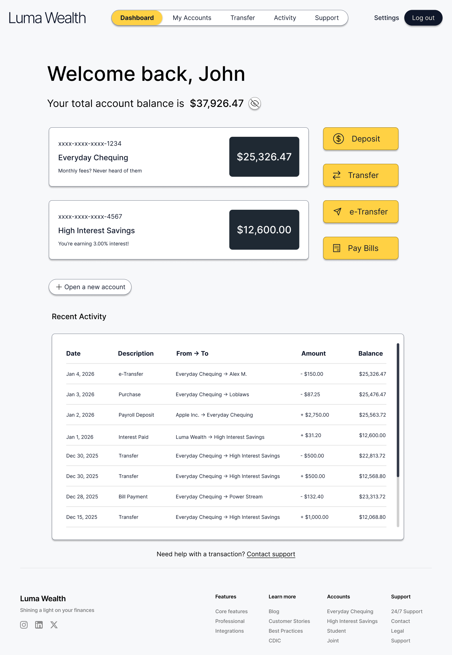
A digital banking experience designed to help users confidently manage personal accounts online through clarity, trust, and simplicity.
Project Overview 🎯
Context
Luma Wealth is a concept digital banking platform created as a heuristic evaluation and product-thinking exercise. Rather than redesigning a specific bank, this project examines recurring breakdowns in legacy digital banking experiences such as unclear progress, broken activation states, and limited recovery paths. Using established UX heuristics and industry patterns, I explored how a system-driven design approach can reduce anxiety and build trust across onboarding and everyday banking.
The Problem
Legacy digital banking experiences often succeed at regulatory compliance but fail at user activation. Long onboarding flows, unclear system states, and broken transitions between “account opened” and “account usable” create uncertainty and eliminate trust. When issues occur, users are frequently pushed offline to resolve them, undermining confidence at critical moments.
The Solution
The goal was to design a digital banking experience that rethinks common legacy banking patterns. Luma Wealth helps users confidently move from account setup into everyday banking through visible progress, predictable interactions, and a cohesive system that supports both onboarding and ongoing use.
Design Process
Evaluate

Define

Design

Prototype

Refine
Project Duration
Dec 2025 - Jan 2026
4 weeks
Role
UX Designer
UX Researcher
UI Designer
Tools
Figma, Claude, Notion
Evaluating Legacy
Digital Banking
Heuristic Evaluation 💭
Industry Patterns 🏦
Design Direction 🔄
Heuristic Evaluation 💭
Research Insights
To evaluate common legacy digital banking onboarding patterns, I opened a personal savings account with Royal Bank of Canada (RBC) and documented the end-to-end experience, from account selection to online banking enrolment.
This onboarding flow highlights how legacy digital banking experiences often meet regulatory requirements but fall short at activation. While users may technically complete account creation, unclear progress, task interruptions, and weak error recovery can prevent them from successfully accessing or using the product. This disruption undermines trust at a critical moment.
Key breakdowns observed during onboarding
Pain Point 1: Lack of Progress Visibility
Throughout the onboarding flow, there is no progress indicator or step count to help users understand how long the process will take or how many steps remain. Users are repeatedly asked for sensitive, high-effort information (identity, address, employment, tax status) without any sense of completion or momentum. This makes the experience feel longer and more exhausting than it likely is.
Pain Point 2: Unnecessary Friction
During account selection, multiple account options are visually presented side-by-side, suggesting easy comparison. However, switching accounts requires several additional steps:
- Clicking “View details”
- Opening a secondary panel
- Scrolling past dense promotional content
- Finding the “Change to this account” action at the bottom
This interaction pattern contradicts how the account tiles visually suggest they can be selected, creating unnecessary friction at a moment when users should feel in control.
Pain Point 3: Business-Driven Upsells
Throughout the onboarding flow, users are prompted to opt into additional products or programs that are not essential to opening a savings account, including:
- Suggestions to open additional accounts
- Optional enrollment in rewards programs (e.g., points or fee savings)
- Voluntary credit checks framed around “personalization” and “relevant offers”
While these prompts may serve business goals, they interrupt task focus and raise questions about user intent, especially when the product being opened does not inherently require a credit check.
Pain Point 4: Account Created, But Not Accessible
After successfully completing onboarding, I encountered an error while enrolling in online banking that prevented further progress. The system instructed me to call support or visit a branch, despite my account being confirmed and credentials already set up.
Although this may not occur for every user, experiencing this interruption firsthand highlighted a gap between account creation and actual usability, creating frustration at a moment meant to feel seamless.
Industry Patterns 🏦
Overview
Legacy digital banking onboarding flows are often shaped by regulatory and business constraints rather than user activation. Compliance-first design leads to long, high-effort sequences with limited progress visibility, while broken systems separate “account opened” from “account usable” without clearly communicating that distinction. When onboarding breaks, recovery paths frequently push users offline to call support or visit a branch, undermining the promise of a fully digital experience. At the same time, business-driven upsells and “personalization” prompts are embedded within critical tasks, increasing cognitive load and interrupting momentum at moments where clarity and confidence matter most.
So where does that lead us?
Industry Patterns Observed (TL;DR)
- Compliance-first design deprioritizes progress visibility and momentum.
- Broken activation states create gaps between “account opened” and “account usable.”
- Limited digital error recovery pushes users offline during critical moments.
- Embedded growth prompts interrupt task-focused flows and increase cognitive load.
Design Direction 🔄
Rethinking Digital Banking from Insights
Rather than redesigning an existing bank or borrowing patterns from competitors, Luma Wealth was designed from first principles in response to the systemic issues identified above. The design focuses on clarity, activation, and trust across both onboarding and everyday banking experiences. Trust is not established once during onboarding, but reinforced through every interaction that follows.
Exploring Solutions
Through Design
Design Principles 👨🏼🍳️
Paper wireframes ✍🏻
Digital wireframes 🧑🏻💻
Low-fidelity prototype 🧪
Design Principles 👨🏼🍳️
Exploring Design Principles
The following design principles were derived directly from the patterns identified during the heuristic evaluation. Each principle translated high-level insights into design decisions across key user flows.
Principle 1: Progress Visibility
Users should always understand where they are, what remains, and when an action is complete.
Principle 2: Activation Continuity
Onboarding should not end at account creation. Access, setup, and first use should feel like a single, continuous flow.
Principle 3: In-Product Recovery
When errors occur, users should be supported within the digital experience whenever possible.
Principle 4: Minimal Distractions
Critical tasks should remain free of distractions until users achieve their primary goal.
Paper Wireframes ✍🏻
Early Explorations from Concepts to Structure
I used paper wireframes to explore multiple layout directions for onboarding, the dashboard, and account views. Rather than mapping full flows, these sketches focus on comparing structural approaches and identifying patterns that best support clarity, progress visibility, and cognitive simplicity.
Across these explorations, I focused on three core questions: how progress and system state could be made explicit during onboarding, how onboarding could transition seamlessly into a usable account experience, and how financial information could be structured to reduce cognitive load during everyday use.
Onboarding Progress & Activation
To explore how progress and system state could be made more explicit during onboarding, I drafted a lightweight concept focused on momentum and continuity rather than individual form screens. The flow uses a persistent progress indicator and subtle motion to reinforce forward movement as each step is completed. Instead of ending on a static confirmation screen, onboarding concludes with a clear handoff that invites users to continue directly into their dashboard, reinforcing activation and reducing uncertainty at the moment of completion.
Digital Wireframes 🧑🏻💻
Concept → Structure
After identifying promising layout patterns through paper exploration, I translated these concepts into digital wireframes to refine hierarchy, spacing, and interaction structure. This step focused on clarifying primary actions, reinforcing progress and system state, and ensuring continuity between onboarding and everyday banking experiences.
Low-Fidelity Prototype 🧪
Validating Flow and Activation
To evaluate whether the proposed structure supported our principles, a few key screens were connected into a low-fidelity prototype focused on onboarding flow and system feedback before moving into high-fidelity design.






Refining the System &
Experience
Mockups 🎨
High-fidelity prototype 🏆
Design System 🧑🏻🎨
Accessibility ♿️
Mockups 🎨
Translating Insights into a Usable Banking Experience
These mockups translate the onboarding and activation insights into a cohesive, end-to-end experience. Design decisions focus on making progress and system state explicit, reducing cognitive load, and ensuring users can move from account setup into everyday banking with confidence and continuity.
Onboarding Flow
These screens highlight clear progress indicators, reduced decision friction, and a guided transition from onboarding into a usable account state.
Extending the Experience Beyond Onboarding
While the heuristic evaluation focused primarily on onboarding and the transition into account access, its insights directly informed the design of the dashboard, account views, money transfer and support pages. These screens were intentionally designed to carry the same principles forward. By maintaining continuity beyond initial setup, the experience reinforces trust and usability throughout everyday banking.
Dashboard & Account
Transfer & Support
High-Fidelity Prototype 🏆
This prototype demonstrates the complete onboarding experience from first step through account activation, followed by a seamless transition into the user’s dashboard. The flow emphasizes clear progress, system feedback, and continuity, ensuring users move from setup into everyday banking without uncertainty or interruption.
Design System 🧑🏻🎨
The Luma Wealth design system was intentionally restrained to support clarity, trust, and emotional calm. A predominantly black-and-white palette reduces visual noise and cognitive load, while a warm yellow accent reinforces moments of action and progress, aligning with the idea of “Luma” as light and guidance.
Rounded corners and softened components were used throughout to reduce perceived severity and create a more approachable, human experience, particularly during high-stakes interactions such as onboarding and money movement.
Accessibility Considerations ♿
Designing for Inclusivity and Readability
Accessibility informed key design decisions from early exploration through final designs. The goal was to ensure banking tasks feel readable, predictable and usable across devices and abilities.
Contrast & Visual Hierarchy
Text contrast meets WCAG AA standards, with emphasis on high readability for primary actions.
Plain Language & Predictable Interactions
Labels, instructions, and system messages use plain language and consistent patterns to reduce ambiguity.
Clear Focus & Keyboard States
Interactive elements were designed with visible focus states and consistent hover/active feedback to support keyboard navigation and improve clarity
Outcome & Next Steps
Takeaways 🎓
Next steps 👏🏻
Takeaways 🎓
Impact
This project reframed digital banking as a system of trust rather than a collection of features. By addressing common breakdowns in onboarding and activation, Luma Wealth demonstrates how clarity, progress visibility, and predictable interactions can reduce anxiety and support confident everyday banking.
What I learned
Designing for financial products reinforced the importance of system thinking and restraint. Small decisions around progress, language, and state communication have an outsized impact on user confidence, especially during high-risk moments like onboarding and money movement.
Next Steps 👏🏻
Opportunities for future iteration
Future work would focus on validating these solutions through usability testing and expanding the system to support edge cases such as account recovery, error handling, and customer support flows. Additional iterations could also explore personalization that adapts over time without interrupting core tasks or increasing cognitive load.
Liked what you read?Check out my next case study
Designing clarity into everyday grocery shopping
A mobile app that organizes grocery lists by store layout and guides users aisle-by-aisle reducing friction, decision fatigue, and time spent wandering the store.
View case study