

PRESTO — UX Case Study
A Smarter Way to Manage Your Transit Card
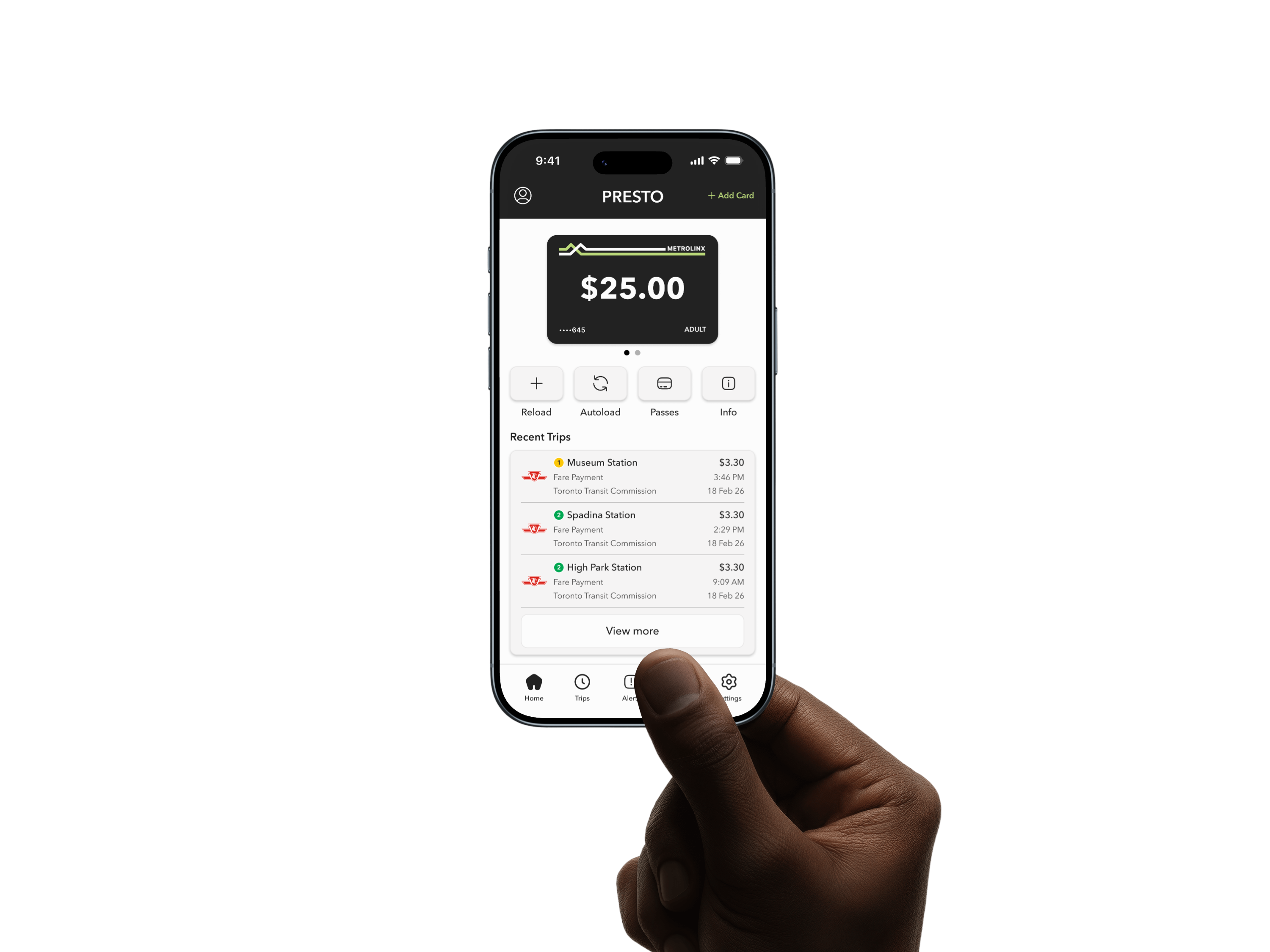
A conceptual redesign of the PRESTO app focused on clarity, usability, and modernizing the transit experience across Toronto.
Project Overview
Context
The PRESTO app supports millions of transit riders across Toronto, yet its App Store rating sits at 1.8 stars. The digital experience feels fragmented, structurally inconsistent, and missing features riders expect. This project explores how a full UX and UI redesign could simplify navigation, streamline core interactions, and modernize the brand system while keeping PRESTO recognizable.
Design Focus
Clarifying hierarchy across core flows, improving the discoverability of high-frequency actions, introducing persistent navigation, and bringing missing features like Service Alerts and PRESTO Perks into the app.
Role
UX Designer
UX Researcher
UI Designer
Timeline
March 2026
2 weeks
Tools
Figma
Claude
Procreate
Design Process
Audit
Define
Design
Prototype
Reflect
Tap a section below to skip ahead ↓
1
Design Audit
Before designing anything new, the first step was understanding what wasn't working. This audit breaks down the current PRESTO app across navigation, visual consistency, interaction patterns, and more to identify the core problems worth solving.
User Reviews
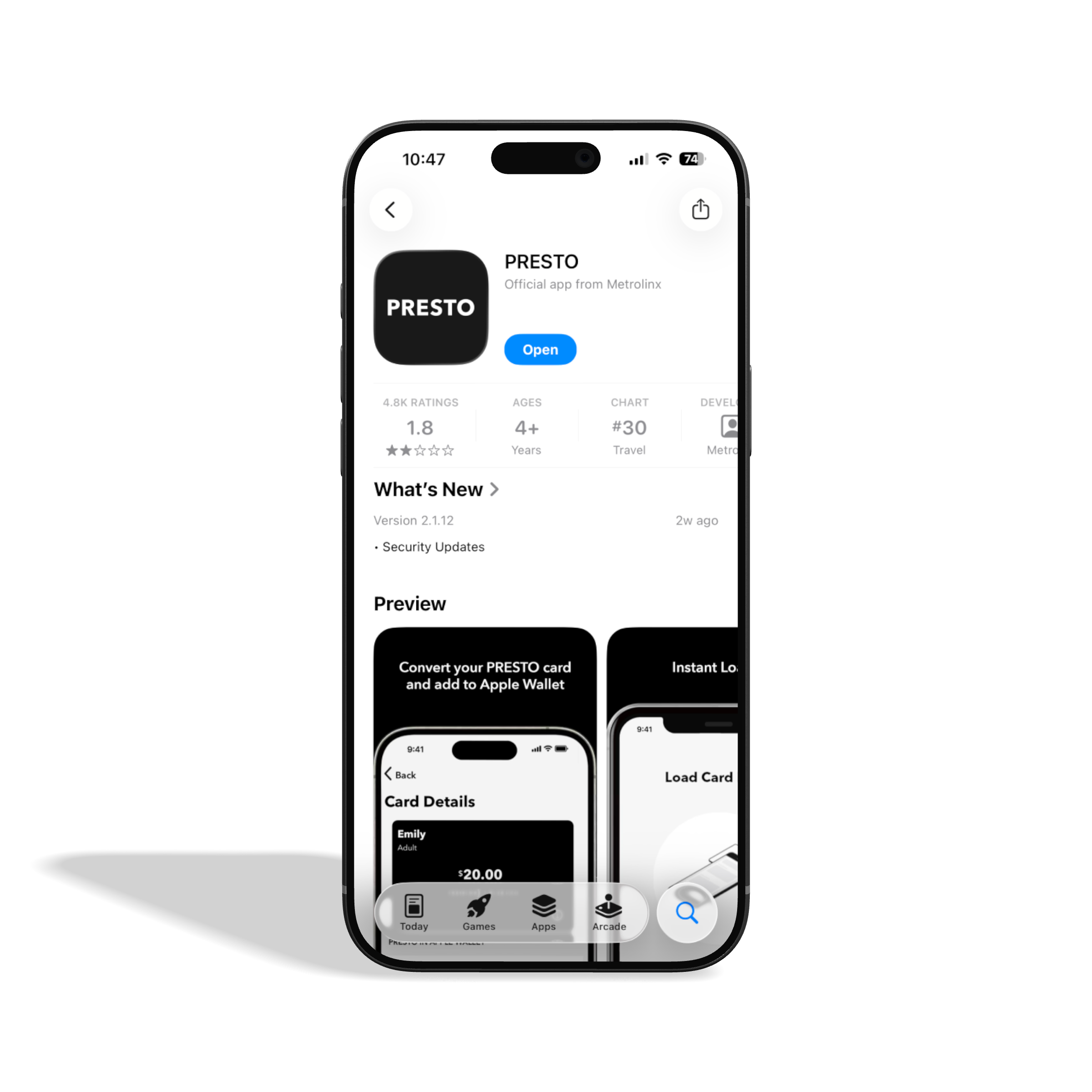
With 4,800+ ratings and a 1.8-star App Store score, PRESTO users have made their frustrations clear. Users cite less functionality than the website, too many steps to complete basic tasks, and confusing navigation. Many others report persistent slowness, crashes, and an outdated design. The pain points aren't one-off issues. They're rooted in structural and visual decisions that make everyday tasks harder than they need to be.
The Problems
Navigation & Information Architecture
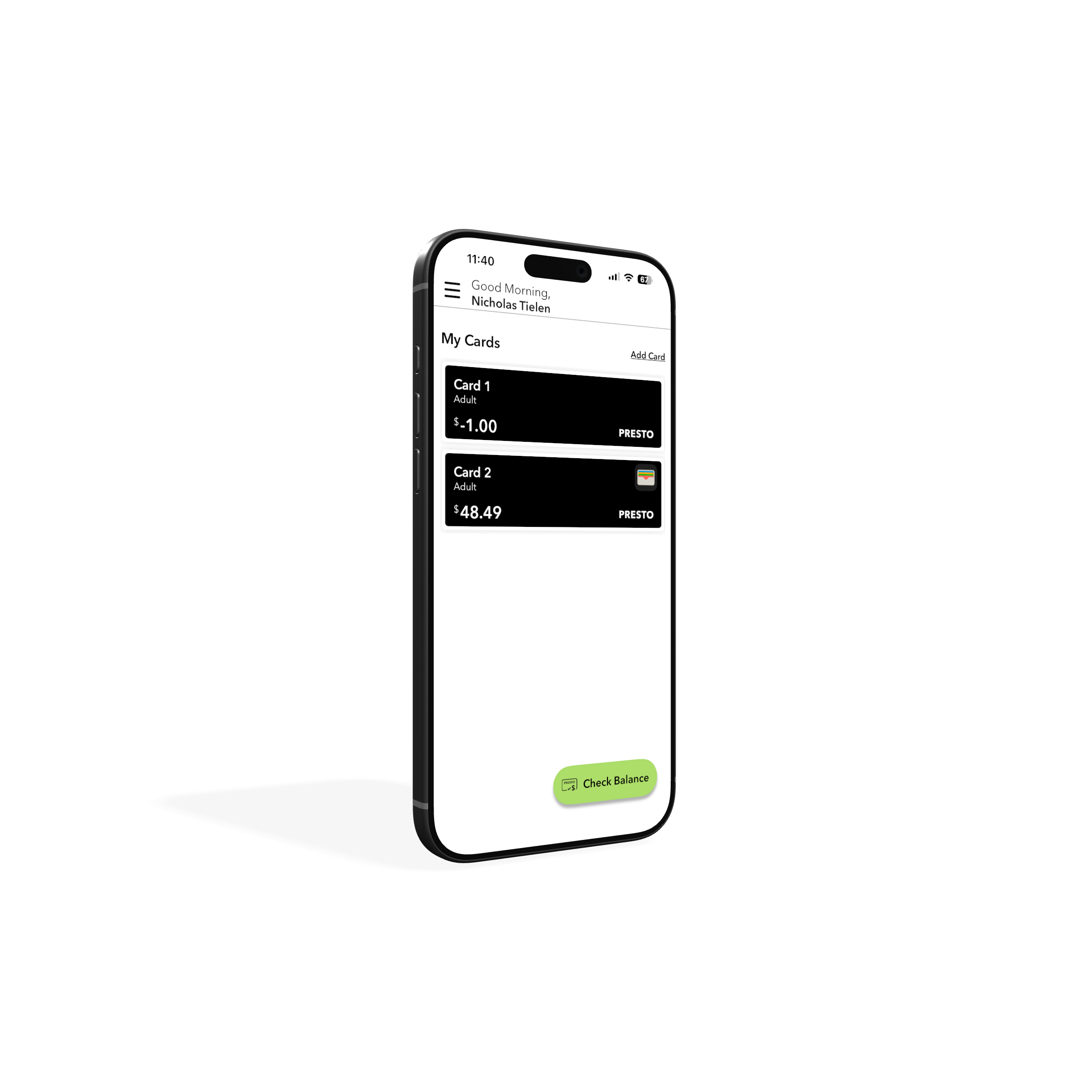
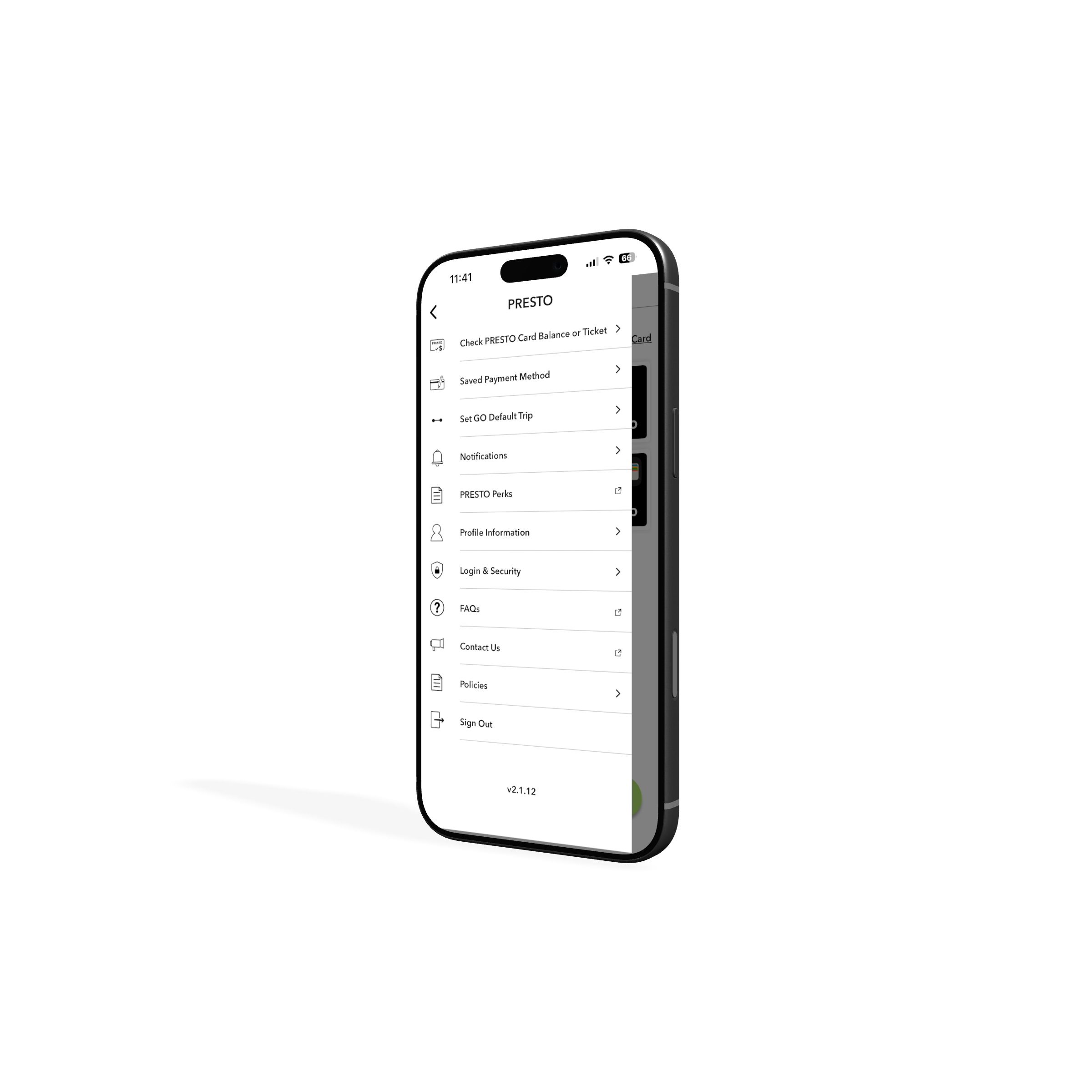
The app has no persistent navigation.
Once a user selects their card, the hamburger menu disappears entirely, replaced by a back button. The menu is only accessible from the main screen and lists 11 options, three of which redirect users outside the app. There's no clear separation between core features and secondary links.
Card Management & Hierarchy
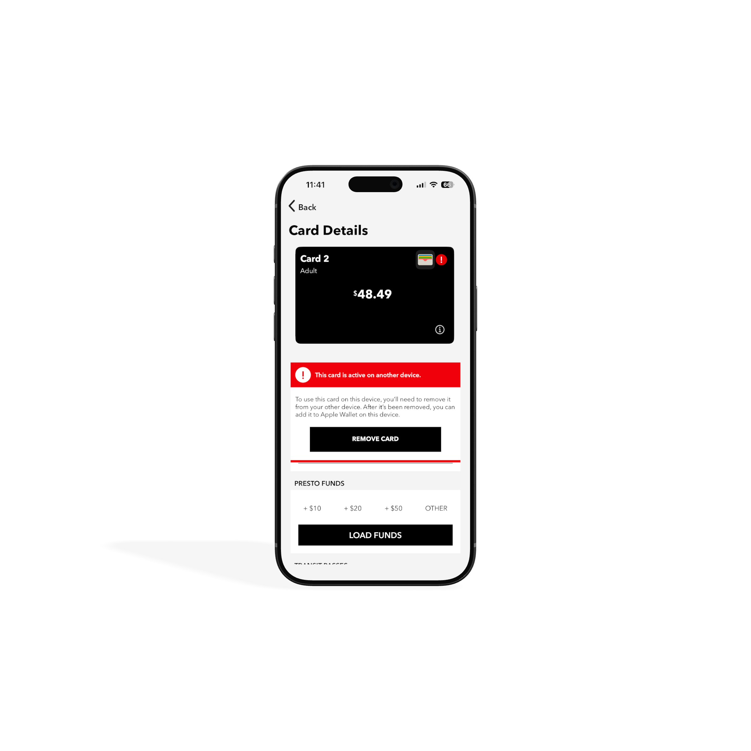
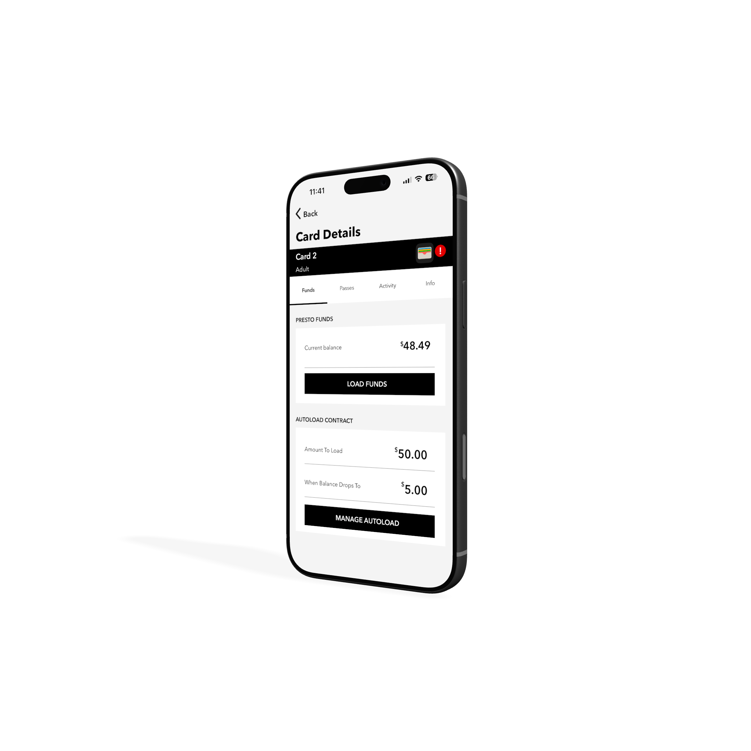
Two screens do the same job. Neither does it well.
Selecting a card leads to a details screen, but the real functionality is hidden behind a small "i" icon that opens a second, better-organized screen. Most users would never find it. Meanwhile, the card UI locks 40% of the screen, leaving little room for the content below.
Missed Feature Opportunities
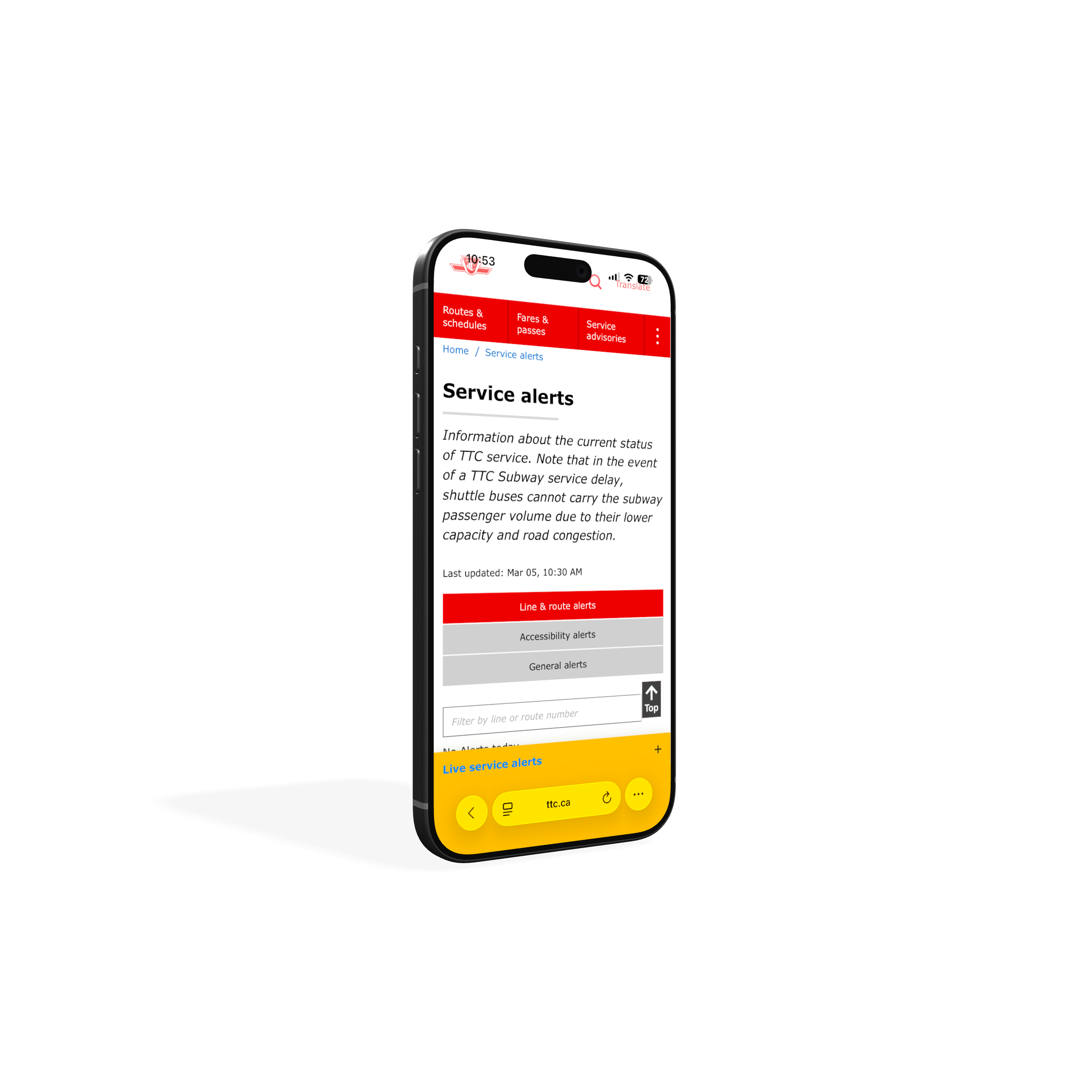
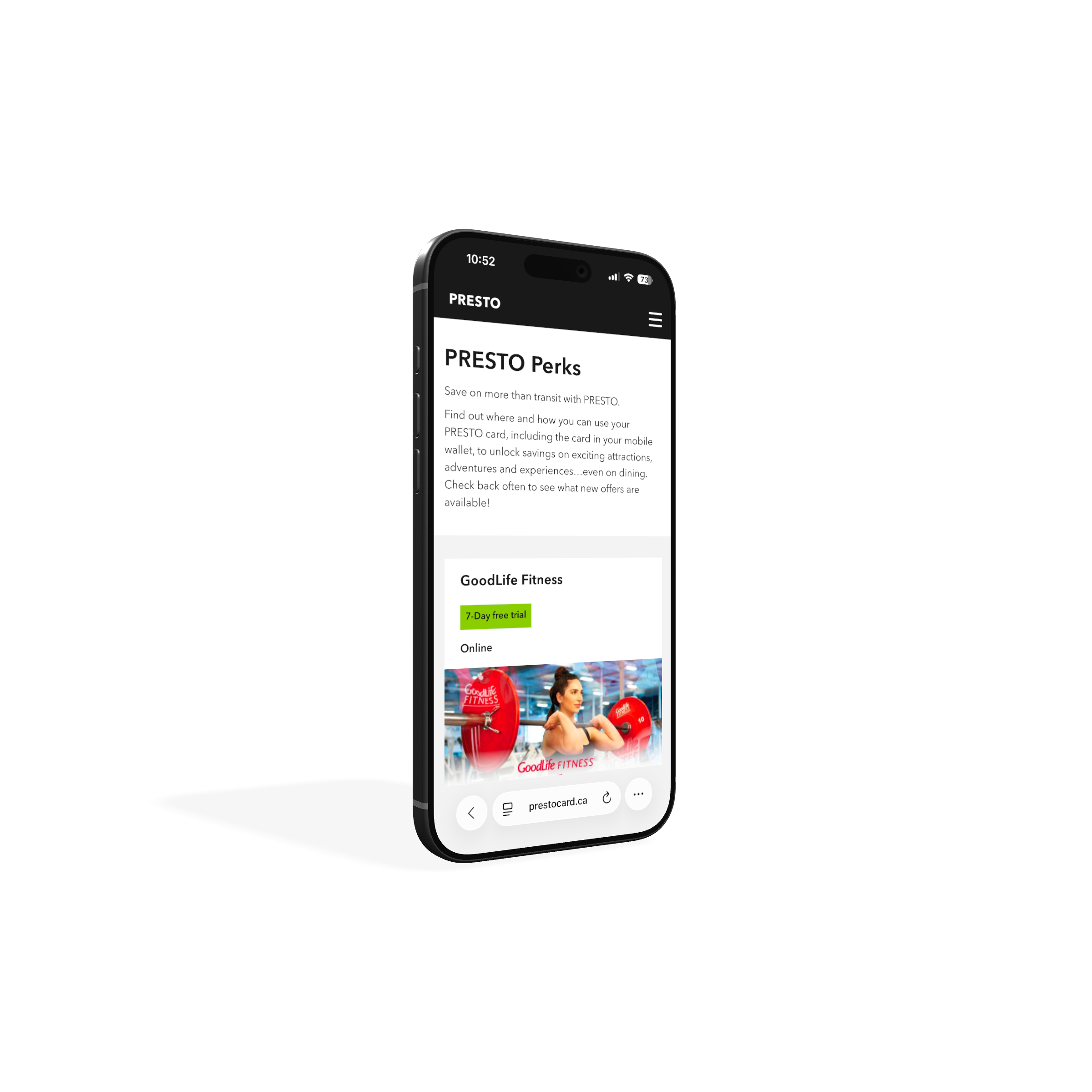
The app could do a lot more
for its riders.
PRESTO Perks offers discounts across food, activities, museums, and more but the app redirects users to an external link with no explanation of what it is or how it works. Service alerts are absent entirely, forcing riders to leave the app and check the TTC website separately. Riders deserve an app that supports them throughout their entire commute.
Inconsistent Interaction Patterns
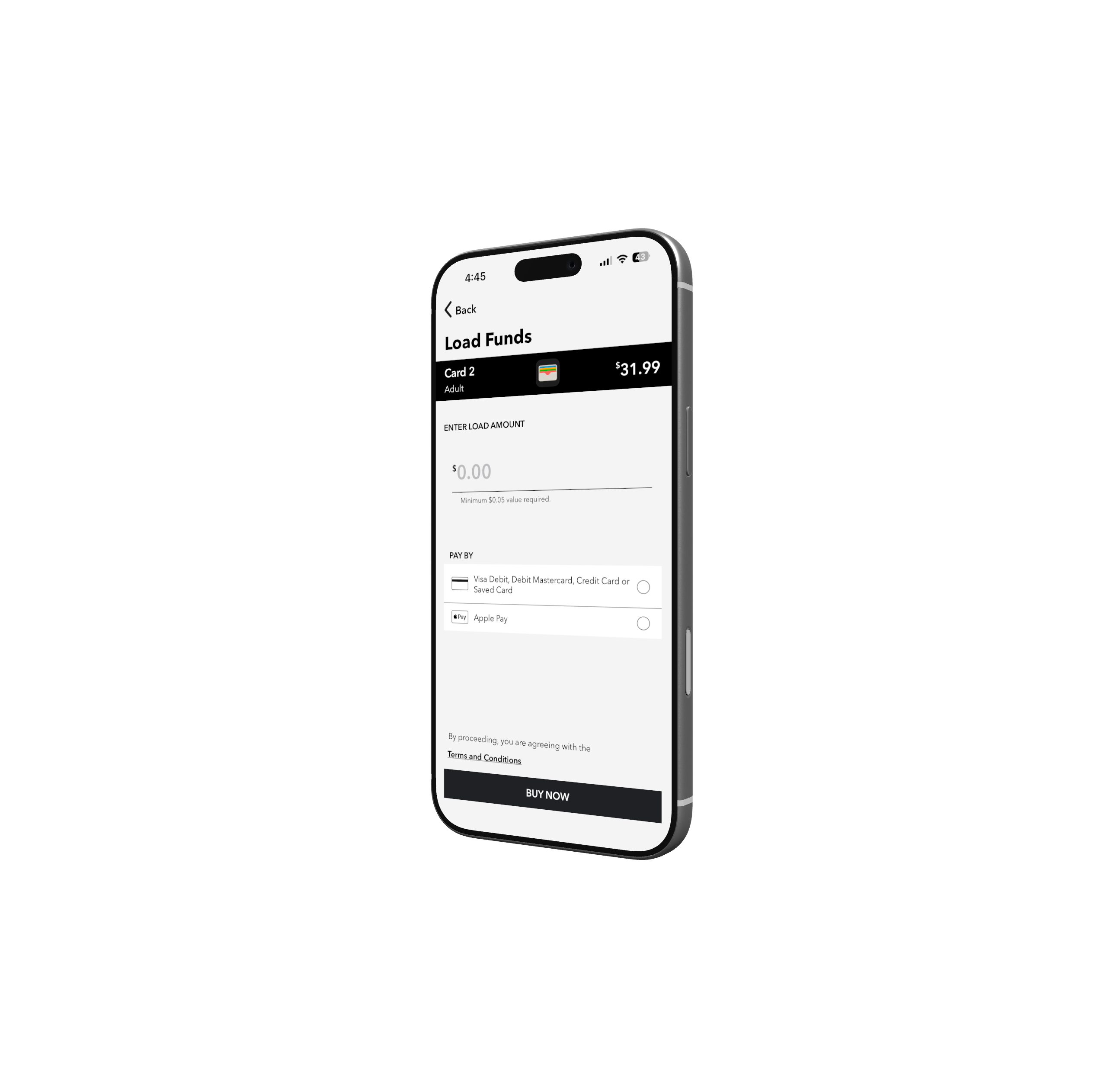
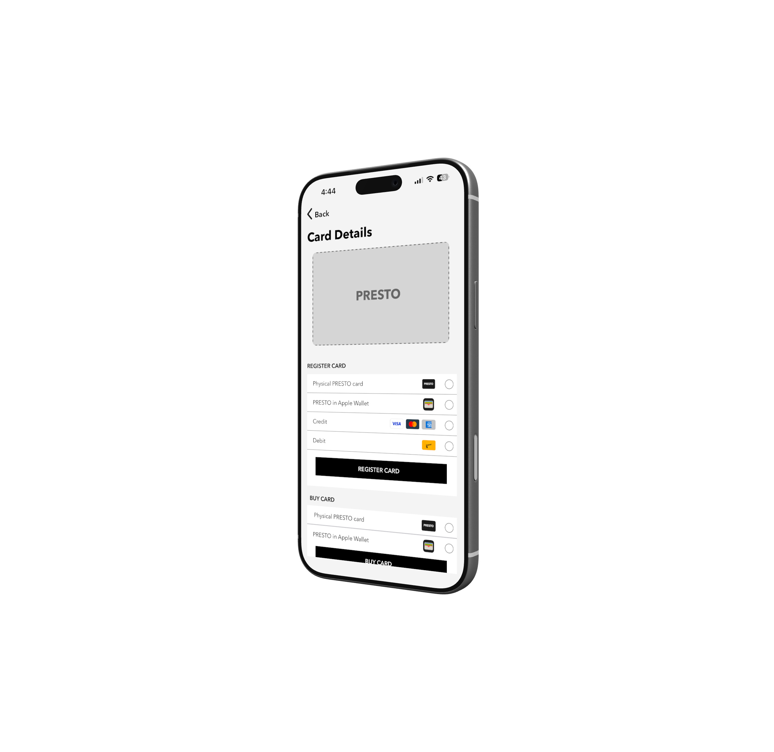
Similar actions behave differently with no clear reason.
Tapping "View More Transactions" navigates to the second card screen. Tapping "Load Funds" skips it entirely. Adding a new card offers no progress indicator across its multi-step flow. Credit and Debit appear as separate options, adding friction where there should be none.
Visual & Spacing Issues
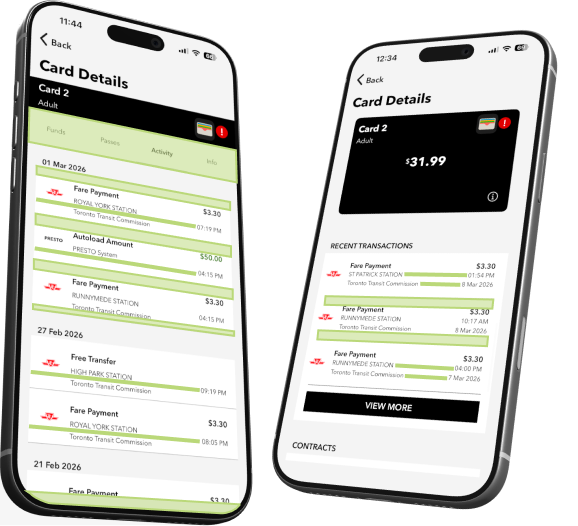
The details add up.
Trip history rows have uneven internal padding, tighter at the bottom than the top, breaking the visual rhythm down the list. The same component on another screen has even padding, suggesting the inconsistency is overlooked rather than intentional. Transaction rows align cleanly on one screen but timestamps fall out of alignment on another. Limited typographic hierarchy throughout makes it hard to distinguish what matters from what doesn't.
2
Design Principles
From problems to principles.
Every design decision in this redesign traces back to a specific problem found in the audit. Rather than fixing issues in isolation, these five principles were established to guide the work from start to finish.
Principle 01
Navigation you can always count on.
A fixed bottom navigation bar replaces the hamburger menu, giving users a reliable anchor no matter where they are in the app.
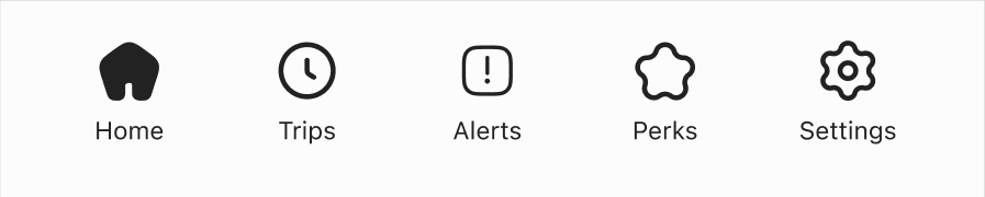
Bottom Navigation Bar
Principle 02
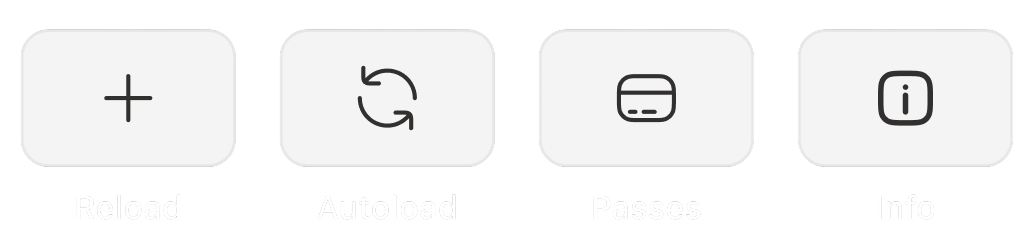
One home for every action.
Every core action lives on the home screen, visible, labeled, and ready. One place, every action.
Quick Action Buttons
Principle 03
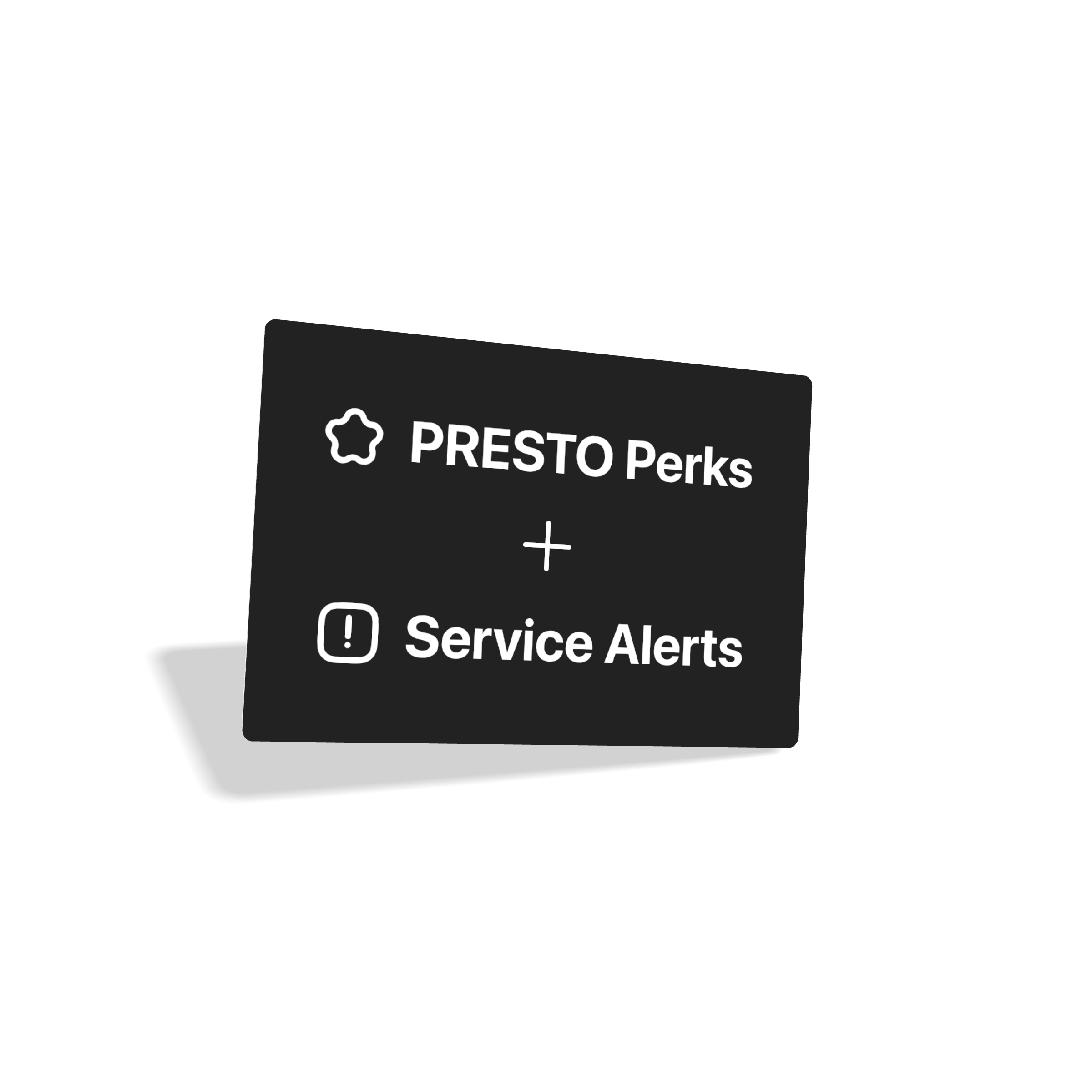
Give riders a reason to open the app.
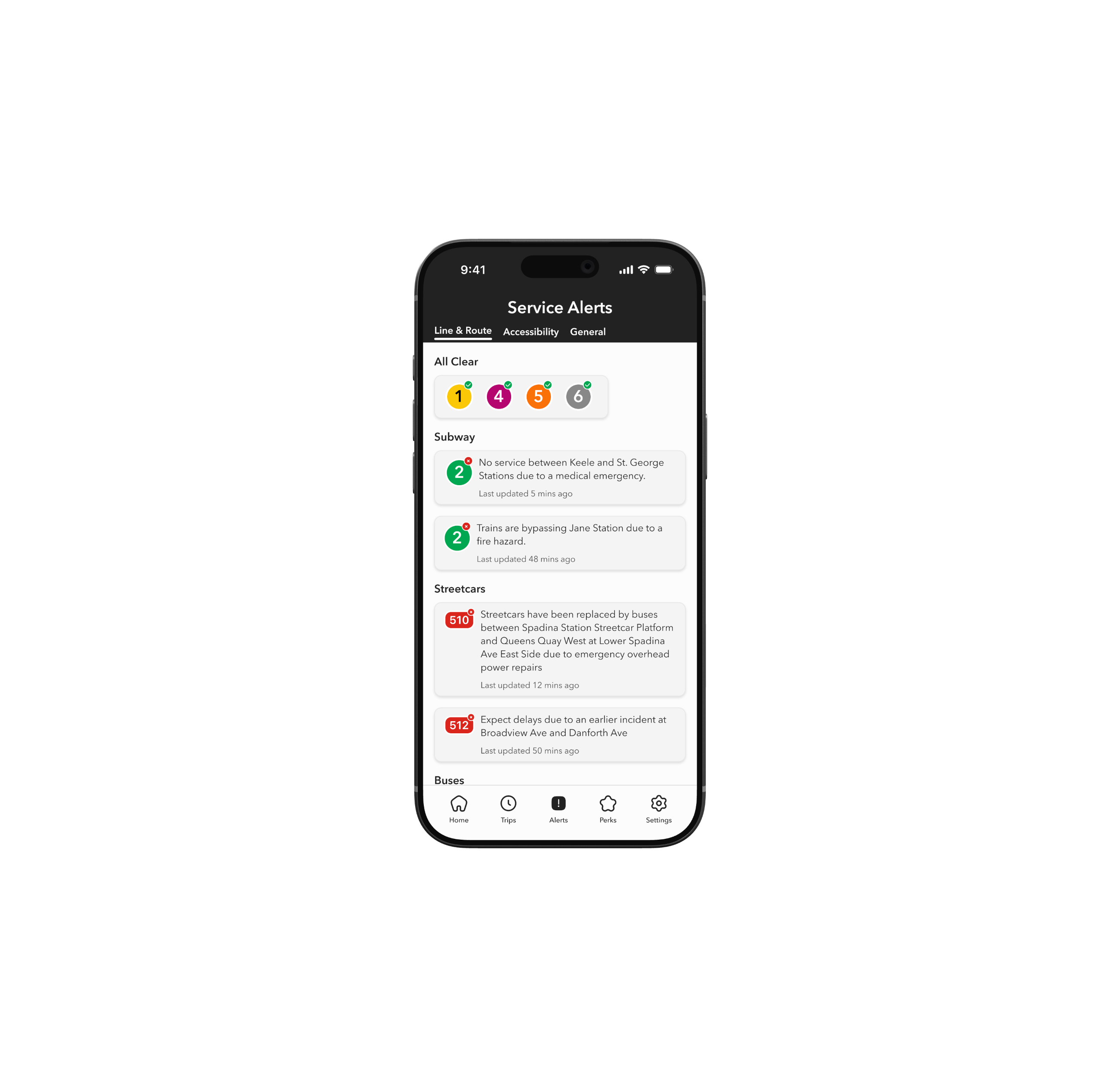
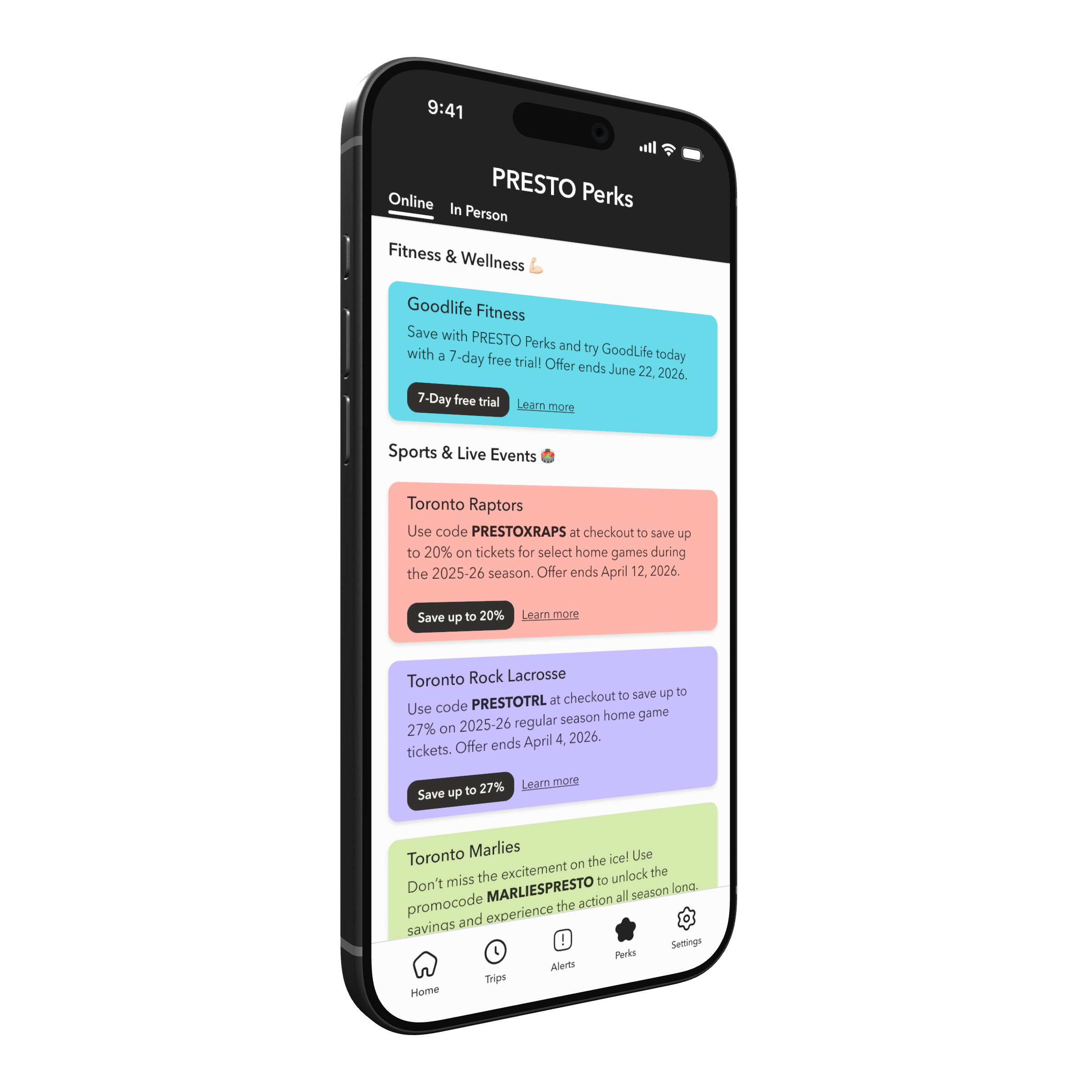
PRESTO Perks and Service Alerts are brought in-app for the first time, giving riders real-time updates and exclusive discounts without leaving the app.

PRESTO
Principle 04
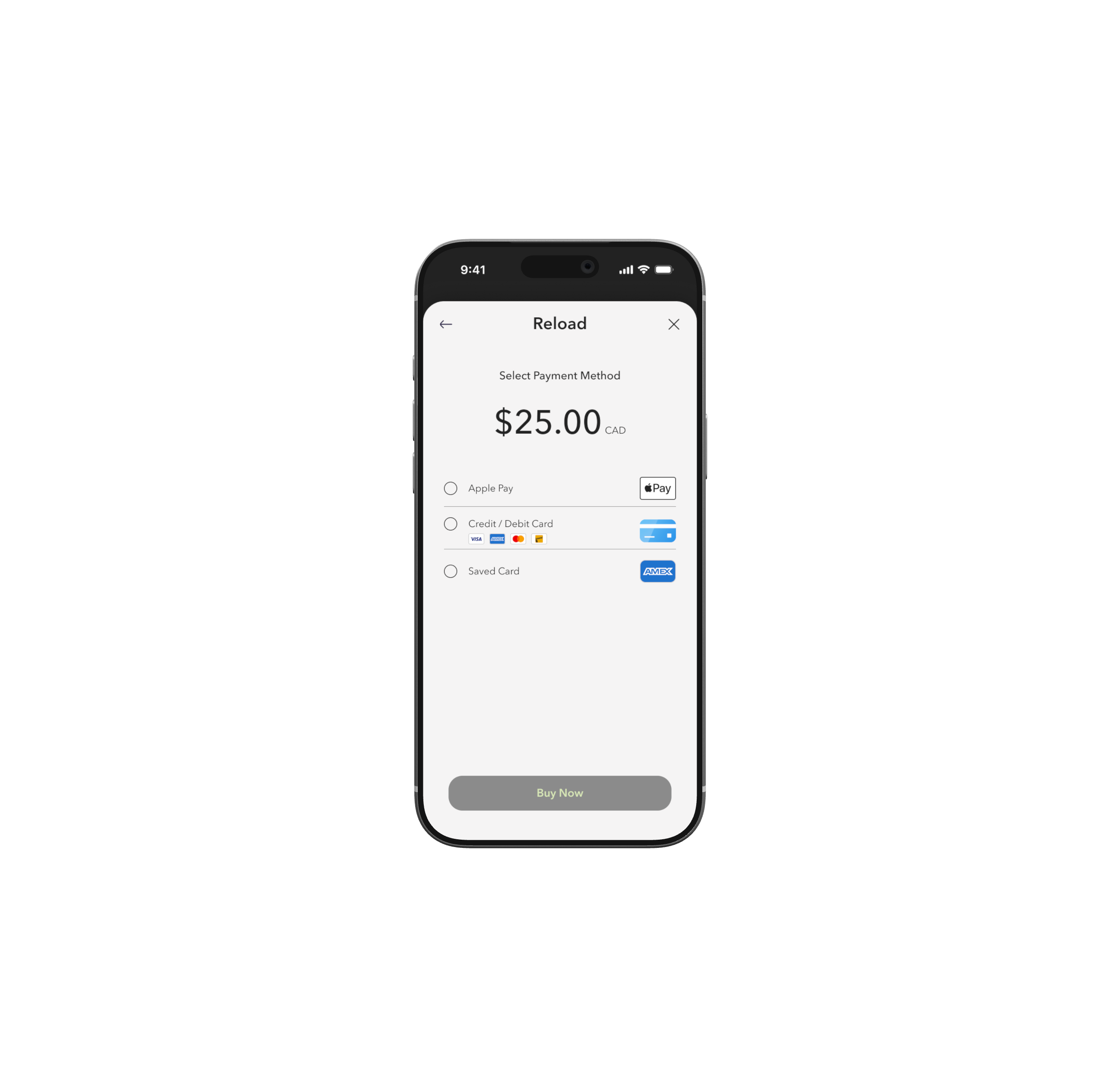
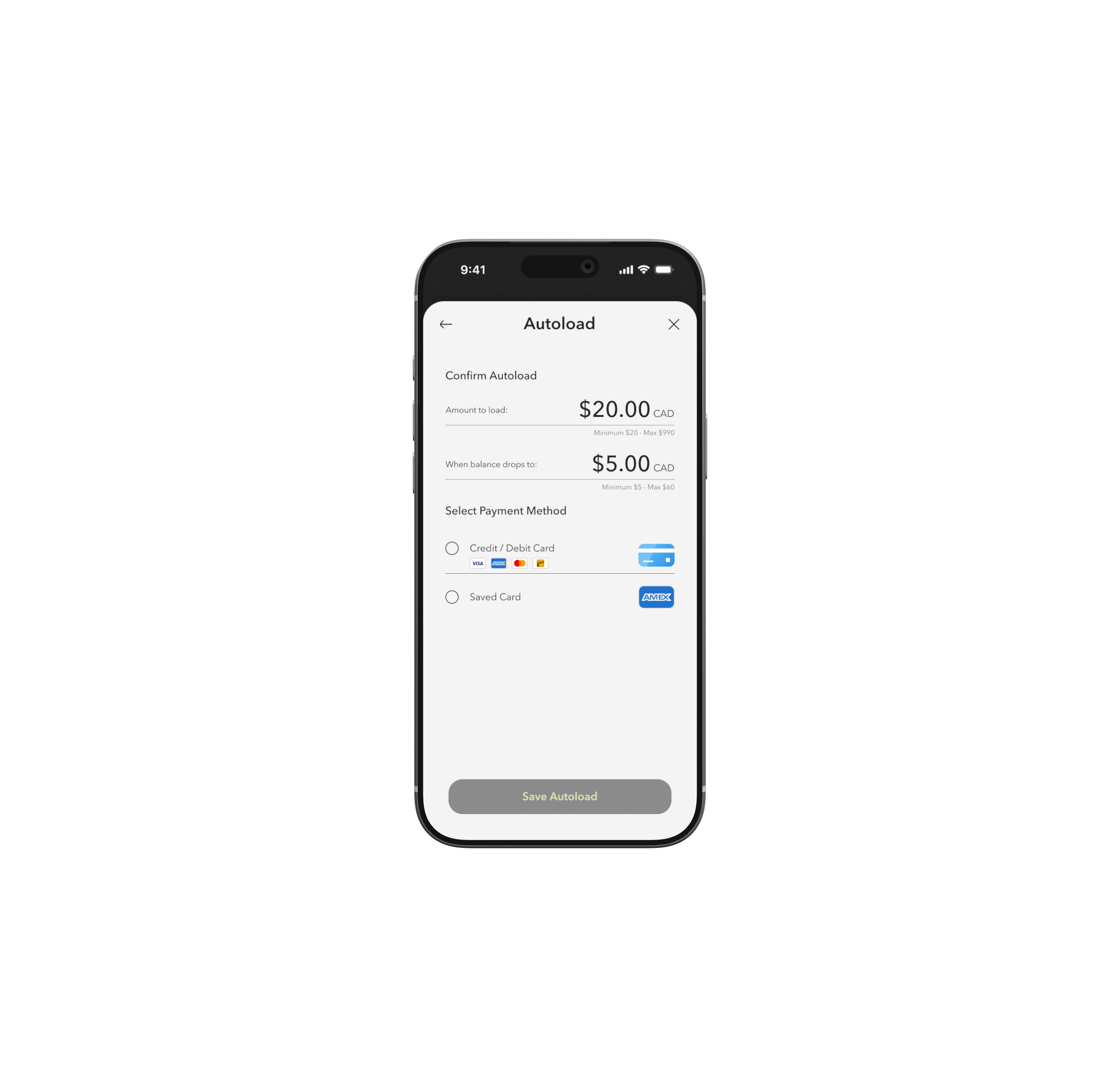
Consistency builds confidence.
A unified card component is applied across every quick action. Same structure, same layout, every time.
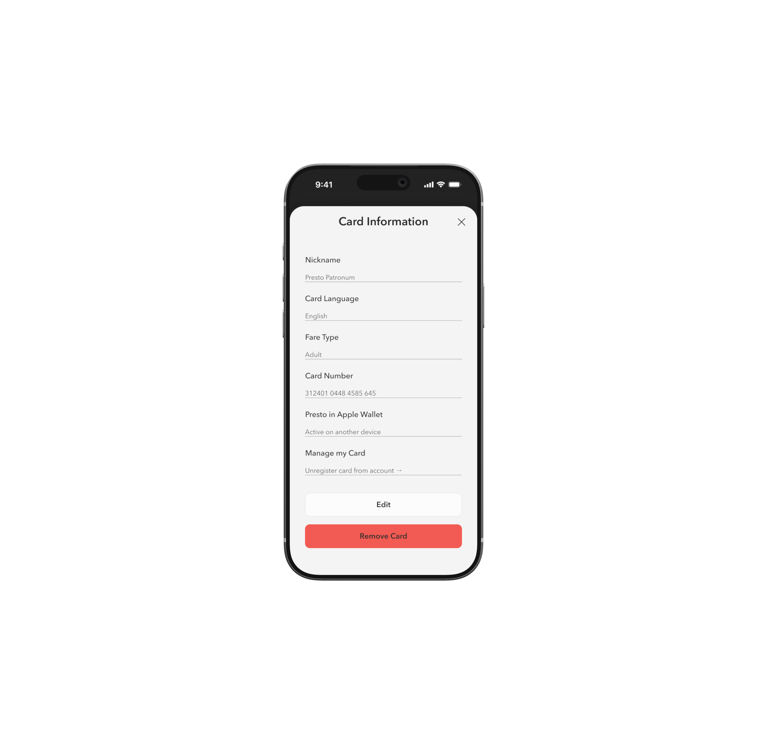
Card Consistency
Principle 05
Surface what matters. Bury what doesn't.
A tabbed layout organizes deeper content into clear sections without adding navigation complexity. New features can be introduced as additional tabs without restructuring the app.
Tabbed layout across multiple screens
3
Product Redesign
What PRESTO could be.
The redesign touches every core interaction a PRESTO rider has with the app, from reloading a card to discovering a perk. Navigation is persistent, core actions live on the home screen, and features like Service Alerts and PRESTO Perks are fully integrated for the first time.
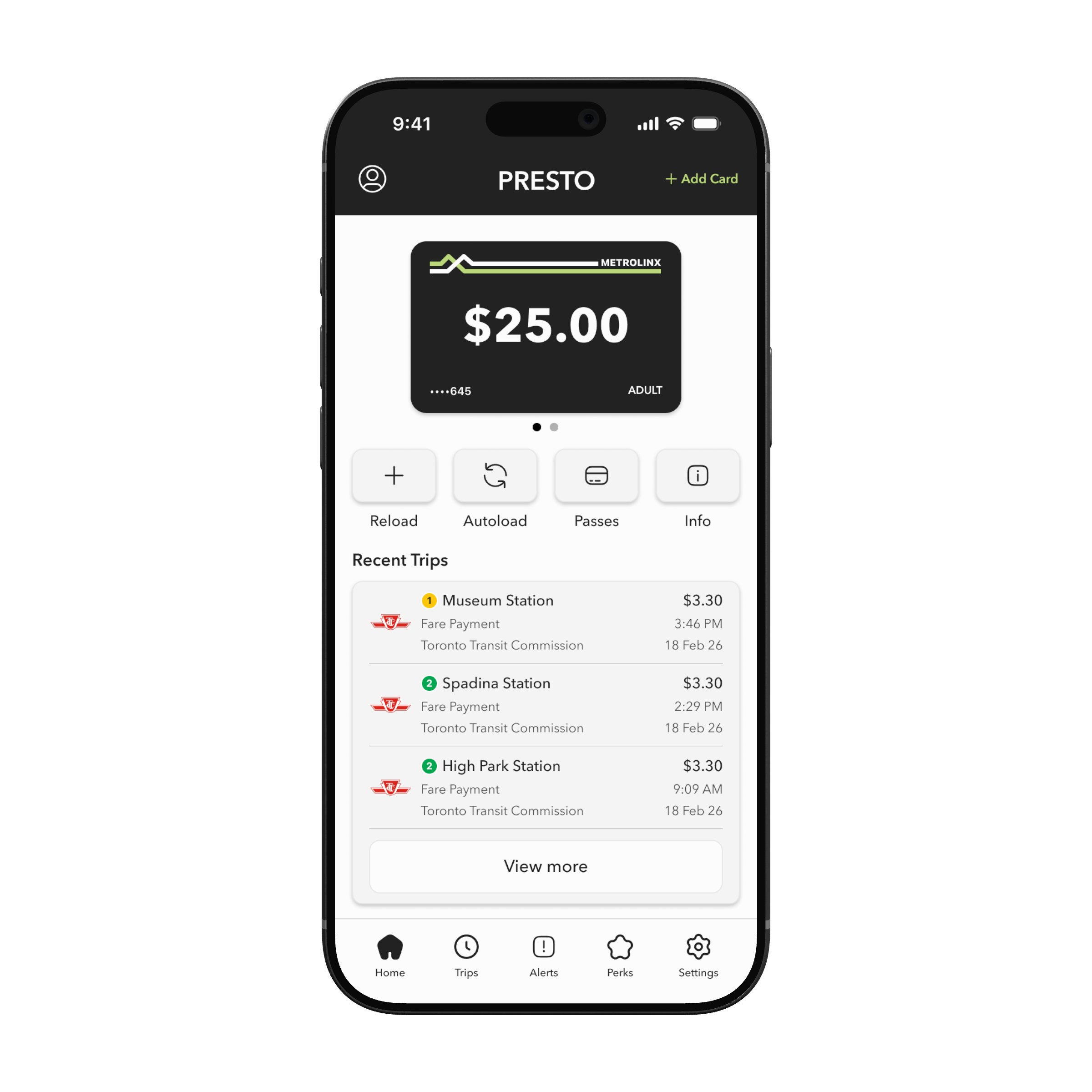
The Home Screen, Rebuilt.
The home screen is the command centre of the redesign. Everything a rider needs most lives here: quick actions, recent trips, and persistent navigation that keeps every section of the app one tap away.
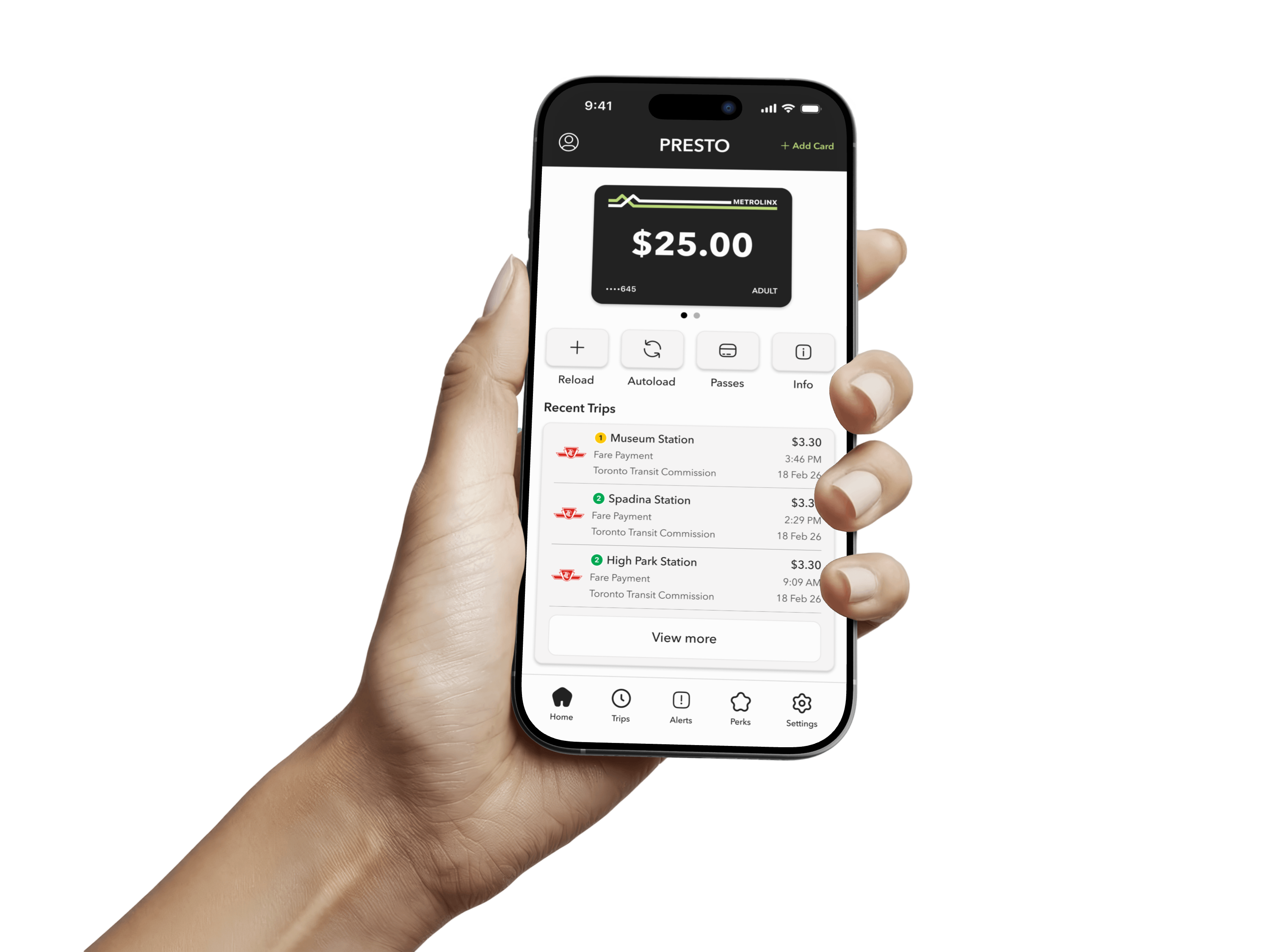


Adaptive App Bar
Adjusts its content based on the current screen.
Quick Actions
The four most common actions, surfaced immediately.
Recent Trips
Your last few journeys visible at a glance, no navigation required.
Navigation Bar
Persistent across every screen - Home, Trips, Alerts, Perks, Settings.
Take a closer look.
Here's a closer look at some of the key rider tasks in the redesign. Select a flow to see it in action.
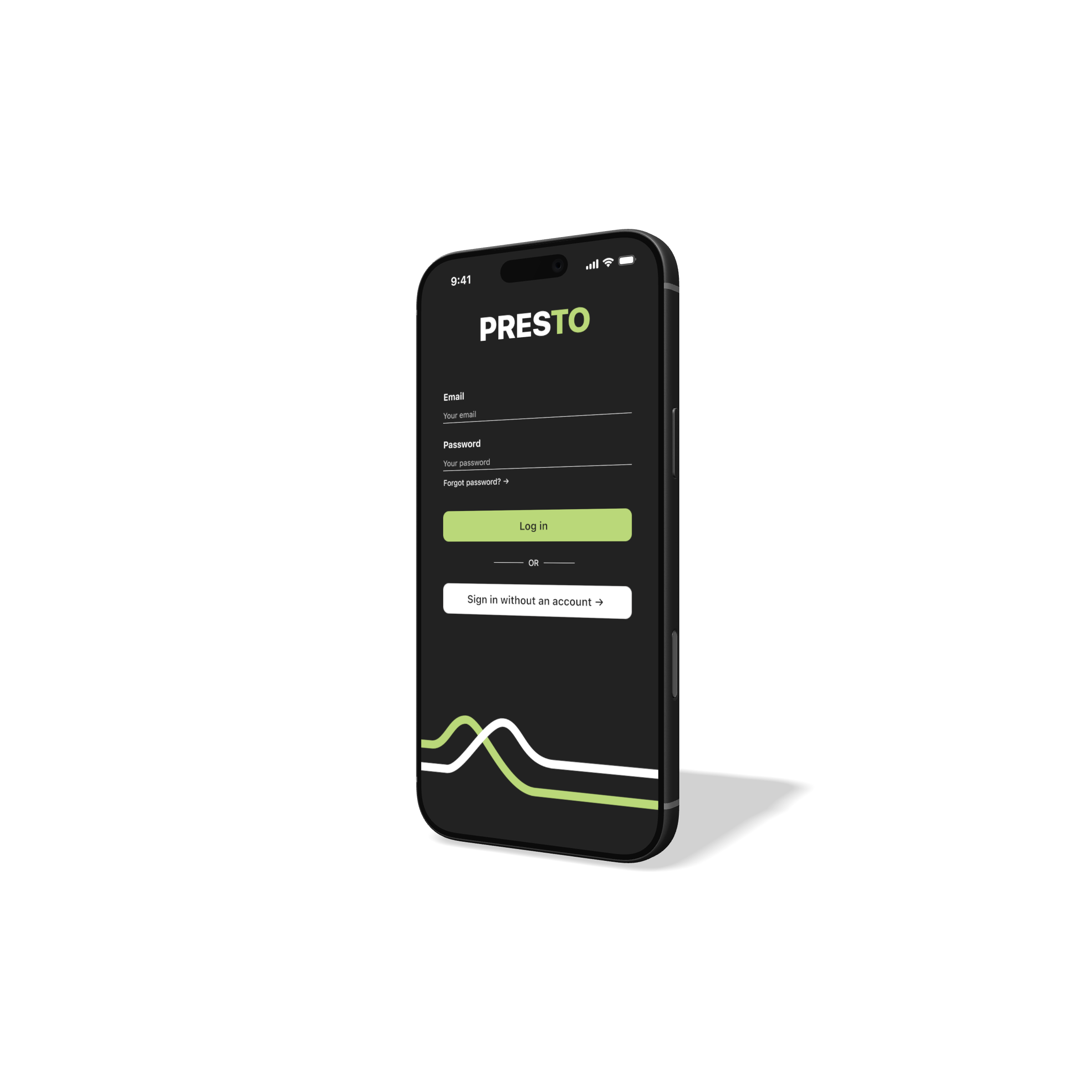
Swipe to explore flows ↓

Reload
Autoload
Add a card
View active perks
Trip History
From screen to street.
The redesign, out in the wild.
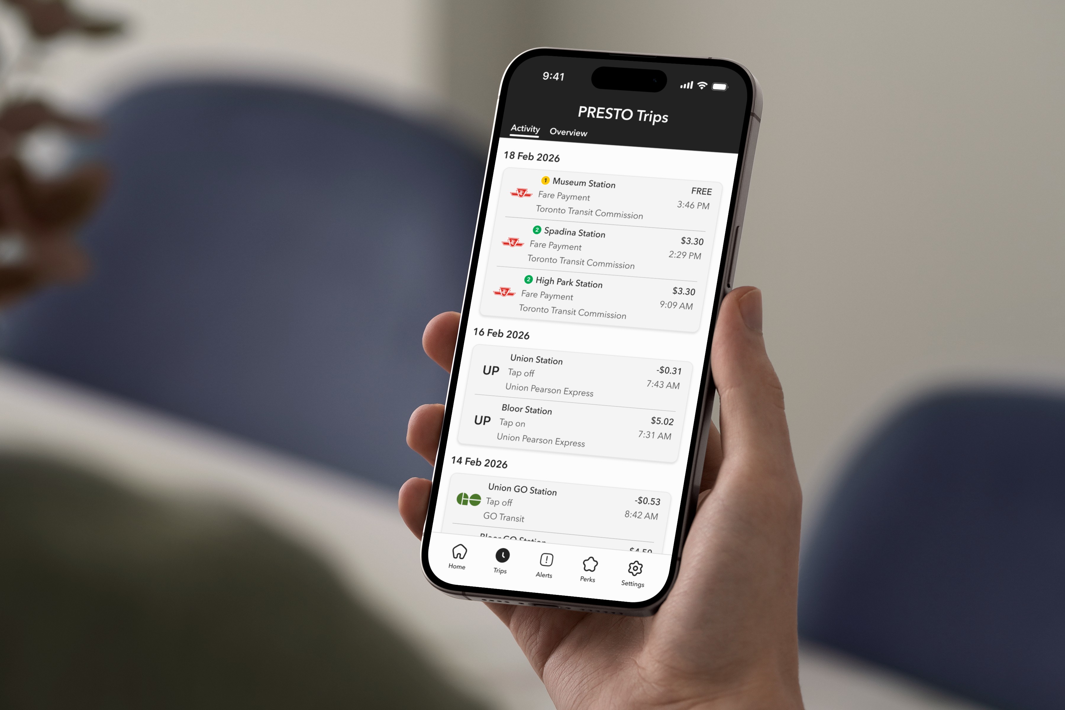
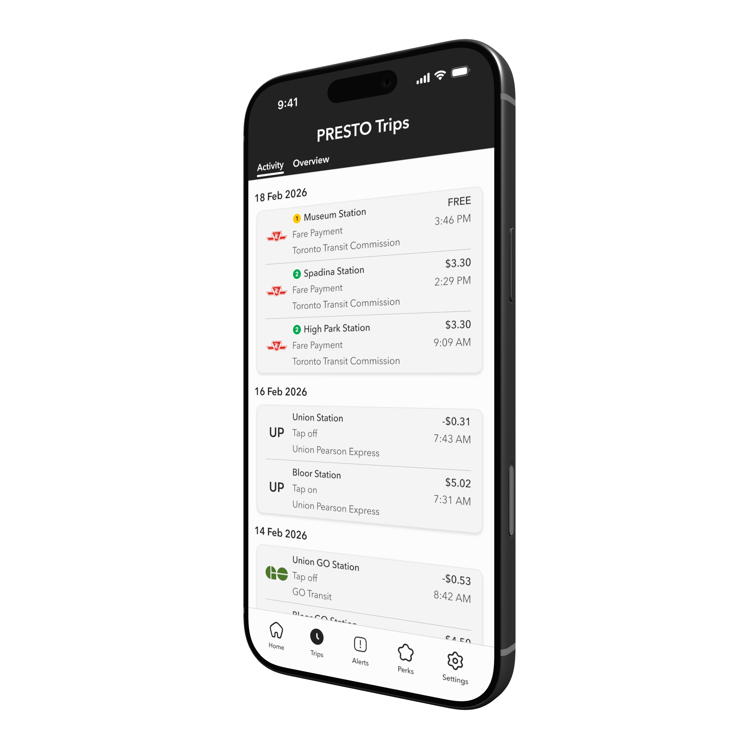
Trip History
Every journey, every fare. Organized and easy to scan.
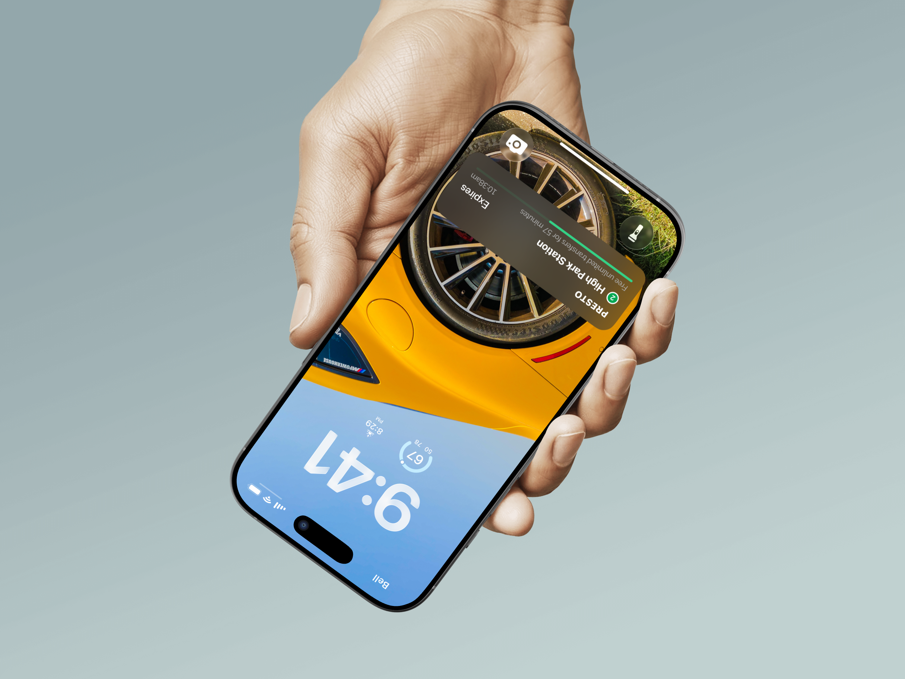
Live Activity
Your transfer window, now on the lock screen.
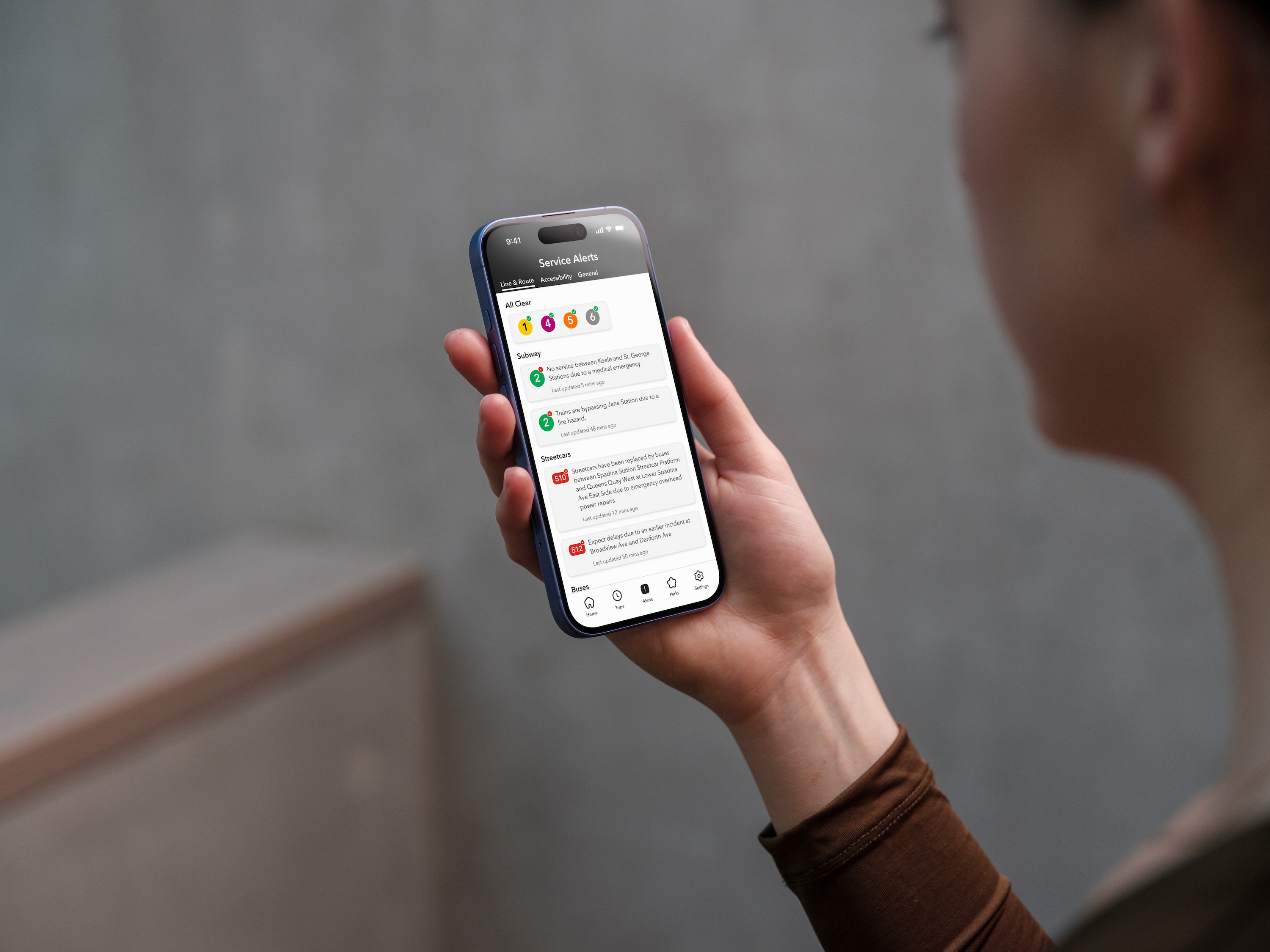
Service Alerts
Know before you go. Live TTC and GO Transit updates, in-app.
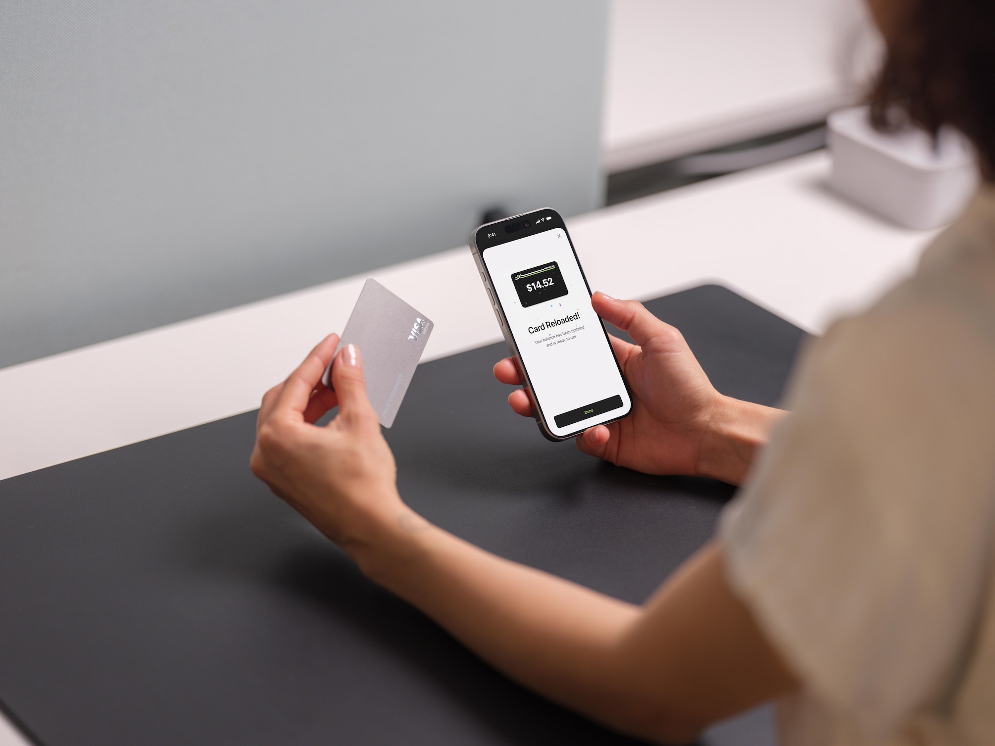
Reload
Top up your balance in seconds, straight from the home screen.
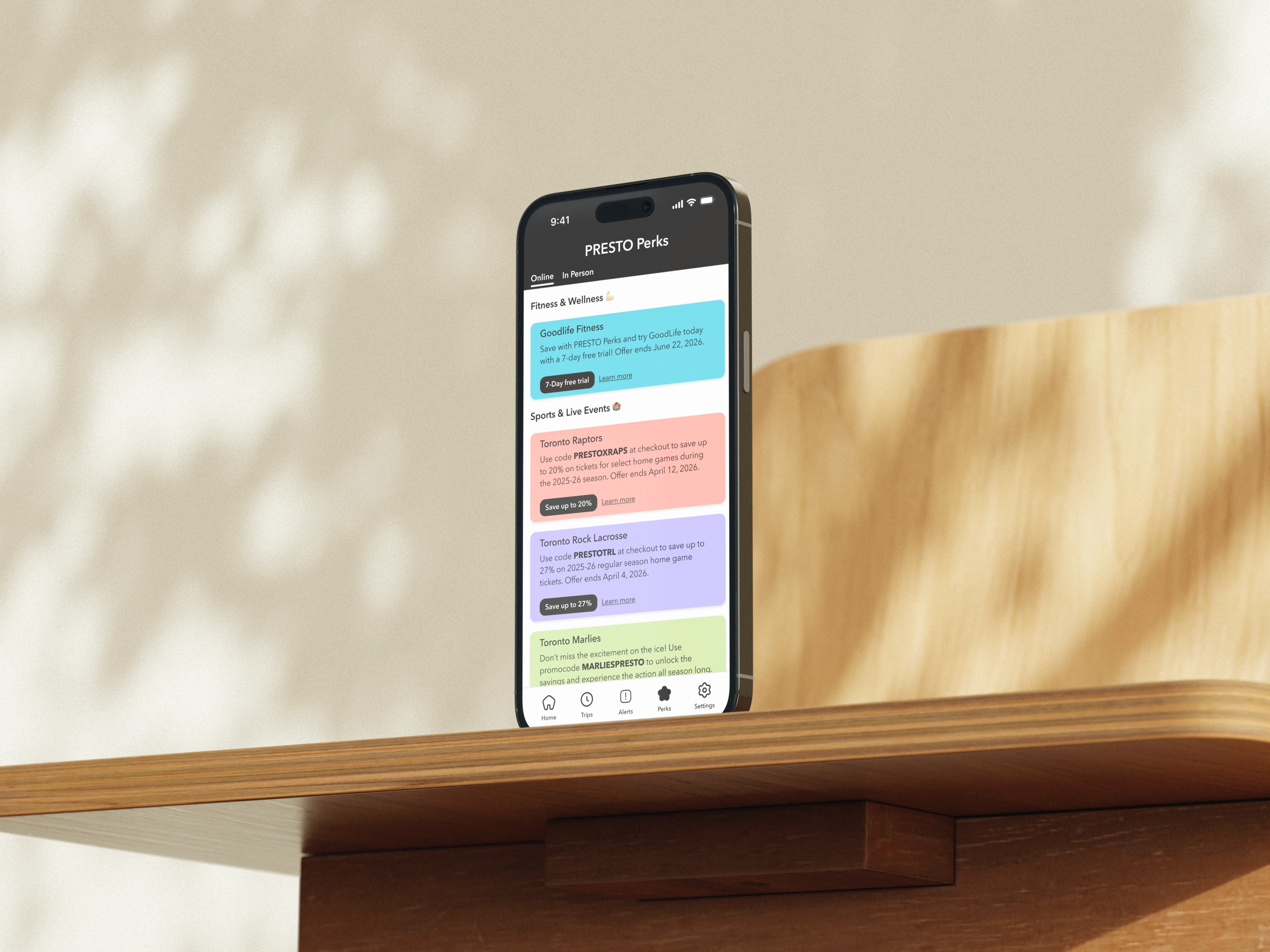
PRESTO Perks
Discounts on food, events, and attractions. Just for riding.
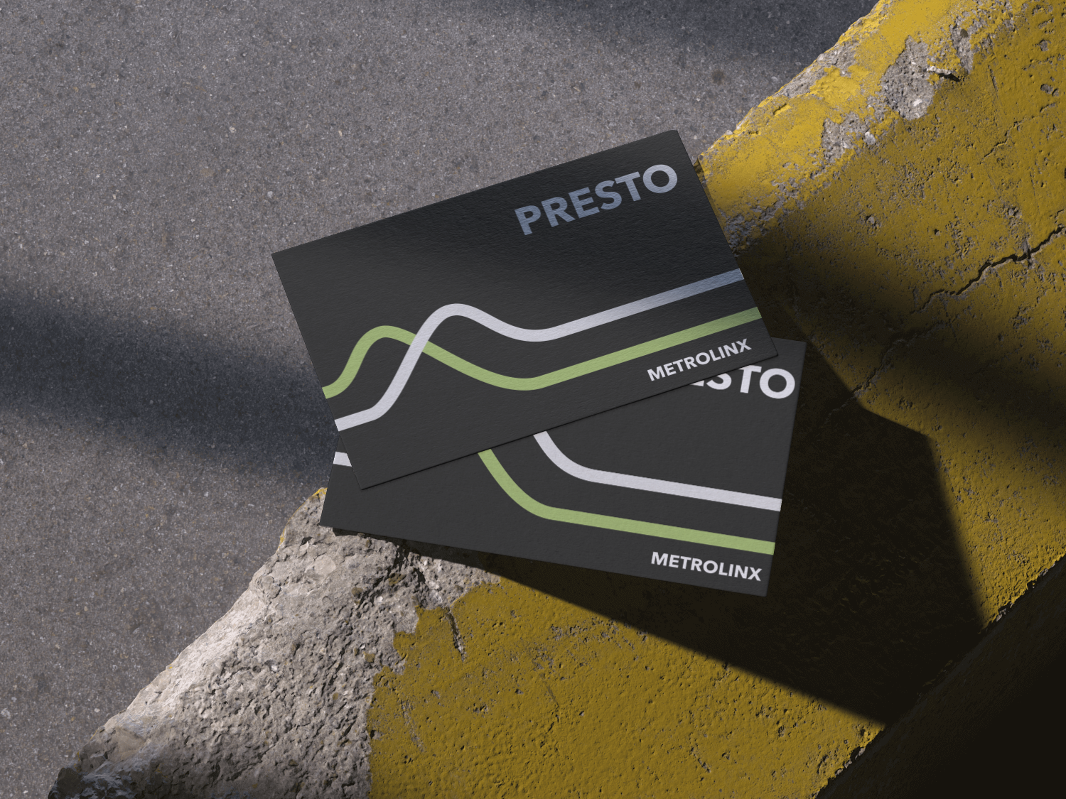
Card Refresh
An updated physical card design that matches the look and feel of the redesigned app.
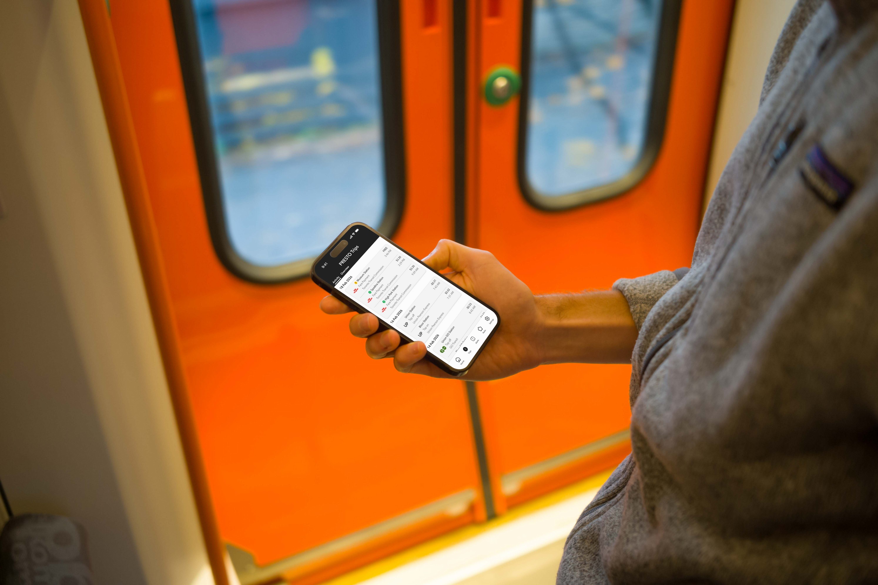
Trip Insights
Track your spending and travel patterns over time.
4
Design System
Components
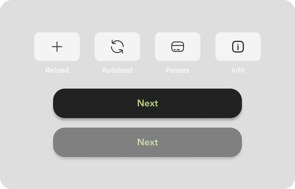
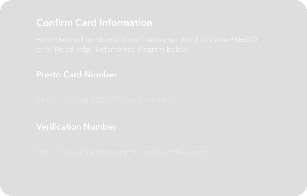
A library of essential UI components built for consistency and scale. Every element follows the same spacing, sizing, and state logic so the interface always feels familiar.
Buttons
Input fields
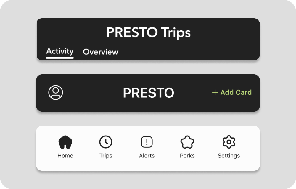
Navigation Bars
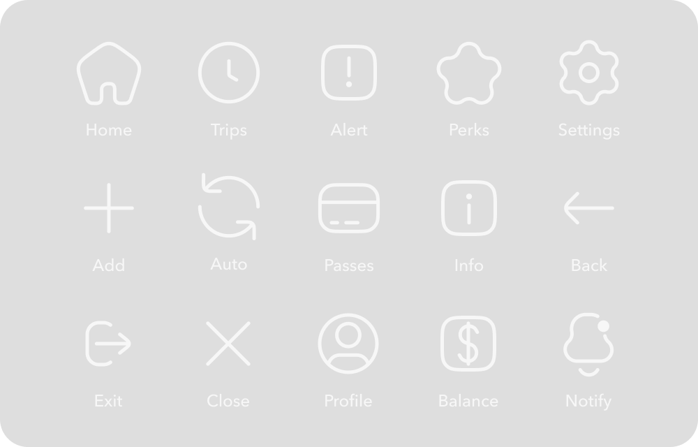
Icons
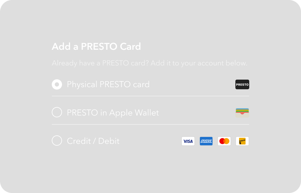
Radio Boxes
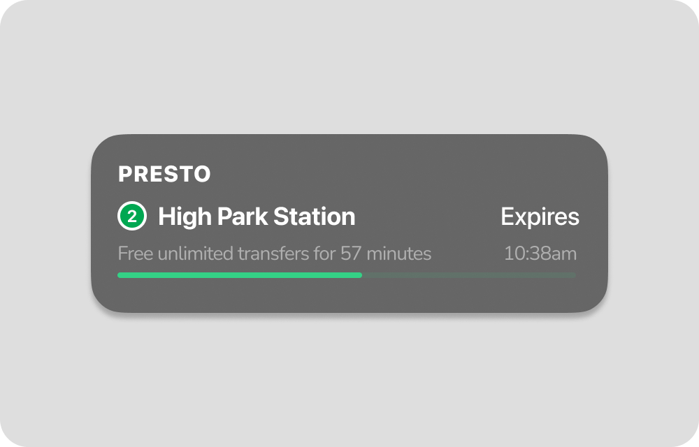
Live Activity
Typography & Spacing
Typography
Avenir Next is used throughout the app for its geometric clarity and legibility at small sizes. It was also chosen specifically for its resemblance to PRESTO's existing typeface, ensuring the redesign feels familiar without feeling unchanged.
Avenir Next
ABCDEFGHIJKLMNOPQRSTUVWXYZ
abcdefghijklmnopqrstuvwxyz
0123456789

Style
Display
Screen Title
Heading 1
Button
Body 1
Body 2
Body Emphasis
Label
Chip
Weight
Bold
Medium
Bold
Demi Bold
Medium
Regular
Bold
Medium
Demi Bold
Size
48
24
16
16
14
14
14
12
12
Height
56
32
22
22
20
20
20
16
16
Spacing
Every spacing value in the app is divisible by 4, from the padding inside a button to the gap between list items. This creates a consistent visual rhythm that makes the interface feel ordered without requiring conscious effort from the user.

Colour
PRESTO's palette stays true to its brand roots. Black and white form the foundation, softened slightly from their pure values to feel less clinical on screen. Green appears sparingly, reserved for moments that matter.
Primary Colours
Text & Icons
#222222
The primary dark tone for all body text, headings, and icons. Chosen for maximum legibility.
Background
#FCFCFC
Near-white rather than pure white to reduce eye strain.
Card Surface
#F5F4F4
A subtle step down from the background, used for cards and containers to create depth without heavy shadows.
Accent Colour
Interactive Accent
#BAD879
PRESTO's brand green, used sparingly for buttons, active states, and key brand moments.
Secondary Colours
Perks Card
#FF8674
#05C3DE

#A396FF
Three vibrant accents used exclusively on the Perks screen. A deliberate contrast to the app's minimal palette that gives Perks its own energy.
View Design System
5
Reflection
Impact
The redesign transforms PRESTO from a frustrating utility into a product riders can rely on. Persistent navigation replaces a disappearing hamburger menu, a consolidated home screen eliminates duplicate screens and dead ends, and two new features turn the app into something riders actively want to open. For an app used by over a million GTA riders every day, these are structural improvements, not cosmetic ones.
What I Learned
Starting with user reviews before opening Figma was the most valuable decision I made. It grounded every design choice in real frustration rather than assumption, and made it harder to rationalize decisions that didn't solve an actual problem.
Building a design system from scratch forced a level of discipline I didn't anticipate. The system thinking that felt abstract at the start became the thing that held the entire redesign together.
Each screen went through more iterations than I expected. What felt right at first glance often fell apart under closer inspection. Hierarchy issues, spacing inconsistencies, components that worked in isolation but clashed in context. The willingness to restart a screen rather than patch it was one of the more important lessons.
Next Steps
The most important next step is user testing with real PRESTO riders, particularly around the new navigation structure and consolidated home screen. Several flows also warrant deeper exploration, including Passes, Trip History filtering, and onboarding for new riders.
Longer term, a production handoff would require full component specifications, interaction documentation, and close collaboration with engineering. The redesign is a vision. Translating it into a shippable product is another story.

Liked what you read?Check out my next case study
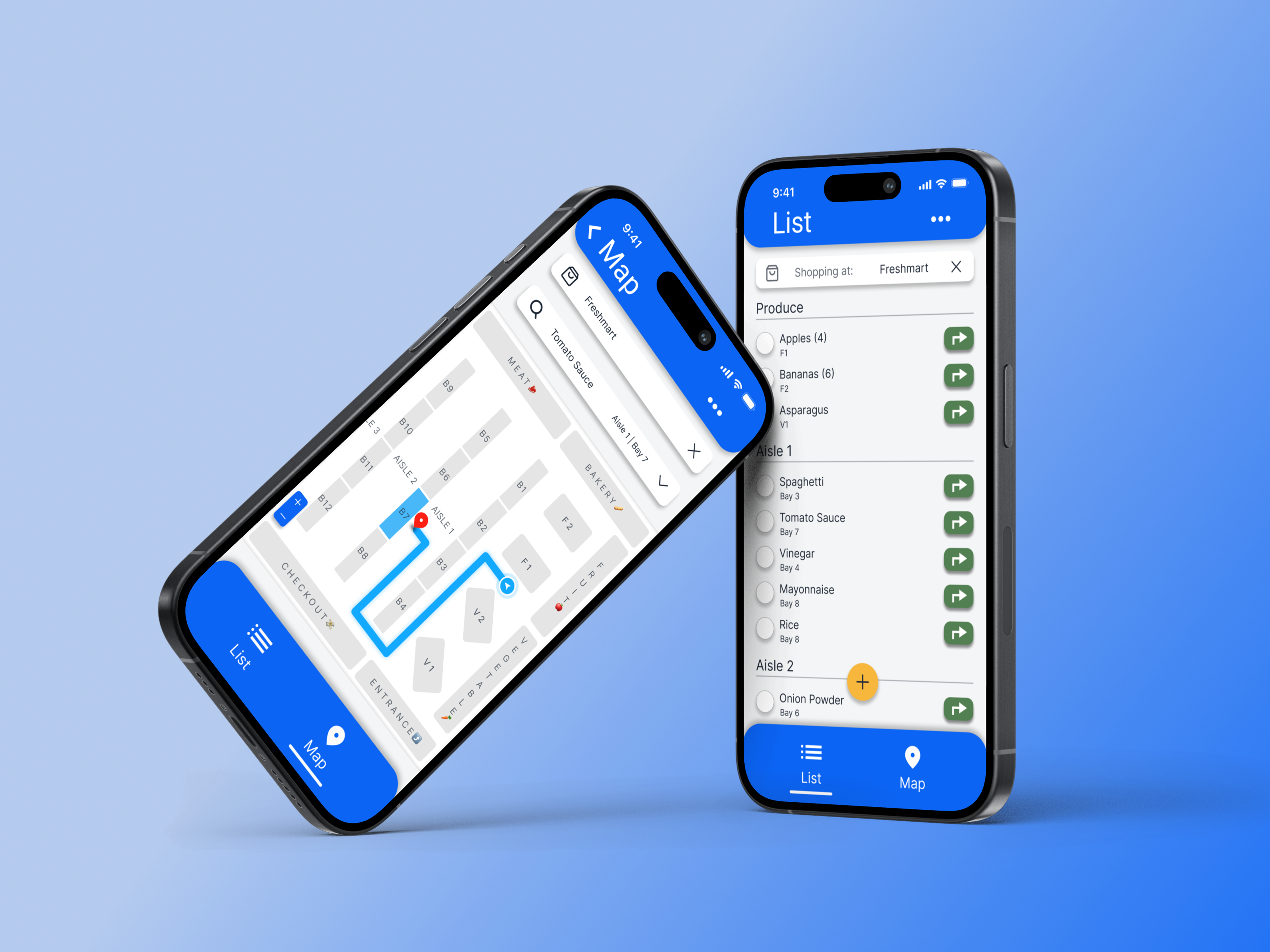
Designing clarity into everyday grocery shopping
A mobile app that organizes grocery lists by store layout and guides users aisle-by-aisle reducing friction, decision fatigue, and time spent wandering the store.
View case study


PRESTO — UX Case Study
A Smarter Way to Manage Your Transit Card
A conceptual redesign of the PRESTO app focused on clarity, usability, and modernizing the transit experience across Toronto.
Project Overview
Context
The PRESTO app supports millions of transit riders across Toronto, yet its App Store rating sits at 1.8 stars. The digital experience feels fragmented, structurally inconsistent, and missing features riders expect. This project explores how a full UX and UI redesign could simplify navigation, streamline core interactions, and modernize the brand system while keeping PRESTO recognizable.
Design Focus
Clarifying hierarchy across core flows, improving the discoverability of high-frequency actions, introducing persistent navigation, and bringing missing features like Service Alerts and PRESTO Perks into the app.
Design Process
Audit

Define

Design

Prototype

Reflect
Tap a section below to skip ahead ↓
Project Duration
March 2026
2 weeks
Role
UX Designer
UX Researcher
UI Designer
Tools
Figma
Claude
Procreate
1
Design Audit
Before designing anything new, the first step was understanding what wasn't working. This audit breaks down the current PRESTO app across navigation, visual consistency, interaction patterns, and more to identify the core problems worth solving.
User Reviews
With 4,800+ ratings and a 1.8-star App Store score, PRESTO users have made their frustrations clear. Users cite less functionality than the website, too many steps to complete basic tasks, and confusing navigation. Many others report persistent slowness, crashes, and an outdated design. The pain points aren't one-off issues. They're rooted in structural and visual decisions that make everyday tasks harder than they need to be.
The Problems
Navigation & Information Architecture
The app has no persistent navigation.
Once a user selects their card, the hamburger menu disappears entirely, replaced by a back button. The menu is only accessible from the main screen and lists 11 options, three of which redirect users outside the app. There's no clear separation between core features and secondary links.
Card Management & Hierarchy
Two screens do the same job. Neither does it well.
Selecting a card leads to a details screen, but the real functionality is hidden behind a small "i" icon that opens a second, better-organized screen. Most users would never find it. Meanwhile, the card UI locks 40% of the screen, leaving little room for the content below.
Missed Feature Opportunities
The app could do a lot more for its riders
PRESTO Perks offers discounts across food, activities, museums, and more but the app redirects users to an external link with no explanation of what it is or how it works. Service alerts are absent entirely, forcing riders to leave the app and check the TTC website separately. Riders deserve an app that supports them throughout their entire commute.
Inconsistent Interaction Patterns
Similar actions behave differently with no clear reason.
Tapping "View More Transactions" navigates to the second card screen. Tapping "Load Funds" skips it entirely. Adding a new card offers no progress indicator across its multi-step flow. Credit and Debit appear as separate options, adding friction where there should be none.
Visual & Spacing Issues
The details add up.
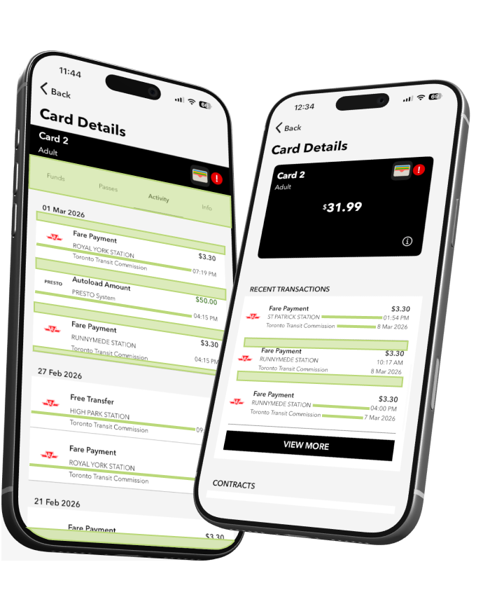
Trip history rows have uneven internal padding, tighter at the bottom than the top, breaking the visual rhythm down the list. The same component on another screen has even padding, suggesting the inconsistency is overlooked rather than intentional. Transaction rows align cleanly on one screen but timestamps fall out of alignment on another. Limited typographic hierarchy throughout makes it hard to distinguish what matters from what doesn't.
2
Design Principles
From problems to principles.
Every design decision in this redesign traces back to a specific problem found in the audit. Rather than fixing issues in isolation, these five principles were established to guide the work from start to finish.
Principle 01
Navigation you can always count on.
The hamburger menu was the app's biggest navigation failure: context-dependent, inconsistent, and easy to lose. A fixed bottom navigation bar replaces it entirely, giving users a reliable anchor no matter where they are in the app.
Bottom Navigation Bar
Principle 02
One home for every action.
Every core action lives on the home screen, visible, labeled, and ready. No menus to navigate, no screens to hunt through. One place, every action.
Quick Action Buttons
Principle 03
Give riders a reason to open the app.
PRESTO Perks is brought in-app with exclusive discounts on fitness, food, and live events, turning the app into something riders actively want to open. Service Alerts delivers real-time TTC and GO Transit updates directly in-app, so riders never need to check external sources. Two features that support riders throughout their entire commute.

PRESTO
Principle 04
Consistency builds confidence.
A unified card component and consistent flow structure is applied across every quick action. Whether reloading, managing autoload, or viewing card details, the layout feels familiar. When something works the same way every time, riders don't have to think twice.
Card Consistency
Principle 05
Surface what matters. Bury what doesn't.
Pages with deeper content use a tabbed layout. This organizes related information into expandable sections without adding navigation complexity. New features can be introduced as additional tabs without restructuring the app and the most important information is always one tap away.
Tabbed layout across multiple screens
3
Product Redesign
What PRESTO could be.
The redesign touches every core interaction a PRESTO rider has with the app, from reloading a card to discovering a perk. Navigation is persistent, core actions live on the home screen, and features like Service Alerts and PRESTO Perks are fully integrated for the first time.
The Home Screen, Rebuilt.
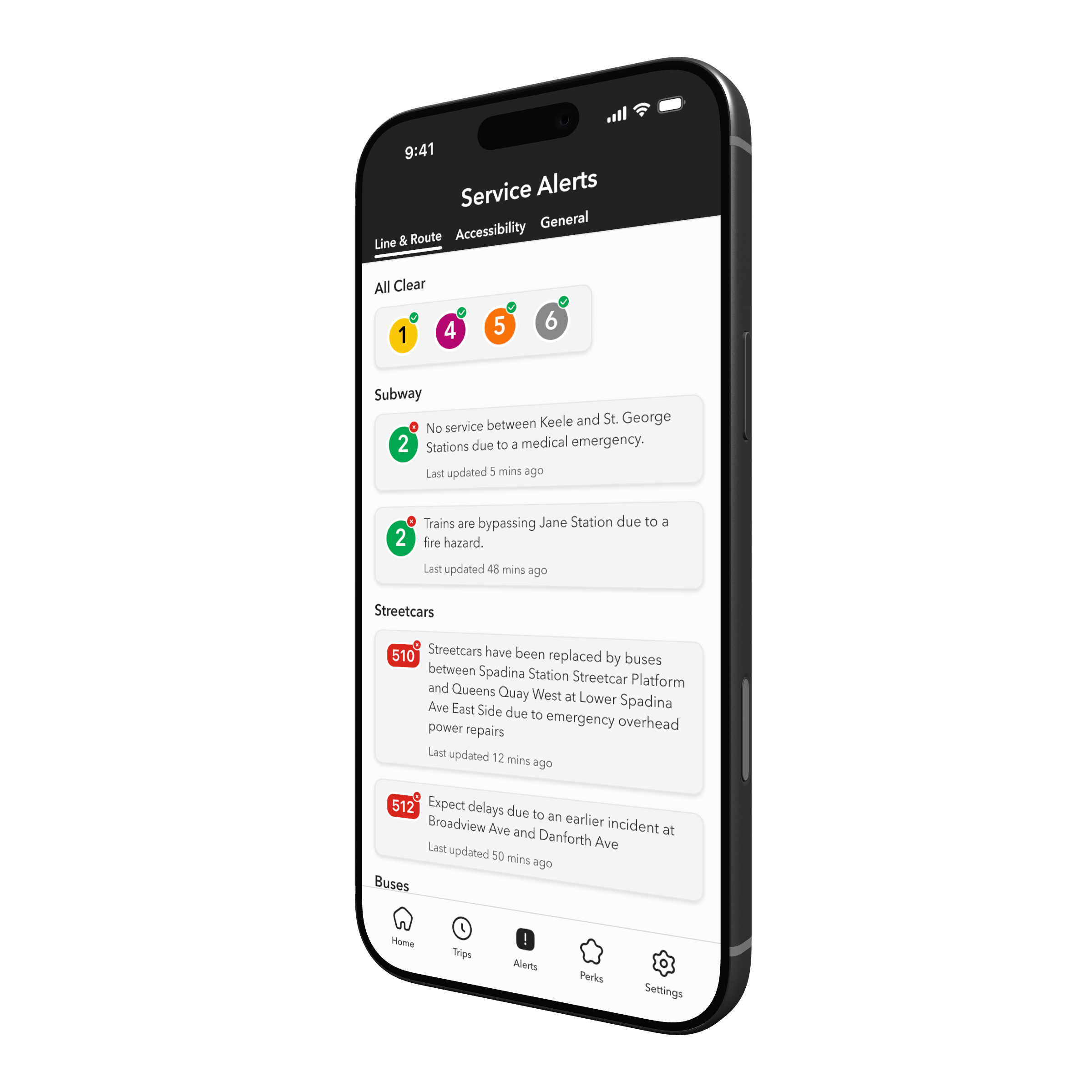
The home screen is the command centre of the redesign. Everything a rider needs most lives here: quick actions, recent trips, and persistent navigation that keeps every section of the app one tap away.
Adaptive App Bar
Adjusts its content based on the current screen.
Navigation Bar
Persistent across every screen — Home, Trips, Alerts, Perks, Settings.
Quick Actions
The four most common actions, surfaced immediately.
Recent Trips
Your last few journeys visible at a glance, no navigation required.


Take a closer look.
Here's a closer look at some of the key rider tasks in the redesign. Select a flow to see it in action.
Reload
Autoload
Add a card
View active perks
View trip history
From screen to street.
The redesign, out in the wild.
Trip History
Every journey, every fare. Organized and easy to scan.
Live Activity
Your transfer window, now on the lock screen.
Service Alerts
Know before you go. Live TTC and GO Transit updates, in-app.
Reload
Top up your balance in seconds, straight from the home screen.
PRESTO Perks
Discounts on food, events, and attractions. Just for riding.
Card Refresh
An updated physical card design that matches the look and feel of the redesigned app.
Trip Insights
Track your spending and travel patterns over time.
4
Design System
Components
A library of essential UI components built for consistency and scale. Every element follows the same spacing, sizing, and state logic so the interface always feels familiar.
Buttons
Input fields
Navigation Bars
Icons
Radio Boxes
Live Activity
Typography & Spacing
Typography
Avenir Next is used throughout the app for its geometric clarity and legibility at small sizes. It was also chosen specifically for its resemblance to PRESTO's existing typeface, ensuring the redesign feels familiar without feeling unchanged.
Avenir Next
ABCDEFGHIJKLMNOPQRSTUVWXYZ
abcdefghijklmnopqrstuvwxyz
0123456789

Style
Display
Screen Title
Heading 1
Button
Body 1
Body 2
Body Emphasis
Label
Chip
Weight
Bold
Medium
Bold
Demi Bold
Medium
Regular
Bold
Medium
Demi Bold
Size
48
24
16
16
14
14
14
12
12
Line Height
56
32
22
22
20
20
20
16
16
Spacing
Every spacing value in the app is divisible by 4, from the padding inside a button to the gap between list items. This creates a consistent visual rhythm that makes the interface feel ordered without requiring conscious effort from the user.
4px
8px
12px
16px
24px
32px
40px
48px
56px
64px
72px
Colour
PRESTO's palette stays true to its brand roots. Black and white form the foundation, softened slightly from their pure values to feel less clinical on screen. Green appears sparingly, reserved for moments that matter.
Primary Colours
#222222
Text & Icons
The primary dark tone for all body text, headings, and icons. Chosen for maximum legibility against light backgrounds.
#FCFCFC
Background
Near-white rather than pure white to reduce eye strain.
#F5F4F4
Card Surface
A subtle step down from the background, used for cards and containers to create depth without heavy shadows or borders.
Accent Colour
#BAD879
Interactive Accent
PRESTO's brand green, used sparingly for buttons, active states, and key brand moments.
Secondary Colours
#FF8674
#05C3DE
#A396FF
Perks Card
Three vibrant accents used exclusively on the Perks screen. A deliberate contrast to the app's minimal palette that gives Perks its own energy.
View Design System
5
Reflection
Impact
The redesign transforms PRESTO from a frustrating utility into a product riders can rely on. Persistent navigation replaces a disappearing hamburger menu, a consolidated home screen eliminates duplicate screens and dead ends, and two new features turn the app into something riders actively want to open. For an app used by over a million GTA riders every day, these are structural improvements, not cosmetic ones.
What I Learned
Starting with user reviews before opening Figma was the most valuable decision I made. It grounded every design choice in real frustration rather than assumption, and made it harder to rationalize decisions that didn't solve an actual problem.
Building a design system from scratch forced a level of discipline I didn't anticipate. The system thinking that felt abstract at the start became the thing that held the entire redesign together.
Each screen went through more iterations than I expected. What felt right at first glance often fell apart under closer inspection. Hierarchy issues, spacing inconsistencies, components that worked in isolation but clashed in context. The willingness to restart a screen rather than patch it was one of the more important lessons.
Next Steps
The most important next step is user testing with real PRESTO riders, particularly around the new navigation structure and consolidated home screen. Several flows also warrant deeper exploration, including Passes, Trip History filtering, and onboarding for new riders.
Longer term, a production handoff would require full component specifications, interaction documentation, and close collaboration with engineering. The redesign is a vision. Translating it into a shippable product is another story.

Liked what you read?Check out my next case study
Designing clarity into everyday grocery shopping
A mobile app that organizes grocery lists by store layout and guides users aisle-by-aisle reducing friction, decision fatigue, and time spent wandering the store.
View case study


PRESTO — UX Case Study
A Smarter Way to Manage Your Transit Card
A conceptual redesign of the PRESTO app focused on clarity, usability, and modernizing the transit experience across Toronto.
Project Overview
Context
The PRESTO app supports millions of transit riders across Toronto, yet its App Store rating sits at 1.8 stars. The digital experience feels fragmented, structurally inconsistent, and missing features riders expect. This project explores how a full UX and UI redesign could simplify navigation, streamline core interactions, and modernize the brand system while keeping PRESTO recognizable.
Design Focus
Clarifying hierarchy across core flows, improving the discoverability of high-frequency actions, introducing persistent navigation, and bringing missing features like Service Alerts and PRESTO Perks into the app.
Design Process
Audit

Define

Design
Prototype
Reflect
Click a section below to skip ahead ↓
Project Duration
March 2026
2 weeks
Role
UX Designer
UX Researcher
UI Designer
Tools
Figma
Claude
Procreate
1
Design Audit
Before designing anything new, the first step was understanding what wasn't working. This audit breaks down the current PRESTO app across navigation, visual consistency, interaction patterns, and more to identify the core problems worth solving.
User Reviews
With 4,800+ ratings and a 1.8-star App Store score, PRESTO users have made their frustrations clear. Users cite less functionality than the website, too many steps to complete basic tasks, and confusing navigation. Many others report persistent slowness, crashes, and an outdated design. The pain points aren't one-off issues. They're rooted in structural and visual decisions that make everyday tasks harder than they need to be.
The Problems
Navigation & Information Architecture
The app has no persistent navigation.
Once a user selects their card, the hamburger menu disappears entirely, replaced by a back button. The menu is only accessible from the main screen and lists 11 options, three of which redirect users outside the app. There's no clear separation between core features and secondary links.
Card Management & Hierarchy
Two screens do the same job.
Neither does it well.
Selecting a card leads to a details screen, but the real functionality is hidden behind a small "i" icon that opens a second, better-organized screen. Most users would never find it. Meanwhile, the card UI locks 40% of the screen, leaving little room for the content below.
Missed Feature Opportunities
The app could do a lot more for its riders
PRESTO Perks offers discounts across food, activities, museums, and more but the app redirects users to an external link with no explanation of what it is or how it works. Service alerts are absent entirely, forcing riders to leave the app and check the TTC website separately. Riders deserve an app that supports them throughout their entire commute.
Inconsistent Interaction Patterns
Similar actions behave differently with no clear reason.
Tapping "View More Transactions" navigates to the second card screen. Tapping "Load Funds" skips it entirely. Adding a new card offers no progress indicator across its multi-step flow. Credit and Debit appear as separate options, adding friction where there should be none.
Visual & Spacing Issues
The details add up.
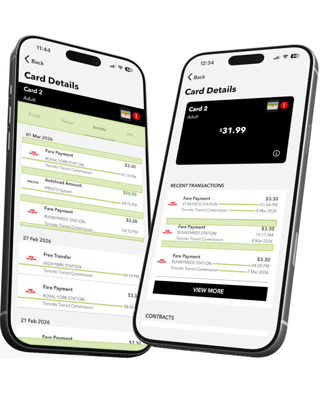
Trip history rows have uneven internal padding, tighter at the bottom than the top, breaking the visual rhythm down the list. The same component on another screen has even padding, suggesting the inconsistency is overlooked rather than intentional. Transaction rows align cleanly on one screen but timestamps fall out of alignment on another. Limited typographic hierarchy throughout makes it hard to distinguish what matters from what doesn't.
2
Design Principles
From problems to principles.
Every design decision in this redesign traces back to a specific problem found in the audit. Rather than fixing issues in isolation, these five principles were established to guide the work from start to finish.
Principle 01
Navigation you can always count on.
The hamburger menu was the app's biggest navigation failure: context-dependent, inconsistent, and easy to lose. A fixed bottom navigation bar replaces it entirely, giving users a reliable anchor no matter where they are in the app.
Bottom Navigation Bar
Principle 02
One home for every action.
Every core action lives on the home screen, visible, labeled, and ready. No menus to navigate, no screens to hunt through. One place, every action.
Quick Action Buttons
Principle 03
Give riders a reason to open the app.
PRESTO Perks is brought in-app with exclusive discounts on fitness, food, and live events, turning the app into something riders actively want to open. Service Alerts delivers real-time TTC and GO Transit updates directly in-app, so riders never need to check external sources. Two features that support riders throughout their entire commute.
PRESTO
Principle 04
Consistency builds confidence.
A unified card component and consistent flow structure is applied across every quick action. Whether reloading, managing autoload, or viewing card details, the layout feels familiar. When something works the same way every time, riders don't have to think twice.
Card Consistency
Principle 05
Surface what matters. Bury what doesn't.
Pages with deeper content use a tabbed layout. This organizes related information into expandable sections without adding navigation complexity. New features can be introduced as additional tabs without restructuring the app and the most important information is always one tap away.
Tabbed layout across multiple screens
3
Product Redesign
What PRESTO could be.
The redesign touches every core interaction a PRESTO rider has with the app, from reloading a card to discovering a perk. Navigation is persistent, core actions live on the home screen, and features like Service Alerts and PRESTO Perks are fully integrated for the first time.
The Home Screen, Rebuilt.
The home screen is the command centre of the redesign. Everything a rider needs most lives here: quick actions, recent trips, and persistent navigation that keeps every section of the app one tap away.
Adaptive App Bar
Adjusts its content based on the current screen.
Navigation Bar
Persistent across every screen — Home, Trips, Alerts, Perks, Settings.
Quick Actions
The four most common actions, surfaced immediately.
Recent Trips
Your last few journeys visible at a glance, no navigation required.


Take a closer look.
Here's a closer look at some of the key rider tasks in the redesign. Select a flow to see it in action.
Reload
Autoload
Add a card
View active perks
View trip history
From screen to street.
The redesign, out in the wild.
Trip History
Every journey, every fare. Organized and easy to scan.
Live Activity
Your transfer window, now on the lock screen.
Service Alerts
Know before you go. Live TTC and GO Transit updates, in-app.
Reload
Top up your balance in seconds, straight from the home screen.
PRESTO Perks
Discounts on food, events, and attractions. Just for riding.
Card Refresh
An updated physical card design that matches the look and feel of the redesigned app.
Trip Insights
Track your spending and travel patterns over time.
4
Design System
Components
A library of essential UI components built for consistency and scale. Every element
follows the same spacing, sizing, and state logic so the interface always feels familiar.
Buttons

Reload

Autoload

Passes

Info
Next
Next
Input fields
Confirm Card Information
Enter the card number and verification number from your PRESTO card. Need help? Refer to the diagram below.
Presto Card Number
Enter 17 digit PRESTO card number
Verification Number
Enter 3 digit number at the back of the card
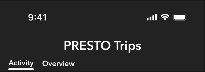
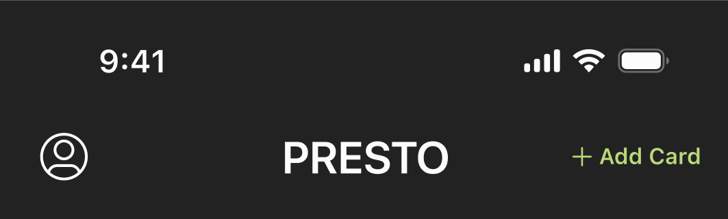
Navigation Bars
Icons

Home

Trips


Alert

Perks

Settings

Add

Auto

Passes


Info

Back

Exit

Close

Profile

Balance

Notify
Radio boxes
Add a PRESTO Card
Already have a PRESTO card? Add it to your account below.

Physical PRESTO card
PRESTO

PRESTO in Apple Wallet

Credit / Debit


Live Activity
PRESTO
2
High Park Station
Free unlimited transfers for 57 minutes
Expires
10:38am
Typography & Spacing
Typography
Avenir Next is used throughout the app for its geometric clarity and legibility at small sizes. It was also chosen specifically for its resemblance to PRESTO's existing typeface, ensuring the redesign feels familiar without feeling unchanged.
Avenir Next
ABCDEFGHIJKLMNOPQRSTUVWXYZ
abcdefghijklmnopqrstuvwxyz
0123456789

Style
Display
Screen Title
Heading 1
Button
Body 1
Body 2
Body Emphasis
Label
Chip
Weight
Bold
Medium
Bold
Demi Bold
Medium
Regular
Bold
Medium
Demi Bold
Size
48
24
16
16
14
14
14
12
12
Line Height
56
32
22
22
20
20
20
16
16
Spacing
Every spacing value in the app is divisible by 4, from the padding inside a button to the gap between list items. This creates a consistent visual rhythm that makes the interface feel ordered without requiring conscious effort from the user.
4px
8px
12px
16px
24px
32px
40px
48px
56px
64px
72px
Colour
PRESTO's palette stays true to its brand roots. Black and white form the foundation, softened slightly from their pure values to feel less clinical on screen. Green appears sparingly, reserved for moments that matter.
Primary Colours
#222222
Text & Icons
The primary dark tone for all body text, headings, and icons. Chosen for maximum legibility against light backgrounds.
#FCFCFC
Background
Near-white rather than pure white to reduce eye strain.
#F5F4F4
Card Surface
A subtle step down from the background, used for cards and containers to create depth without heavy shadows or borders.
Accent Colour
#BAD879
Interactive Accent
PRESTO's brand green, used sparingly for buttons, active states, and key brand moments.
Secondary Colours
#FF8674
#05C3DE
#A396FF
Perks Card
Three vibrant accents used exclusively on the Perks screen. A deliberate contrast to the app's minimal palette that gives Perks its own energy.
View Design System
5
Reflection
Impact
The redesign transforms PRESTO from a frustrating utility into a product riders can rely on. Persistent navigation replaces a disappearing hamburger menu, a consolidated home screen eliminates duplicate screens and dead ends, and two new features turn the app into something riders actively want to open. For an app used by over a million GTA riders every day, these are structural improvements, not just cosmetic ones.
What I Learned
Starting with user reviews before opening Figma was the most valuable decision I made. It grounded every design choice in real frustration rather than assumption, and made it harder to rationalize decisions that didn't solve an actual problem.
Building a design system from scratch forced a level of discipline I didn't anticipate. The system thinking that felt abstract at the start became the thing that held the entire redesign together.
Each screen went through more iterations than I expected. What felt right at first glance often fell apart under closer inspection. Hierarchy issues, spacing inconsistencies, components that worked in isolation but clashed in context. The willingness to restart a screen rather than patch it was one of the more important lessons.
Next Steps
The most important next step is user testing with real PRESTO riders, particularly around the new navigation structure and consolidated home screen. Several flows also warrant deeper exploration, including Passes, Trip History filtering, and onboarding for new riders.
Longer term, a production handoff would require full component specifications, interaction documentation, and close collaboration with engineering. The redesign is a vision. Translating it into a shippable product is another story.

Liked what you read?Check out my next case study
Designing clarity into everyday grocery shopping
A mobile app that organizes grocery lists by store layout and guides users aisle-by-aisle reducing friction, decision fatigue, and time spent wandering the store.
View case study